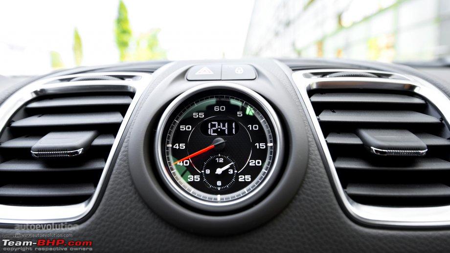
The dash clock that some Porsches have is one of my favorites. I took a picture of one the other day and decided to recreate it using only assets on Facer. I did upload a font for the digital time, but other than that it is all Facer assets. What do you think? If you see the dash clock for a 911 R you’ll see it is the same vibe.
Good job! I have an all Facer Creator-made watch face here too:
My little piece of feedback is that the tick marks in Facer Creator don’t shrink down well and become a bit blurry on the small subdials. I usually just create a line and rotate it a number of times to get the same effect without the blur (the link above has an example) 
I agree. My screen was being funny. When I selected an asset it would cover up the bottom third of the dial with the menu and I couldn’t get in there to edit up close. I need to figure out why the resolution was being funny and fix that. It worked fine for text assets, but everything else made the menu huge. I’ve got a few other tweaks on that subdial to do anyway. There should only be 4 numbers on the subdial and the numbers on the second dial should be larger to move the subdial down a little. Still…
It’s pretty close.  Thanks for the feedback!
