Hello, I have a problem creating a watch face for my Samsung galaxy watch 4. In DIM mode, the notification icons are too strong / bright. Is there a way to set this? Thank you.
It might be easier to answer after seeing the face, but, here’s one thing you can do.
Make a copy of each element in question, set them to be visible in dim mode only, and adjust their opacity as needed. This way one set of them shows at full opacity, and another shows at reduced opacity in dim mode.
Weather icons have no opacity, which needs to be handled differently. What I do:
- In Photoshop I make a copy of all images behind the weather icon (basically, the complete dial) and I combine it into one Photoshop image layer. This will be a patch to cover the weather icon.
- Then I trim the patch so that it just about covers up the weather icon, with a little overlap.
- I feather** the edges so the patch blends in better
- I add the patch above the weather icon, and adjust its opacity as needed
** I’ve had issues with a patch that wasn’t feathered, I get lines around the edges of the patch on the watch itself, so I don’t want to take any chances and I ALWAYS feather my patches. The amount of feathering depends on the size of your artwork: I do all my work in Photoshop at 3000x3000 (but I shrink down to 1000x1000 when exporting individual elements), and the feathering I do is 9 pixels. If your artwork is much smaller than that, I would say feather no less then 2 pixels.
What I do to properly see where to trim the patch: from Creator’s Preview Tools, I use the camera icon to save the Design Screenshot. I resize the screenshot to match it exactly to the size of my artwork in Photoshop, then I add it as a layer in the artwork so I can see exactly where I need to trim.
1 Like
These are notifications like do not disturb, ongoing activity or music playing. They are so much bright in DIM mode. I can turn down the contrast for the rest like weather, steps…
Wow, I was way off in what I understood!
Those are notifications outside of the face from the watch itself, and unless I’m mistaken, I don’t think you can change their brightness.
I was just about to post the same problem.
I tried to set a opacity of 30% which is fine, BUT when hands cross each other, the common parts result in a different colour
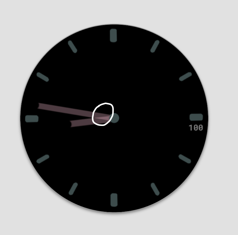
Then I went back to sketbook and put the the brightness of the hands at minimum.
But when imported in Sketchbook: the colour is lighter, but the brightness stays?
(or do I have to put the contrast down instead of brightness, or both?) ![]()
That’s the problem when you set opacity in that way: the hand becomes transparent, and whatever is under it (the other hand) can be seen through the first hand.
Because of that, I export 2 sets of hands from my artwork: one set is the regular hands at normal brightness, and the second set is the dim hands at reduced brightness/opacity.
For a dim hand, I make a copy of its regular version, I set it to the opacity I want, I add a new layer under it that contains black in the hand’s outline, then I export that to PNG as the dim hand. This way the hand is reduced in brightness/opacity to what I want, and the black layer that I introduced under it will prevent it from being transparent.
Same with the dial: my dim-mode dial is a copy of the dial, reduced in opacity, with a black layer under it to stop transparency.
So you have:
Regular mode: the regular hand, 1 layer
Dim mode: 2 hands, 2 layers
- the regular hand with reduced brightness/ opacity = dimmed hand.
- a black version of the hand, as layer underneath.
= 3 hands/3 layers in Total?
Sorry, I should have been more clear in how I explained, and the word “layer” can easily cause confusion because I have 2 different types of layers: element layers in Facer Creator, and image layers in Photoshop (or in many other graphics apps).
My first set, the regular hand: I make it in Photoshop, I export it to PNG, and from that I create the regular hand layer in Creator.
My second set, the dim hand: in Photoshop I copy the regular hand and I reduce its opacity, I add the black image layer under it (still in Photoshop), then I export that to PNG. From that I create the dim hand layer in Creator.
I hope I’m explaining it better now. That leaves me with only 2 sets of hands, the regular hand and the dim hand.
I’m not familiar with Sketchbook, but from what I understand, it can open Photoshop PSD files. Here’s a small and simplified PSD of a minutes hand to demonstrate what I was trying to say. This has 2 versions of the same minutes hand: regular minutes hand in one layer, and a dim minutes hand in another layer with a black background layer under it. If Sketchbook handles layers like Photoshop, you should be able to see what I meant to say.
(the hands are not centered on the canvas, just to see both side by side, otherwise I always have my hands centered)
Hands.psd (209.3 KB)
I’ll give that a try tomorrow. (In Belgium it’s getting late ![]() ).
).
Already 1 question after a quick Read of your post.
For the Dim hand. I understand that u make the 2 layers and then export for use in Facer .
In sketchbook I can do that too, but the 2 layers are merged to 1 when exporting to PNG. That’s oké = the goal?
Yes, for me that is my goal for my dim hand: to take the dim hand with its reduced opacity and combine it together with its black background into one exported PNG. The black background is only there so you can’t see through the transparency of the hand with reduced opacity.
1 Like
Hi
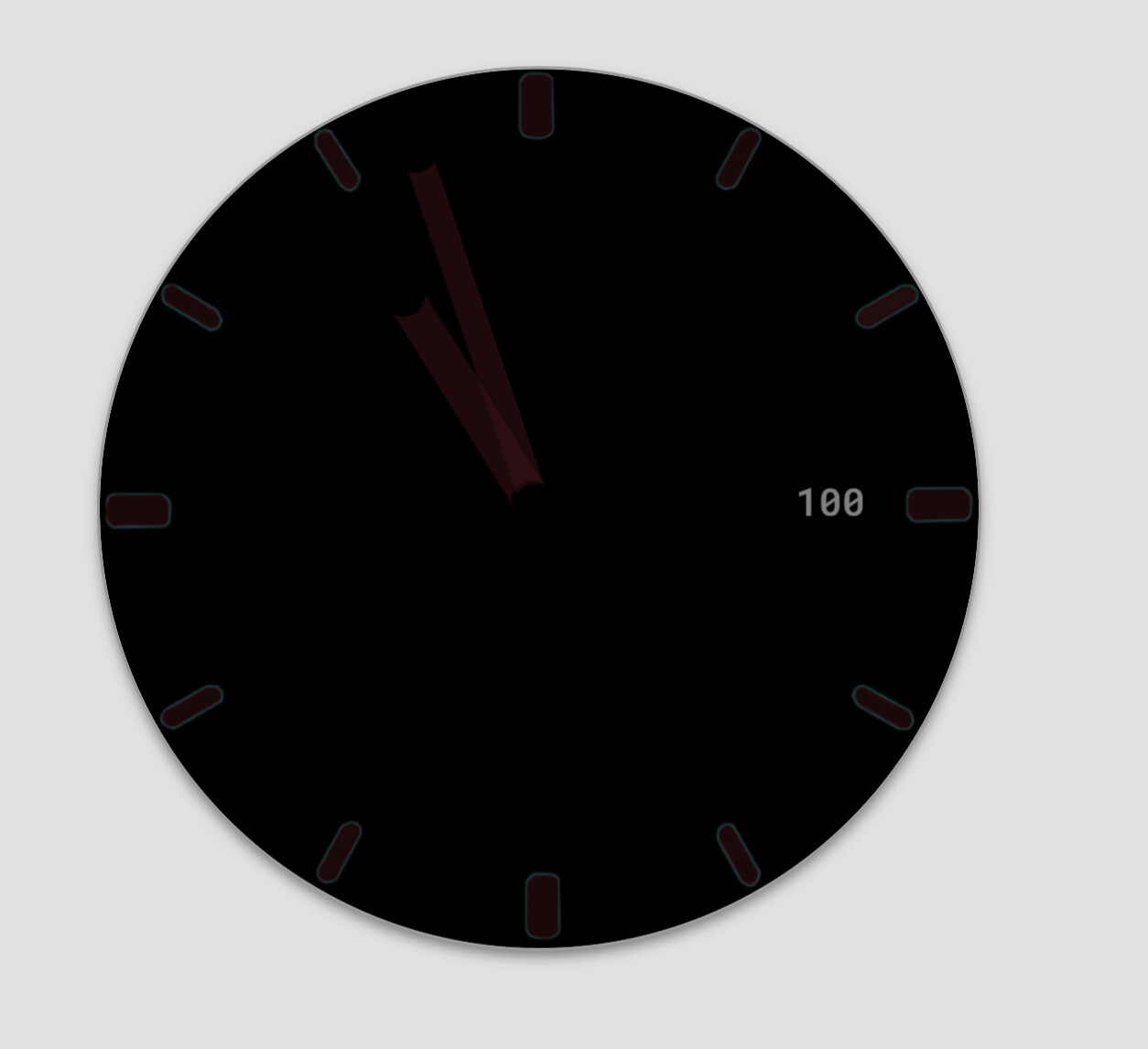
I’m still confused. I did it like you said. But still the same problem.
Any idea what I’m overlooking?
I hope you can open the tiff I exported as .psd, where I put the 2 layers for the minute hand:
H hand dim.psd (423.7 KB)
Bye
Nico
1 Like
I looked at the dim hand in the PSD file, and you created it exactly the same way I do. But in the screenshot you posted, looks like you set the dim hand’s opacity less than 100%.
Using this method, you’re controlling the dim hand opacity only in Sketchpad and not in Creator, so in Creator they need 100% opacity — but, it looks like you already fixed that in the face you posted above!
Jep, thanks anyway ![]()