Hello. I tried to check your example, but despite complicated formulas that in the end only give two numbers, I could not find any difference from having there two layers of mirrored images switching visibility at 12 and 6h. The highlights and bases having same pivot point act as one merged image.
Yeah, as I said I am not a coder. I would love to find the most elegant way to do this, and your method seems to be that…but, i don’t now how to do that (yet) - lol ![]()
![]()
The end result is what I am looking for so I gotta be happy with that. ![]()
I just find something and bash away at it until it works.
Actually, I think I just did that! On your suggestion, I just took out the code on the opacity layer and just set it back to 100 and it works just fine. So now it is just mirroring from 1-30, 31-60 just like you said. The opacity code did nothing anyway! ![]()
Thank you!
Hi @russellcresser , I’m trying to improve the dynamic shadows but I still don’t understand how they work… ![]() Could you kindly tell me which formulas you used for the shadow hands? Or eventually publish some inspectable example? Thanks!!
Could you kindly tell me which formulas you used for the shadow hands? Or eventually publish some inspectable example? Thanks!!
Here is my tutorial file. the hands highlights switch at 30 and 60 on the dial.
If you go to the Top of this Topic you will see I have posted a link to an Inspectable Draft. You can check the code out there. You will see that the formulas only cover half of the face overlapping of course. I preferer to call them Dynamic Highlights. You will see you have to prepare hands with the highlights in the right place for that Quadrant.
There will be other ways of doing this.
thanks @kirium0212! what if I wanted to add custom shadows which move like the standard ones?
The drop shadows are there already. If you want more of a shadow, you just have to change the Y value. Don’t do too much though. If you want it to be realistic, the hour hand should have a small drop shadow, the minute hand a little more, and the biggest drop shadow would be the second/stopwatch as the hands are stacked.
Ok, but the example you posted seems not inspectable… So I can’t check it out… Perhaps I missed something…
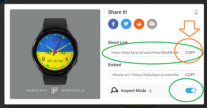
On any faces here in the community page you see, you will have to click the name of the face at the bottom of the linked face. That will open up the face in a new webpage and the inspection “rocket” will show so you can inspect the face. For some reason the link does not show the rocket here.
Working with shading as a function of the position, I’d think having the hand being made up of three images would make sense. One would be the hand unshaded, one would be light shading as a semitransparent white on one side, one on the other side of the hand. Rotate them the same. When cos() to the angle is negative, it’s below the three. Or you could set the shading light as a function of cos/sin to the angle.
Quick example.
The hand is made of 5 images, the backrground in black and 4 areas of shade. I took a shortcut with the opacity, it is negative half the time, but that just reads as zero.
Darn, thought I’d gotten it right. Fixed.
Thanks for the Sin Pi reminder . I am trying to do something with Sin Rad and it is not working . I used 4 images for the trick but for different reasons I could have used 3 . Left Right highlight and none . I see what your have done with your Facets on Your Hand . I think few will ever see that your Highlight Morphs far less than the facet lights Correctly . I like the Lighting at 10 o’clock like Facer . That is where my Default Rendering lights are . I can not be bothered to set lights up on everything I render so that is how it comes out the box . Upper Left light and Matt .
Looks good, maybe too complicated for little difference.
Somehow I would expect the both sides of tip still to be enlighted at 12h. Maybe adding 30 to general opacity of all those higlights would help
@petruuccios You’re right, the lighting isn’t entirely correct. It was just a quick example of how to have lighting follow angle.
If anyone needs it, I can make an example with more correct values, but since the hand is ugly as sin, I’d rather put the work into making it with an actual watch hand.
There’s so much I wanna do it that I think about to create more realism and detail, but I am reminded of the tiny end-user experience so it’s wasted energy a lot of the times.
