Hello all, I have been tinkering around on Facer for a couple of weeks now and I have figured out a lot with the help of numerous community posts.
However, I can’t seem to find anything related to the question I have.
It is regarding “dynamic shading” of hands. In the “other” platform, I am able to flip the highlights of my hands when the watch hand crosses the 12 and 6 locations on the watch face (by placing this line of code in the width property of the image ({drh} = 1) % 360 > 180 and -512 or 512).
So if you can imagine a light source from the top of the watch face shining down on the hands. The top or exposed part of the hand would be lighter in shade than the unexposed past of the hand. As the hand goes around the face the lighter and shaded areas will flip @ 12 and 6 to create added realism.
Has anyone done or seen this in Facer? Any help for a Facer newbie is greatly appreciated.
Thanks in advance!
2 Likes
The only way to do that is using two layers of each hand. Then make sure that the hand pictures have the light and dark sides opposite of each other. Then use opacity to switch between the hand images depending on the time. I’ve been considering trying that with some of my saved hands that have a light and darker tone on them. I just haven’t done it yet.
3 Likes
ooof…that seems cumbersome and redundant. hehe
I will get on learning about setting opacities at certain times then.
thanks man.
1 Like
This is all I could manage with my skills. I am certain it could be improved on.
BTW tick marks flip with Wrist action.
4 Likes
this question has been bothering me for a while too.
I haven’t found a good answer so far.
for a nice progression of light and shadow you would simply need too many pictures.
we might find a really good solution together.
If I think of anything, I’ll publish it.
3 Likes
Hey thanks for this! I really got something working the way I want it. I get the gradual highlight shifting and it looks great. I just adjusted it for a “bevelled” hand with only two faces that need to be highlighted or shaded. Works perfect!
Thanks.
2 Likes
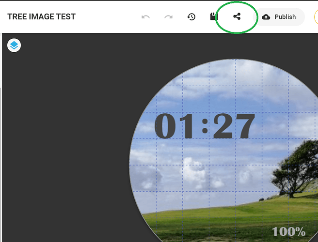
Actually I want to share it, but I cant figure out how…LOL
2 Likes
Yeah . Bevel is the best bet . more visible. If stuff is too subtle it misses the point . Some time try sharing your work here . Well Done .
1 Like
Ha Ha . Mind reading .
Just paste the link here when you are Ready .
1 Like
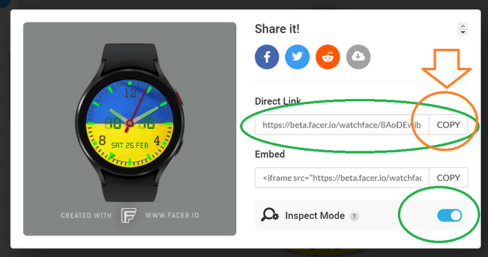
Well done . Not sure if that is inspectable the link come across completely different from what I post . Are you on a Mac or something ?
I made it inspectable. I am using a Mac, yes? Does that make a difference? I usually just right clock on the image and open it in a new tab. That seems to reveal the inspect option.
1 Like
Yeah a bit confusing . The Inspection you are talking about is for the Java script . The inspection I flagged up is the Facer Special Link that opens in Creator and lets you Inspect the code and Graphics to Help Makers Collaborate to fix and stuff . I am not capable of doing that in Java .
Yes, I can open my link up in Creator and open it? I’ll try again.
1 Like
Hey . That link works better for me. This is a good example of how difficult it is to get into the advanced stuff . I will have to spend some time looking a that to get a good handle on it . I am no coding expert by any means . All I will say is there is a slight contradiction with the Minute hand shadow . It contradicts the lighting angle on the hand . I think you need to add 30 degrees somewhere . My brain is not working very well at the moment . You have my respect with the Multi component hands . I have tried stuff like that . Hard Work .
I like to see the lighting come from top left as Facer default shadow . But Each to His Own
yeah i draw all my components based on a 120 degree topLeft light source but I am totally happy with tis result. As you said, no one is going to notice these minute details.
On another note, is it just me or is everything really hard to read/see once you get it onto your watch face? Everything in Facer just seems…really small. My working resolution is 1280x1280 72 DPI and I don’t do any image resizing in Photoshop to get it down to 320x320. Maybe I should?
Sorry for all the questions. BTW
1 Like
Well @kirium0212 there are many debates on the topic of resolution on here I work at 2400 x 2400 at low antialiasing . Basically to take the steps out of shallow angles . I have had stuff from the community that is 640x640 and it looks brilliant on a Face . But yes most watch fasces are based on 320x320. My Eyesight makes me send stuff out a bit chunky but I think there are some that Appreciate it .
I set my Watch Display Brightness 3 out of 10 and adjust stuff to that on test . Colour is another matter . my laptop and Watch do not agree there . You will see a lot stick to Neutral Tones . Basically to save Battery power . Then there are the OLED special Rainbow Jobs which I find myself Guiltily of producing . I am trying to do more rendering this year . The is well advanced and I have been messing about with code more which I am useless at .
seems like a long process and a never ending learning curve. I have been making faces on the “other” platform for a couple of years now and just never had an issue with things being unreadable or unseeable. The end product there is 512x512. Anyway, I am no coder either…I am just very patient and good with a hammer. 
I have always been into making “mechanical” watch faces and not really into the digital stuff. Eventually, i’ll get into hybrids to try to cover all the bases. But for now, it’s gonna be Chronographs, tourbillions, and different guilloche patterns for me.
I really appreciate the help and banter.
Thanks again.
1 Like
You are going to have to subscribe to make a Chrono over here. But your Tourbillon is very nice. I like to see them working. Most make a poor excuse with a bit of an animation. I am a Tools man as well. One of my favourites in the old days was Yanky Screwdriver. I have Zero Patience though .
Cheers! More tourbillons to come as I love em! I already subscribed and have working chronograph, moonphase, datewheel templates all coded and ready to go. 
2 Likes

