Hello everyone,
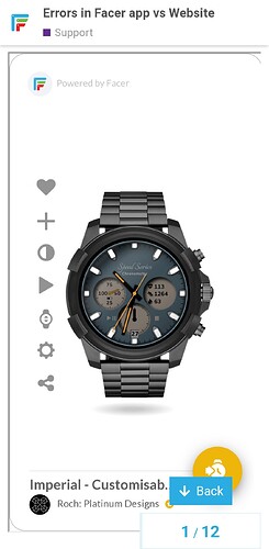
Has anyone been noticing that faces look different on the website vs the Facer app? For example, the dim mode here is displaying correctly:
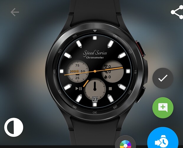
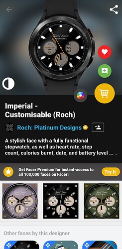
but if you look at the dim mode preview in the Facer app, it appears completely different…does anyone have any ideas as to why and how to fix it?
3 Likes
I could not check it in Creator I Coul not find it Inspectable . I am not sure if I can inspect a Premium Face anty Way .
1 Like
The Web version can be found in this thread (above). The issue is that the version on the phone app (can be seen by searching ‘Imperial - Customisable’) doesn’t match up with the Web version. Have you ever experienced this? Or issues where the creator version doesn’t reflect the phone app version?
1 Like
Never happened to me… phone app version was always the same as web version.
3 Likes
I will have to look when I get up . I am on Mobile at the moment . Often it us the Apps Preview that looks wrong as circular progress bars get changed . Can you describe what changes ?
1 Like
The dim mode of my phone version looks like this:
which is not the same as the dim mode of the Web version above. The issue (phone app not matching Creator or Web version) has been happening on quite a few of my faces lately.
1 Like
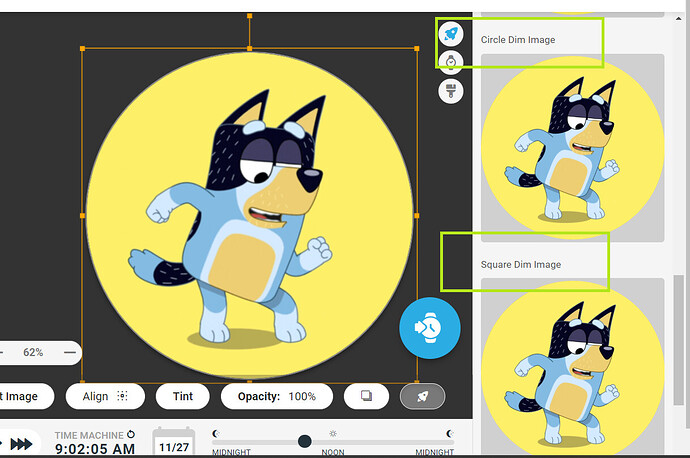
It would be so much easier if you allowed us to inspect the face . Check your background layer . There are 4 windows for the different modes Square and Dimmed . The image may have not landed in each Window. .
.
I think I know what has happened . You have put your Background in the Background Layer . I never us that .
.
.
.
1 Like
Happy to enable inspection mode - Will do when I’m home. I never use background layers either so I don’t think that’s the issue. Looks like some weird synchronisation issue (everything seems fine in Creator).
1 Like
Cool . I have to ask the Bleeding Obvious First . I wonder if it is a Very Hight Res Image . Trying to cut down on power overhead might have clipped it . Creator is a Simulation .
1 Like
I am only aware of trouble with phone app not displaing arcs or circular progressbars width correctly.
2 Likes
Hmm most of it, apart from a couple of shadows, is created entirely within Facer itself, so I don’t think resolution would be the issue. Is anyone able to do me a favour and confirm whether the dim preview looks wrong on their phone? That way I’ll know if it is a Facer issue or just a caching issue on my phone specifically. I’ve raised a ticket for this with Facer support a while back but they must be overwhelmed at the moment.
1 Like
Yes I’ve definitely noticed that issue before too.
1 Like
Unfortunately most of us are PRO but not Premium users.
I would like to help and test it but cannot sync Premium watchface.
2 Likes
No need to sync it @masterboyhr - Just need to look at the preview in the phone app 
1 Like
There you go it is not your Phone Specifically .
.
2 Likes
Thank you sir! Damn 
 So bizarre
1 Like
No luck with this particular face (though I think the ‘wrong’ dim mode still looks good luckily haha) but errors in other mobile previews have been due to progress bar width display errors, fonts not displaying correctly, and VAR opacity codes on old watches no longer functioning correctly (switched functions to move them off the face on the Y axis rather than changing opacity). Thanks to the community for helping fix such issues  Hopefully Facer is on them too.
2 Likes


