Only familiar with paint.net myself but you could make a transparent diamond mask in one layer and a photo of the beed under that layer and then move the photo under the transparent diamond, merge the layers and then delete the solid backgound
I like that idea, but I think you could compromise and make the font bigger yet still fade for minimalism after it displays dark. Maybe 4 or 5 seconds instead of 2? I’m just guessing but seems like 2 wouldn’t be enough.
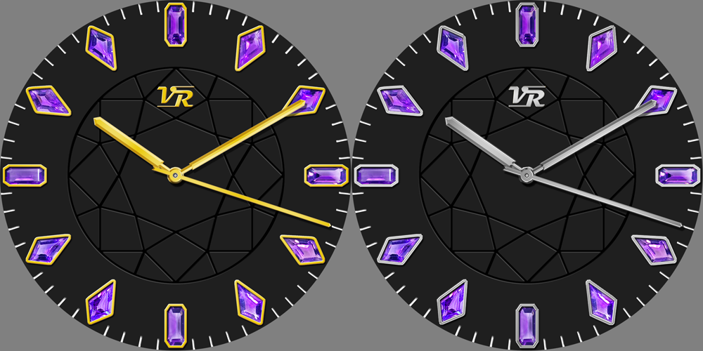
You have a great idea with a gemstone for each hour - focus on that and make the rest minimal and elegant. I would ditch the soccer ball background myself and just give the watch some dimension/shadowing.
Aside from the gemstone markers, the center’s diamond outline was meant to be somewhat of a focal point without being too bold, which is why I made it a beveled engraving in the source image which in turn makes it faint. It would look too empty without it…
I actually like the fractured pattern in the center. Hadn’t though of it ad footbal like until you mentioned it but it is less regular than the standard hecagon pattern. I’d stick with it personally as it is very faint but gives close up personality.
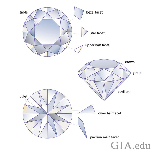
Not many recognize the top view of a diamond (or technically, a round brilliant cut gemstone) over its side view. Best recognized by those in the trade and (more importantly!) those who wear them.
@kourosh. I recognised the pattern In the center but it would be nice to make mor of it. If the lines were transparent you could have some thing mysterious happening underneath it. You do not have to go so Dark with the background. The complementary colour to the gems is Advice I have been given. But a different tone obviously.
Please inspect this for something happening under you crown.
I like the birthstone concept. I think the font needs to be larger in the first sample. It is difficult to see especially on the light background. I prefer the dark faintly textured background. In general, I have never cared for gemstone images on smart watches because they don’t look real to me, but that’s just me. Yours, however, are some of the best I’ve seen. I can tell that you took a lot of time on those. Keep up the good work, and see what your followers have to say. That may guide you as you create more.
Thanks, you just gave me more ideas! It seems that it might be best to make black/white/silver/gold all options in the same face, to appeal to most tastes-- although that would make it a premium face and I don’t know what the demand is for free versus premium faces. Plus at that point, might as well have the means to toggle info on and off while still keeping a minimalist look.
Your design above is very elegant, I like the spiral! The finish of the silver areas reminds me of gold and silver bead components we use in our jewelry products called “stardust.”
I do not know either, only made one premium based on one of my back then favourite, during the free test period. The ratio seems to be like 4:1 for the free ones (maybe even more, I did not make all the possible colour variations into separate faces).
Well… for now I think I have my final version for an all-in-one black/white/gold/silver design, making it a premi face.
@2 toggles metal color and @4 toggles dial color. Center spindle locks all interactions to prevent accidental toggles, with a red indicator around spindle when lock is off. The step/battery/date complications fade out after 4 seconds to slightly reduce clutter.
@kourosh I have made a Transparent Background png Template for you my friend, I will message you with it to use or not use as you wish ok, plus an example of how it could be used