
I’ve been unhappy with Facer font quality for a long time now. There was a rendering problem in the past which Facer corrected, but there remains a general jagged inferior quality. I thought that my old watch 4 might have had something to do with it, so I’ve been living with it. I now have a watch 5 pro and was hoping for better quality, but it’s not the case.
When comparing to a stock Samsung face, the difference was clear, so I ruled out the watch and knew it was again a Facer issue. I then figured that the issue must be the font quality of the fonts I was using. I have been getting fonts from different sources (commercial approved) and have paid for some, yet they all have the same mediocre quality.
So, then I figured that the partners probably have access to or are paying more for high quality fonts, but guess what - nope.
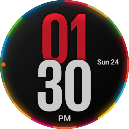
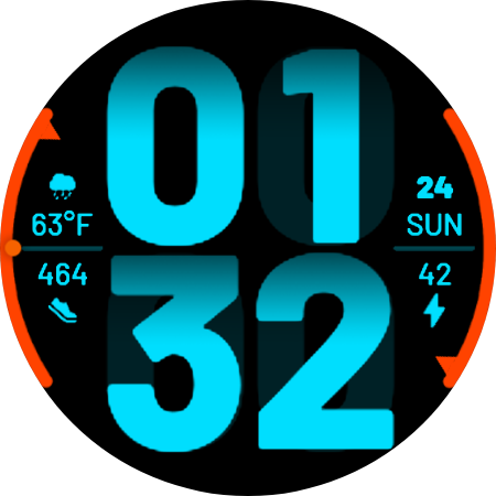
Attached here are actual screenshots off my Watch 5 pro, The top is a stock Samsung face and the bottom is a face by Almarinov NOWO. The difference is startling.
Is everyone seeing what I’m seeing on their watches?
NOWO - Almarinov - NOWO - watch face for Apple Watch, Samsung Gear S3, Huawei Watch, and more - Facer
Samsung - Global goals Digital
3 Likes
I just whipped up a test watch and did a large font watchface on it. I used the Impact font size 200 and sent it to my Fossil Carlyle test watch. It shows up the same way as on your watch. It isn’t near as noticeable on the watch as it is in the screenshot. This is the watchface and the screenshot below.

1 Like
Loaded NOWO, also jagged on my ticwatch…
1 Like
In my opinion it doesn’t matter on the watch, it’s a tiny screen and they look the same on the watch. At least I cannot see the difference.
The same goes for pics and gifs.
50-100 kb pictures do not look good on the big screen but are more than enough for the small screen of a watch.
Icons: 20-50 kb is enough
Unnecessary big/heavy pics and fonts just slow everything.
I guess Facer has to think about older watches as well.
Samsung doesn’t care, buy a new watch with more RAM philosophy…
2 Likes
So far every reply is reporting that the fonts are jagged. One person has stated that it doesn’t matter.
If we accept that the fonts are of poor quality the new question becomes - does it matter?
To be the best, everything matters. I’m sure you’ve heard the expression “It’s all in the details”. No matter how good a designer you may be your final product will not have the detail and be clean and professional if it’s always compromised by poor font quality beyond your control. This is my opinion. I don’t see Facer doing anything about the matter if none of us could care less.
For me, this might be a point where I pull in a font from another source that scales better. But only if my eyes can detect the difference on a device.
Stock hands, numbers, and ticks only get us so far. I view Facer’s fonts the same way. Stock fonts take longer to outgrow than the other elements, but there is a limit.
Show me one that scales better - I’ve tried hundreds. I don’t use any stock fonts and the font in the example by Almarinov is not stock.
I have been using the SF Compact Rounded family of fonts quite a bit lately. They are slightly jagged but are much smoother than most. This is a screenshot of one of my watchfaces using the boldest font from that family. You will notice a slight amount of jaggedness but not excessive.

When it is on a normal watch it is not noticeable at all.
This is a very large blowup from the above picture.
1 Like
@mrantisocialguy That would suggest that there does exist some fonts that are of better quality. Obviously its not the vertical or horizontal components that are the problem but rather curves and diagonals.
I’ll test that font on my end. Where did you get it from?
I do see what you mean, and I think I agree with your conclusions (A Facer issue more than a font issue).
I ran a test with a very thick font (Google Fonts: Rubik Mono One). It renders differently on my watch (Galaxy 6 40mm) than on the PC screen. Font stays smooth all the way up on desktop/editor (and even in the preview below), but I can start to see pixelation around 120 on my watch.
This is an interesting question for Facer developers - what size is the TTF rendered to? If it is directly to final size, it should render smooth every time. The rough edges suggest they might render to a common (smaller) size and then scale the rendered raster image? (I am totally speculating, of course).
2 Likes
This is something where we would need better documentation. We don’t know what happens in background.
The Facer canvas is 320x320. The most typical round watch display nowadays is around 450x450. The raster images when inserted are somewhat downscaled. It looks like 1/2 or smaller to fit the canvas, but there remain some details when stretched afterwards, so it is not exact half. Maybe something similar like double computation occurs with the fonts on actual watches too. First they get scaled for the canvas and after that stretched to the display?
5 Likes
I don’t remember for sure, but this website has all the SF Compact family of fonts in regular and rounded versions.
SF Compact Font Family @ font.gooova.com
Apple uses the regular ones in Apple watches and iPhones. I don’t think they use the rounded ones but I’m not an Apple expert by any means.
I would tend to think that is the main problem. I know any image when it is blown up from a smaller one will almost always have a “ragged” look to it. That is what anti-aliasing is supposed to fix which would make me assume that Facer doesn’t have it, or it can’t run on a smartwatch.
Licensing looks pretty scary, so I won’t use it, but I’ll keep searching.


