Why is this: when I add a date or any text to a watch face it’s way off center. For example, if I want the date to appear exactly centered at 160x160 the font will have to be 166-ish on the Y axis. Sometimes the X axis needs a small adjustment too but that Y axis is way off and if I change the font size it’s off again. Frequently the text will show up centered on my actual watch but not in the Facer app and vice versa. Is there some calculation I need to be doing every time I use text in Facer to keep things centered?
Not sure I can follow.
If you post a link to your draft watch face and enable inspection, we can have a look at it…
People were having problems with some fonts Justifying . The impression is it sorted itself . The Y justification of any font is the bottom of it . Center Justified Fonts should always be in the middle of the space specified . You may want to Look at your Fixed Width option .
As Tom has said It will be good to see the Inspectable Draft of your Specific Issue .
I appreciate the help here. As far as a specific face no- it’s every single time I use a date or any text in Facer. I always use center justified but it’s the Y axis that’s always way off. I mean always. Any time I drop a date in. For example, I add the date with 160 for X and 160 for Y and the text shows up not even close to being centered at 160-- it’s generally off by 6-7 pixels on the vertical axis with 16-20 font sizes.
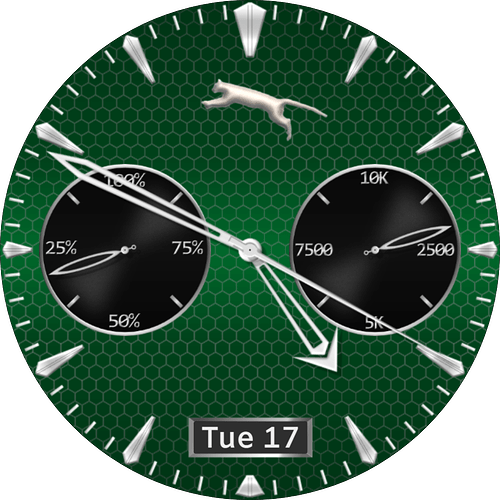
Take a look at the date on the draft below. The date window is 160x280 and the date text, to be centered, is about 286.7 and that’s probably off by a small amount because it’s done by eye.
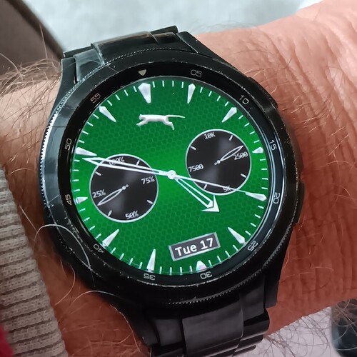
This is also an example of the date appearing to be very off centered vertically but on my watch it is centered so I’m so confused lmao
This is is a test I made using your face as a Backdrop . I used the Default Date Font , Amiko SemiBold . I think we find the posher fonts can have problems . I suppose you have chosen that font for good reason . I usually use MS Windows fonts and some Facer ones that appeared on my Tablet for some reason .
.
.
.
.
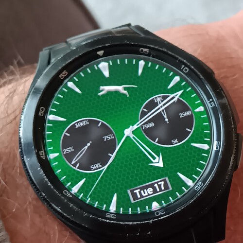
The Date on the Face of your Publication looks Fine on my GW4 Classic . See you got another Sync .
.
.
Hmm. Well, again, I appreciate the help. So if I understand you correctly the default font centers up ok but others are hit and miss. This is unfortunate because I don’t much care for that default font, not that it’s bad, I just like to experiment with different looks. I’ve tried many times to use custom fonts but they all have the same issue so I guess it’s just gonna have to be an eyeball-situation every time ![]()
Thanks again
You will see the Last Shot is of a Sync from your profile . See that it is fine on a GW4 Classic . Is may be a scaling problem on a Face with Higher Pixel count . Why don’t you post us a Shot of the face on your watch with the error . Let us know what watch you have .
Make sure you don’t have a space at the beginning or the end of the text you enter too. Try dafont.com for new free fonts. Good luck!
I looked at that . At the Moment a Text Box will not read a Space at the Begining or End of the Line ofText ![]()
![]()
I use some fonts that are just a little off center when in a watchface. The best I can figure the maker of the font has each letter and number left justified so when used in a center justification setting in a watchface it forces everything to the right slightly. All the fonts that I have used in Facer for the Y axis are bottom justified. All pictures in Facer start out as center justified. You can change it on pictures but not on the font. If I am doing text that I want centered X 160 and Y 160 It will always end up being between X160 and Y 167 to 169 depending on the font size and font style. It’s just something you have to live with.
Good to know it wasn’t some fundamental mistake I was making. Thx all
There is something to consider regarding the Y axis - the bottom of most characters is not the bottom of the character set - there is room below the baseline for descending characters like y, p, q, g, and j.
If you look at the formulas underlying my face “CEZ Border Hands”, you will see that I had to supply an offset as the characters rotate. I hope this helps you.


