I would like to show here that every artist, regardless of whether they are world class or amateur, always comes to a point where they do not find the current work so good.
I always have more ideas than time.
As a result, I always have several designs in the works.
If I get stuck with one, I continue with another.
And again and again I’m at a point where I have to decide whether I’ll continue or it will end up in a folder that is an interim storage.
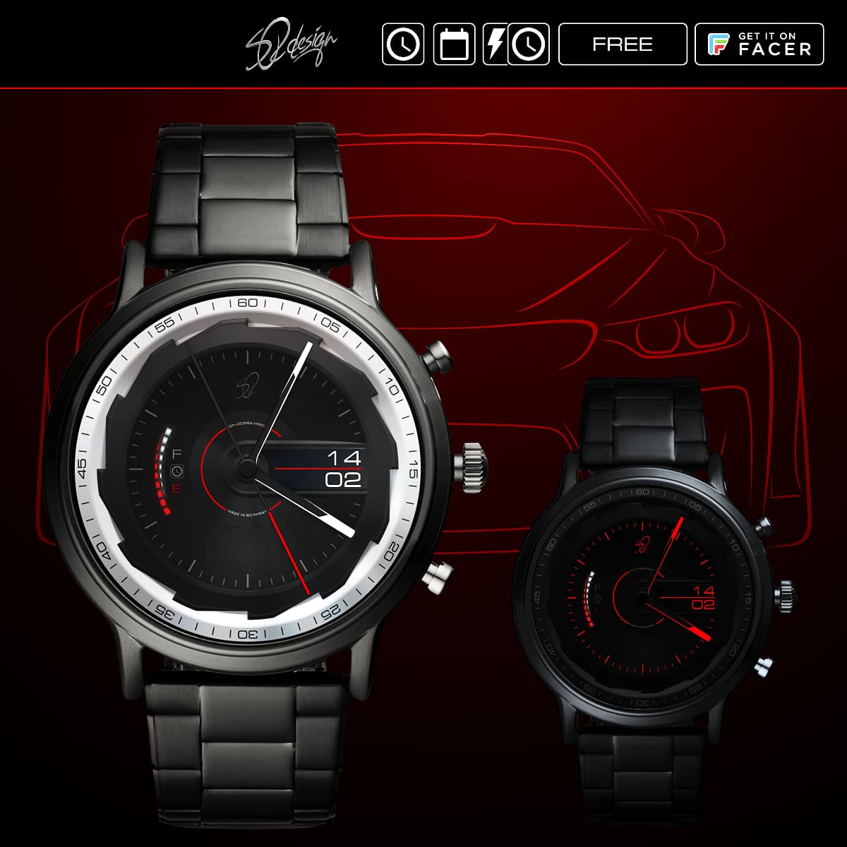
Here we have a good example.
I think all the individual elements are a good idea.
But no matter how, there is no overall picture that I like.
I should say that I probably won’t finish this model like this.
But the design elements used will be used in the next projects.
I have several folders in my computer of “started” projects which I may or may not revisit. My experience so far has been that I get an idea in my head and if its strong enough, or I get results that I am happy about after learning some new process, I will gleefully put my head down and make a face that may take me hours and hours to do much to my wife’s utter confusion. Then I put it up here thinking to myself that I have made “the face of the year”, and it turns out - IT IS DEFINITELY NOT! LOL!
Even if you dont like them, to me they look ready to publish.
What goes about the ideas dropping and lifting, it is normal and sometimes helps to keep it fun. Some ideas simply need time for “enlightening” to come and break trough. I think it is not bad to abandon some less promising ideas to free up the mind
I have more unfinished drafts than I have published faces. But I have not the heart to cleanup those which probably never become ripe enough.
As always, your design is something else.
Not my cup of tea, I like them digital, informative and with bigger fonts but I really appreciate and respect your designs. Beautiful.
Among those four: the second one looks best to me.
And I agree with petruuccios: they are ready for publishing. Don’t delete them.
I thought so, you guys have the same “problems”.
Maybe this topic will help some beginners deal with it better if they read that this is completely normal.
I will not delete the design.
But I make 2 of them.
All together I find it a bit too much.
To be honest, BC looks cross-eyed to me, the outer rims of the small dials are wider on the outside. And somehow the bar in the middle is not working for me. How about turning it 90°? But that’s just me… otherwise looks cool.
The lines in the middle are only dashes for a better overview.
Yes, the rings squint on purpose.
It should give the optical impression that the rings are slightly tilted towards the middle.
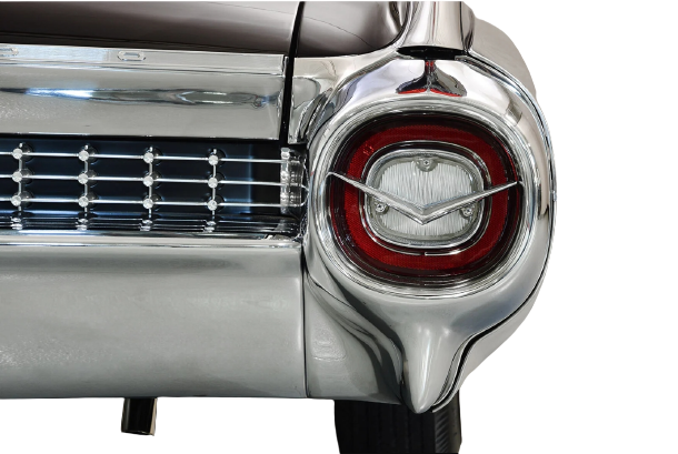
Similar to some sports cars the speedometers are tilted towards the driver.