my drawing looks completely different than the picture i had in mind.
now my plan doesn’t work anymore.
I’m a bit at a loss as to how the hands should look.
the whole thing got a bit off the rails for me. ![]()
my drawing looks completely different than the picture i had in mind.
now my plan doesn’t work anymore.
I’m a bit at a loss as to how the hands should look.
the whole thing got a bit off the rails for me. ![]()
Is it possible to ser your original ideal?
I drew it the way I had it in mind.
but the overall picture gives a completely different impression than i thought.
it looks good too…
but my plan doesn’t work
Just an idea…
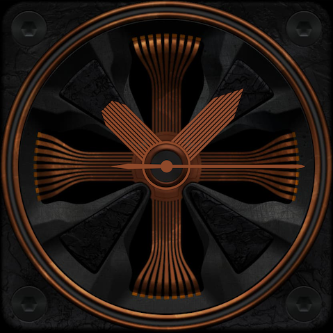
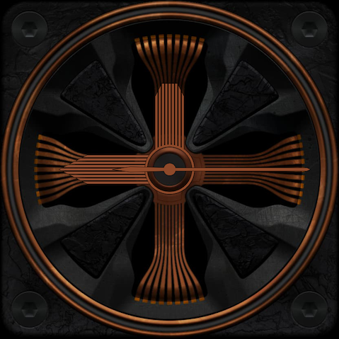
Might be cool if the hands more or less disappear at 12, 3, 6, and 9 o’clock
cool! maybe non-traditional hands. like maybe some sort of machined widgets that rotate around the bezel instead? id just make sure they contrast against the background enough to stand out and read at a glance.
thank you both for the ideas.
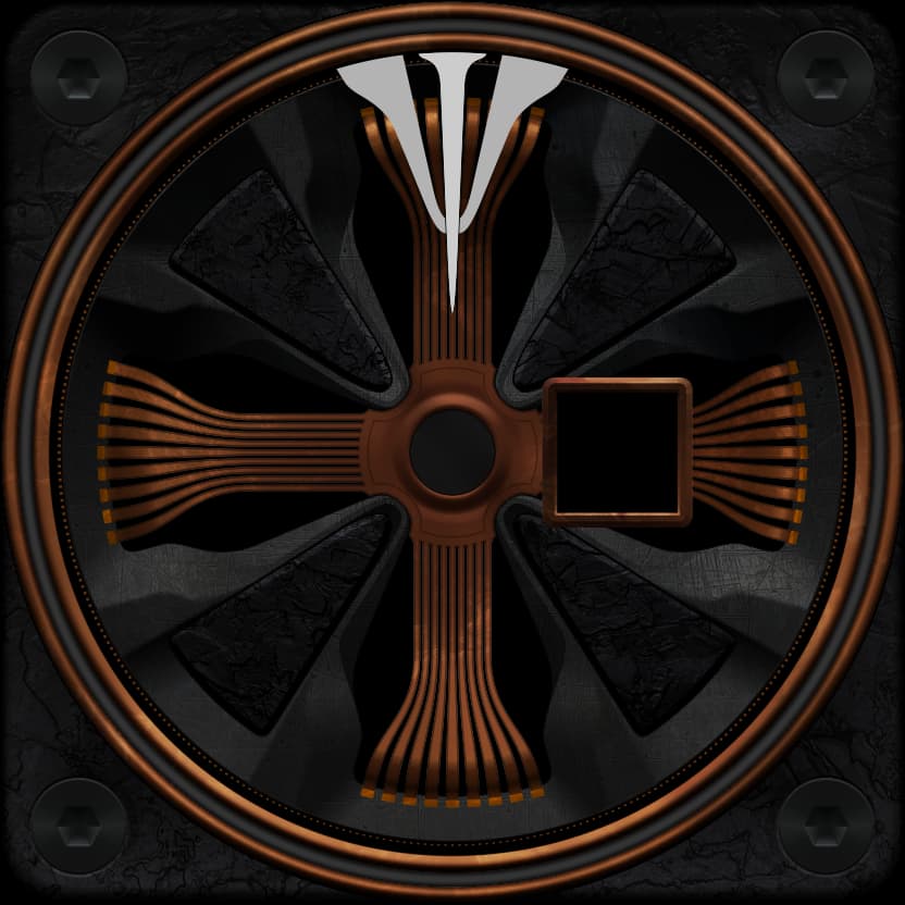
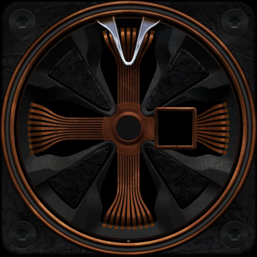
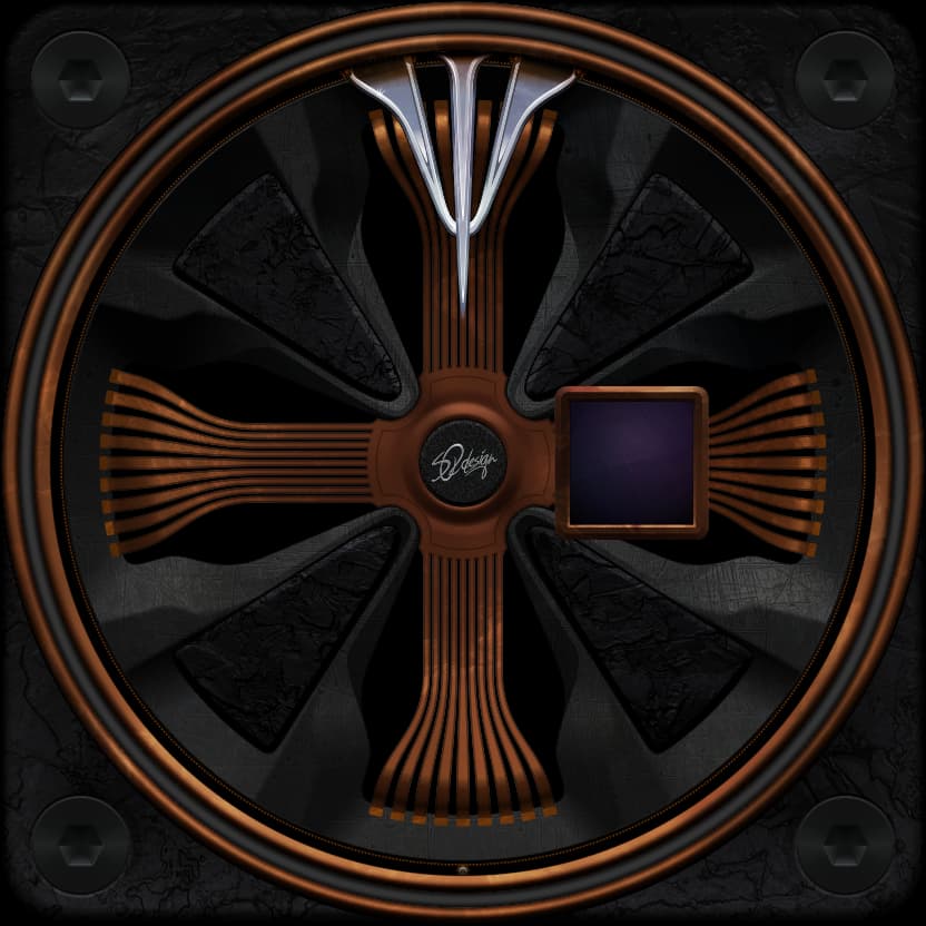
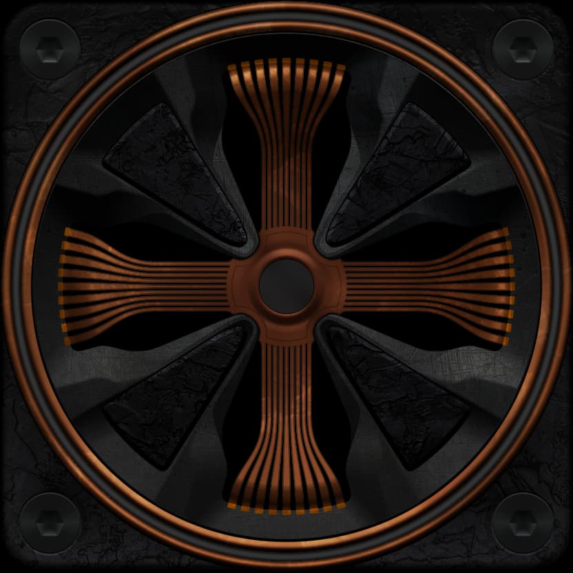
Unlike most of my faces, here I have more modern shapes with an old look.
so i’m considering doing something in the direction of noble steampunk.
I also think that the pointers should be clearly visible.
hands banged on the outside are actually a good idea.
the overall picture kills a viewer now.
I don’t want to put too many things in there.
My first thought seeing the image was the copper-colored “flexible PC boards” you see in laptops and mobile phones, My second thought was power generators, and their wire-wound rotors. From there, my thinking went to the hands of antique electric gauges and antique steam gauges.
I would use some more bright tone of copper or brass for the hands coils, so they stand out above the static ones in background.
I thought about all your inspiration first.
i’m currently trying out shapes that are already part of the face.
These are attached on the outside.
Most likely, the hands will be chrome.
then the contrast should be high enough so that you can see everything quickly.
What do you think?
Nice. If they get shaded like the copper stuff and look all bendy, that’ll look super cool and still be easy to read. Unique piece so far! (btw, i feel like there should be like a ball or something in the outer track doing something or tracking something maybe, or maybe as the seconds?)
the “empty space” in the outer rings is for the battery indicator.
many of my faces have that.
an additional second could run on it.
The idea is good.
Ah ok cool, this is gonna look great when its all done.
perfect
even if I didn’t show anything new, I was still active.
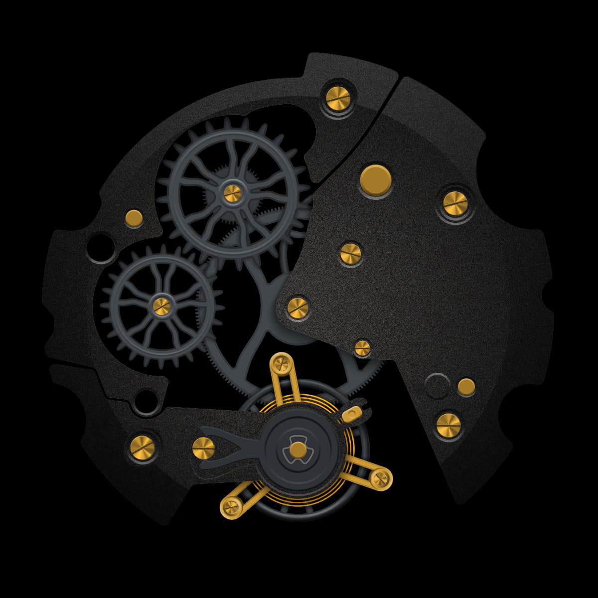
With the help of icrltd4, this unusual face gets a classic movement with modern surfaces.
first test run
there are still a lot of little things to be done on the graphics.
but I’m glad it all works.
Beautiful Mech.
Wow! Did you just whip up that internal gear mechanism? would love to see how you did that. ![]()
When I put this face live, inspection mode is on again.
before that I want to have all errors out.
Man, all that awesome gear work and you covered it!? I’d maybe knock out the black triangle areas and rotate the mechanism so the balance wheel is about at the 8oclock position. Cause i wanna see it!!! Really looks great tho, good work!