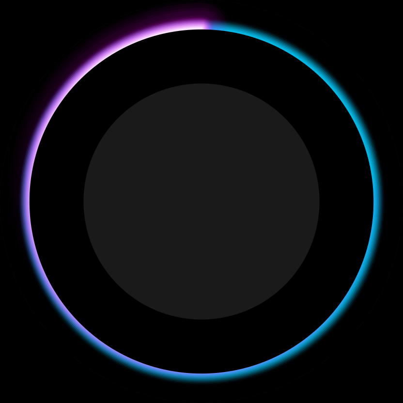
Since the 80’s SIFI theme is so well received, I’m trying an older idea.
Although the 80s movie is closer to my heart, the Tron Legacy disc is visually better.
let’s see what comes out.
Since the 80’s SIFI theme is so well received, I’m trying an older idea.
Although the 80s movie is closer to my heart, the Tron Legacy disc is visually better.
let’s see what comes out.

This should be fun! I really enjoy your creative process threads!
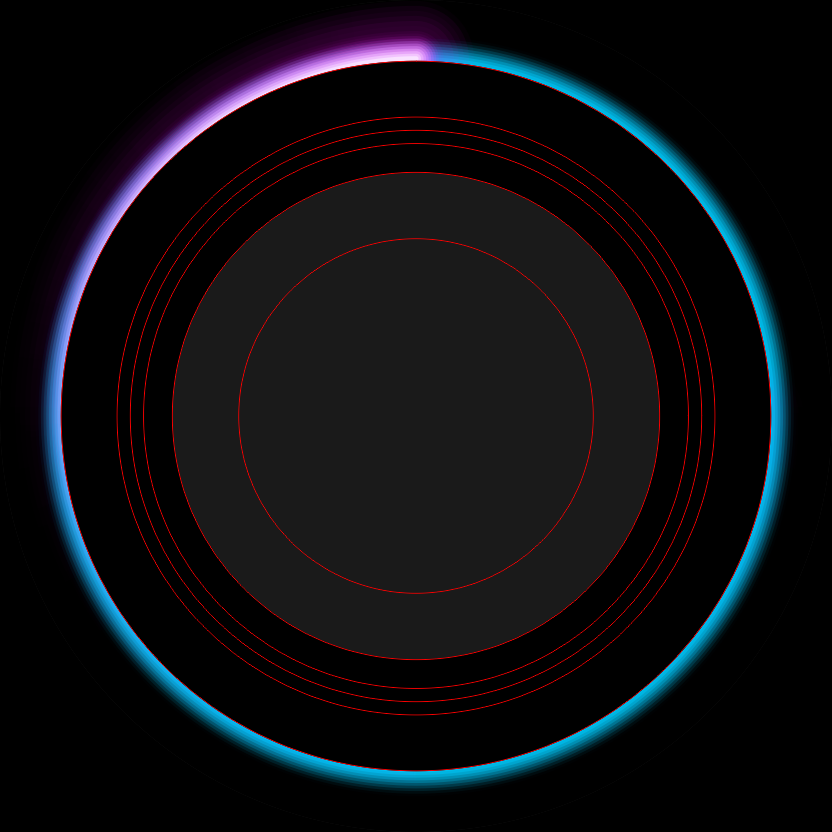
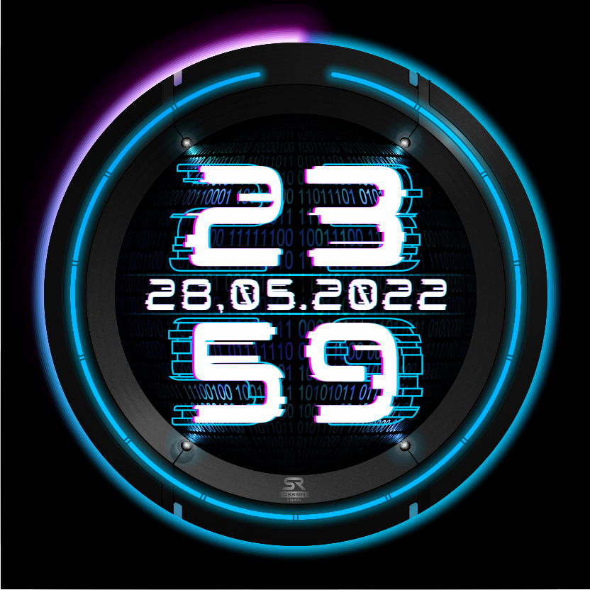
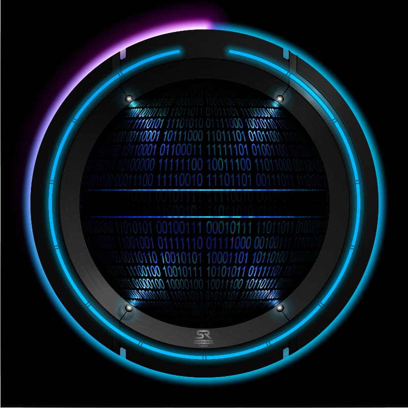
I’ll probably have to adjust the proportions of the discus.
Otherwise the space in the middle is not enough for me.
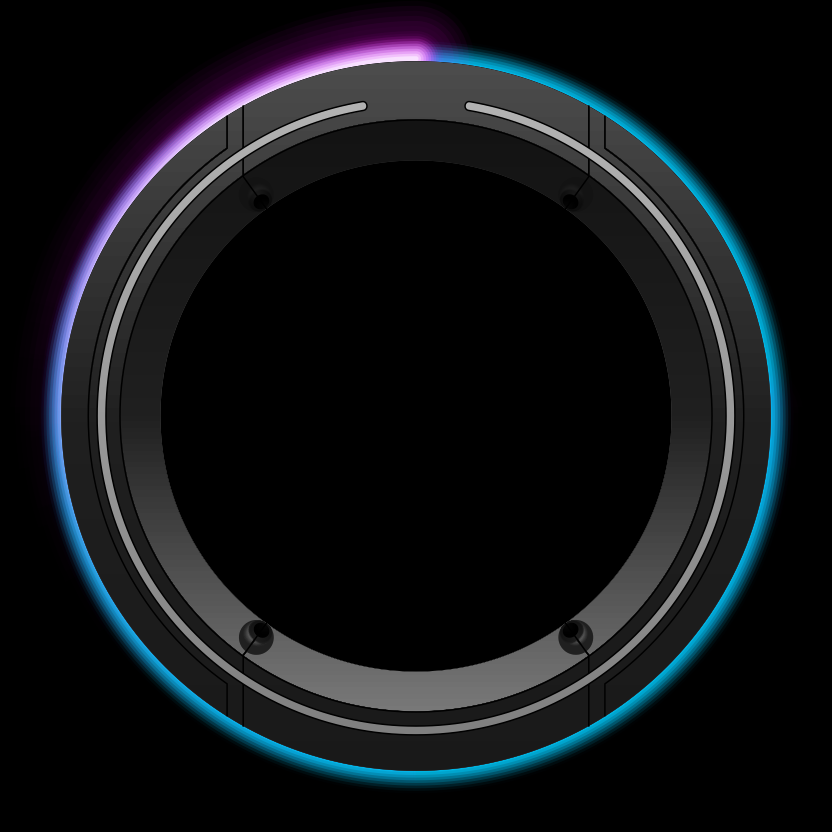
Is that called creative freedom? ![]()
Coming along nicely so far ![]()
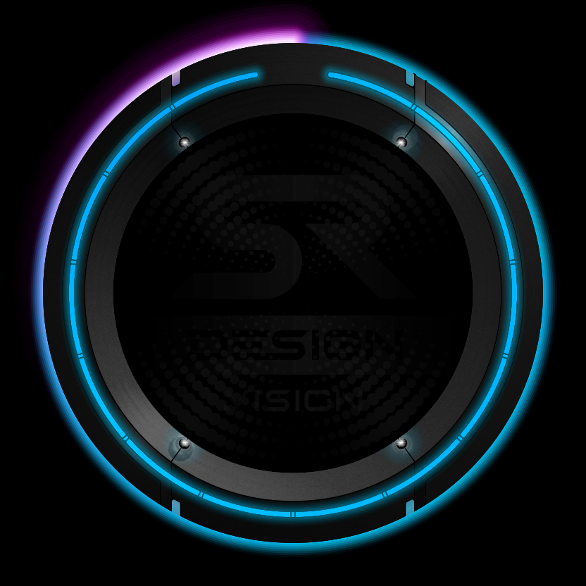
I like the Glitchy Numerals . Did you Generate them yourself ? Nice Work .
not this time.
This is a ready made font from the far reaches of the www. ![]()
Loving how this is going ![]() That Font is brilliant and I love the 4 little spotlights lighting up the background
That Font is brilliant and I love the 4 little spotlights lighting up the background ![]()
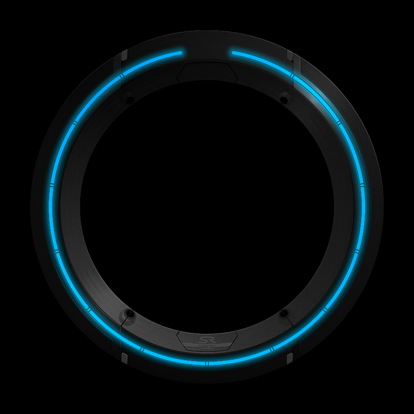
I love clean details.
That’s why I took my time and drew all edges with the appropriate light edges.
Now it can become a watch.
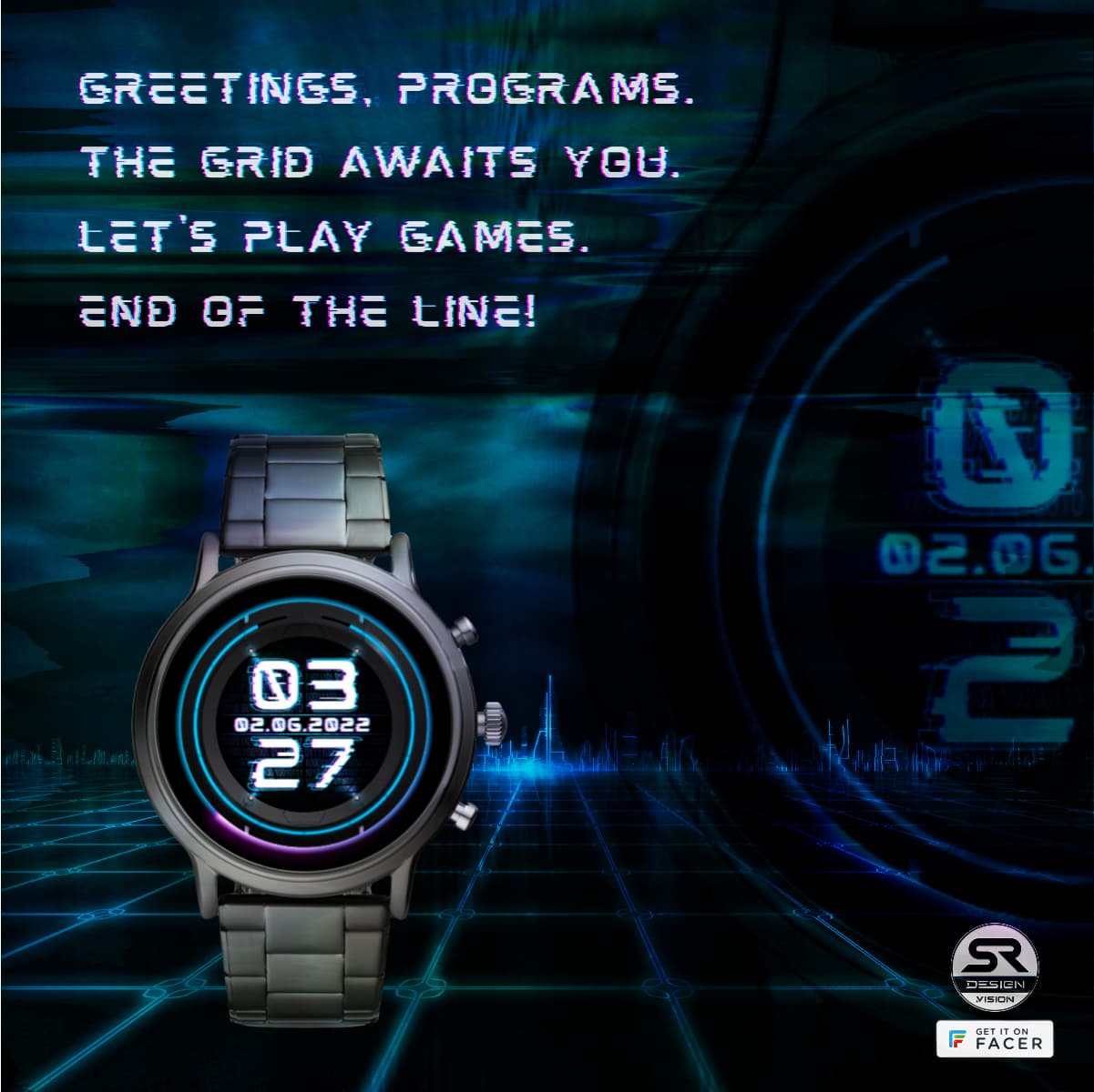
first test run
Love it ![]()
the end is near… ![]()
Slight sideways Vibration on the Numerals ?
Not noticed yet.
The center is always identical.
In the graphic and in the Creator.
If something varies, I don’t know why…
But I didn’t match the numbers either.
Perhaps the variation comes from the original font.
The original font runs in dark mode.
No Sorry. I mean could you have them jiggeling a bit to amplify the Glitchy Feeling. I must stop bring Cryptical.
Ah, see what you mean. ![]()
Yes, that would improve the look.
But if one no longer has good eyesight, it is already difficult to see the face sharply.
That’s why I refrained from further effects.