I know there are many of these styles but I wanted to make it my own? I’m even thinking about buying PRO so I can set my own color. Otherwise, nothing attractive.
7 Likes
HI, ekky.mi,
In my opinion, as a simple beginner, I liked it!
4 Likes
Thanks. Well, it’s not quite what I wanted, I would like to apply the IterpAccel effect there, but I’m also a beginner and it’s a lot of coding just because of the layers.
4 Likes
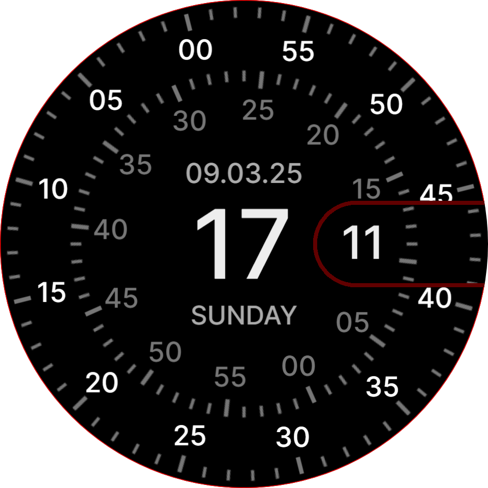
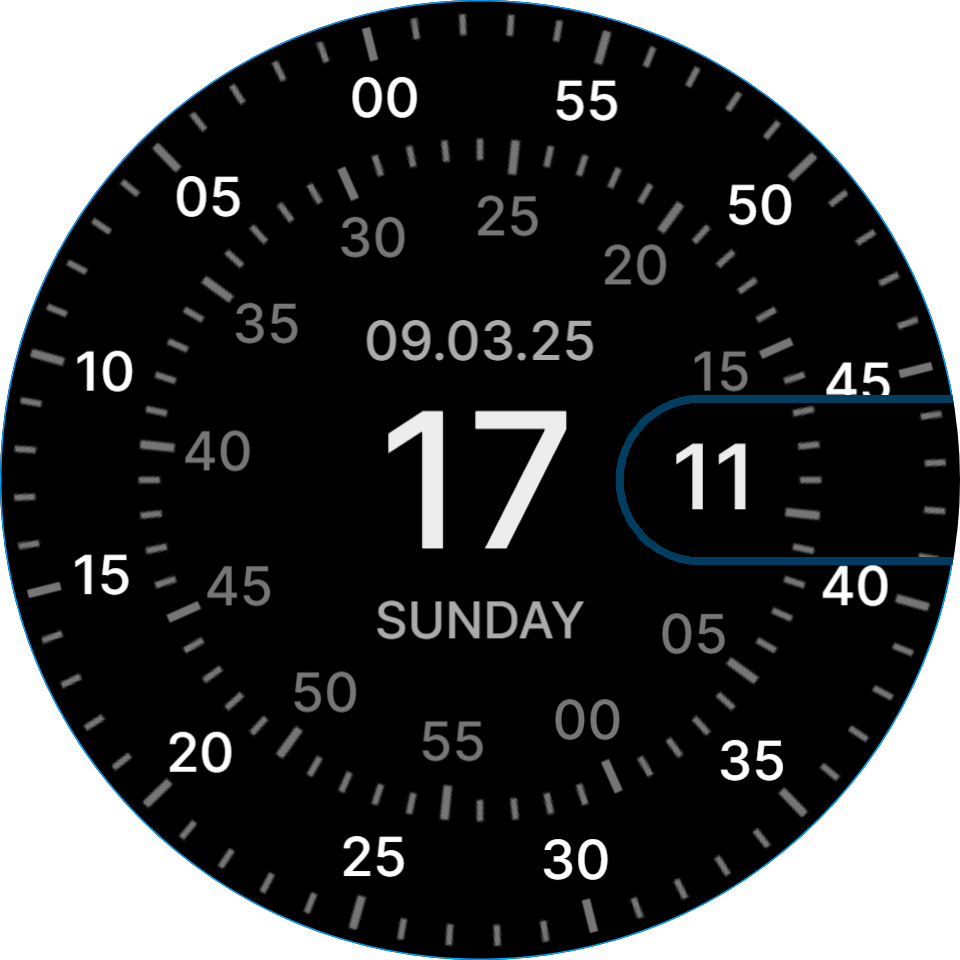
I like the way you keep the numbers vertical- all looks very smooth. Nice watch. Haven’t put it on my wrist yet - how does the dim AOD face work?
5 Likes
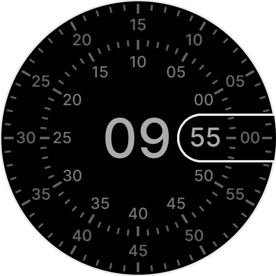
You can find AOD by clicking on the sun in the preview, otherwise I made a Premium version here.
AOD vypadá takto.
4 Likes
The idea was to add this InterpAccel effect, but it seems complicated to me.

4 Likes
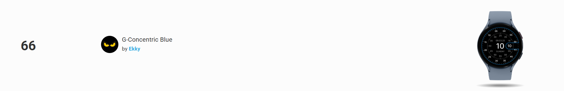
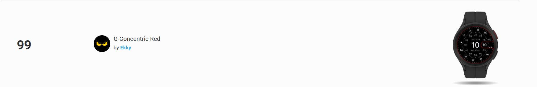
The most successful product I’ve created so far.
I know it’s normal for some, but it’s rare for me to have one watch face, let alone three, make it to the list, even if they’re identical and only differ in color. So I apologize for bragging, but it made me very happy.
But I expected the Premium version to be more successful.
5 Likes
Congratulations my friend!!!
3 Likes
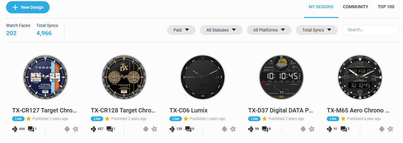
To get into the Premium charts is not easy, you need quite a few likes and at least 10 syncs to get in. My last face made it into the 90s, but only for a short while. It made it 22 syncs. Not much…
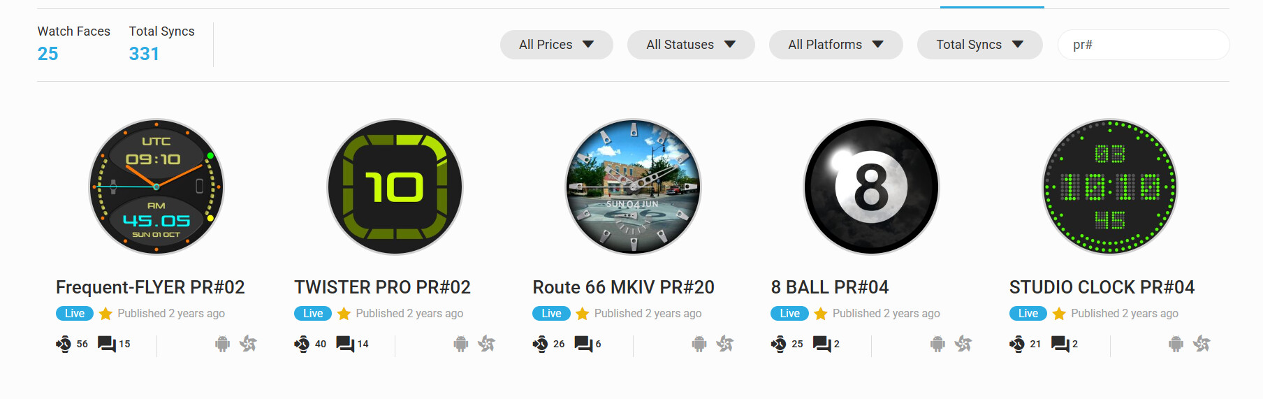
But the chart rules must have changed, seems a little easier to get in, but ultimately I guess you need a lot of followers to get lots of syncs. The premium ones below are older faces that never made the charts, but over the years do have nice number of syncs:
3 Likes
No, I’m not talking about the rankings, I meant that there would be more interest in it.
2 Likes
People want to pay nothing for Smartwatch Faces and Apps . It is a real compliment to get 10 syncs on a Premium Face . As Tom said people are finding these faces browsing through Half a Million Publications and finding something they like and wear on their watches for Half a day . I am continually surprised . Obviously in the long term it is down to a careful choice of Title , Description and Search Tags .
.
3 Likes