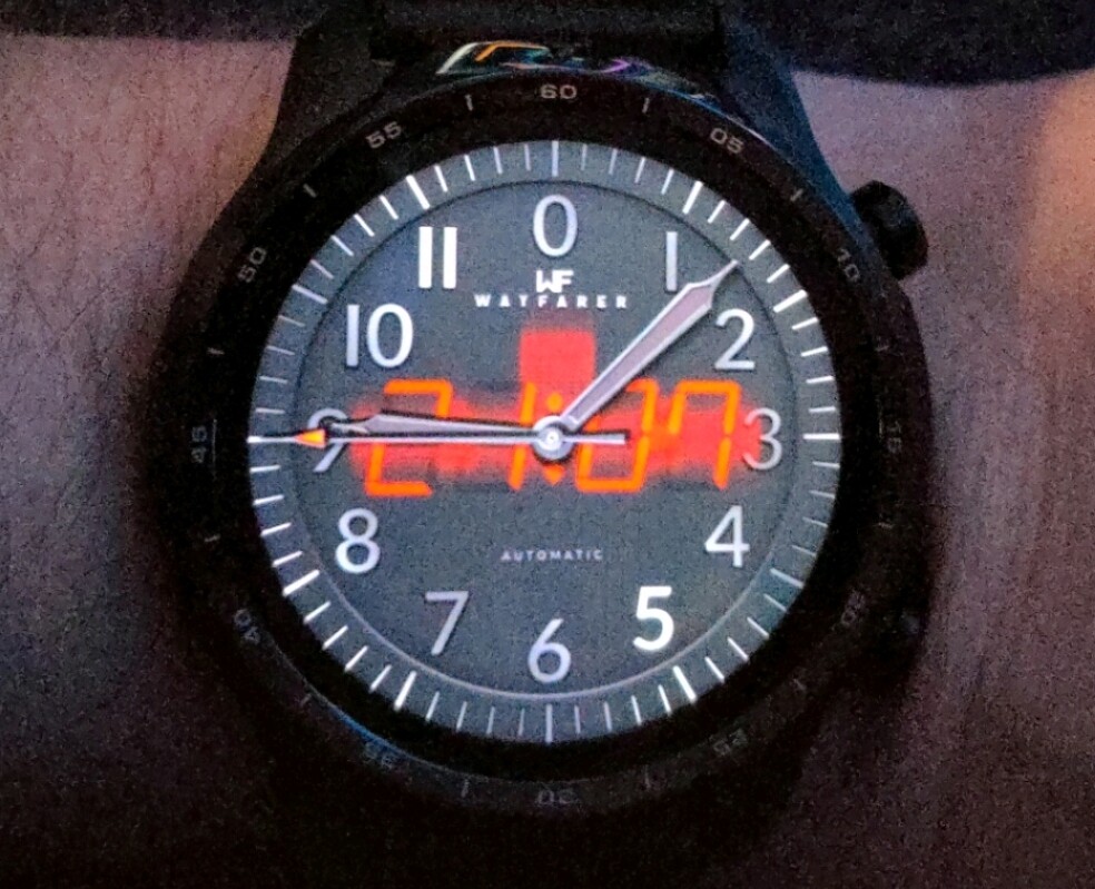
Somebody has told me that my watches that have glowing text all appear to be blurred for them on their TicWatch (attached pictures for reference) I use a Samsung and I have never seen it happen on my end. I did some research and have found some threads from years back with similar sounding problems but none of them provided pictures so was unsure if it was the same.
Thanks in advance!
The glow effect and also the stroke effect both has issues on WearOS. The glow will do weird things like you are showing. The stroke will work sometimes and other times it will show up to the right of the text and look like a “ghost” text. I ended up buying a refurbished Fossil Q Explorer to use in testing all my faces before publishing because of the WearOS quirks.
Thank you for your response!
And that’s a shame. I’ll have to go back and revisit all of my past work and tinker with the glow effect. I imagine it’s been noticed by a few people but nobody said anything about it till now.
Good morning !!! semaj-12 and mrantisocialguy 

Respectfully
I wanted to ask … for me to know … 
In which cases do these inconveniences happen? …
Is it because of using a special typeface?
Or some programming parameter?
Or is the problem, in some watches in common?
Cordially! JDCardozo
Español:
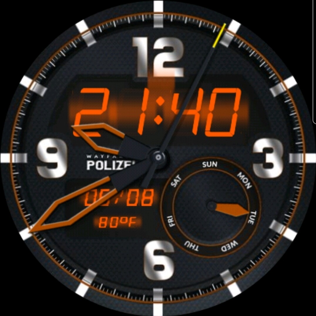
Es por la forma en que WearOS representa los efectos de “brillo” y “trazo” en el texto. Esto nunca sucede en un reloj Samsung, solo en los relojes WearOS. Dejé de usar el efecto de trazo y uso fuentes con contorno y versiones sólidas de la fuente. De esa manera puedo duplicar el texto, la capa superior es el contorno y la capa inferior la versión sólida.
English:
It is because of the way WearOS renders the “glow” and “stroke” effects on text. This never happens on a Samsung watch just WearOS watches. I have stopped using the stroke effect and use fonts that have outline and solid versions of the font. That way I can double up the text, the top layer being the outline and the bottom layer the solid version.
1 Like
Mucha gracias por la explicacion mranticosialguy !!! 
1 Like
Español:
Debo estar aprendiendo un poco de español, entiendo lo que escribiste sin que Google me lo traduzca. 
English:
I must be picking up a little Spanish, I understand what you wrote without Google translating it for me.
1 Like
I too have a Ticwatch and (among few others issues) blurring or stroking the text does not work well.
To the point I’ve stopped using these options because the result is unpredictable.
Wonder with Wear will bring any change.
1 Like
Yeah I’m gonna refrain from using it in the future if a high percentage of wearers are gonna see this blur effect.
@semaj-12 & @akar.zaephyr
As described above I use fonts that have an outline and solid version so that I can double them up for the stroke effect. I have a graphic that I can use behind text to simulate a glow by picking a color and adjusting the opacity. I have not needed to use it yet, but it is an option that won’t interfere with WearOS rendering the “glow”.
2 Likes
I get this on my Moto360. I’ve also stopped using the effect, which is a shame.
Yeah I’m gonna update all my faces with this method so thank you sharing this, very much appreciated!