Every face after the one with the pink rose on it will be in the order of Premium, Free, Premium, Free, etc. Which means changing one face name necessitates changing the two plus the two watch faces names that are being replaced. It gets very confusing very fast.
ah, that’s why we used to skip lines by 10 in basic, back in the old days… 10, 20, 30… you could always insert a 15 then ![]()
I still do revision numbers even so I could slip one in if I had to.
I took a screenshot for you guys in case the sun doesn’t shine where you’re at ![]() . The yellow changes purple and white depending on weather conditions. I think the yellow is a winner though imo.
. The yellow changes purple and white depending on weather conditions. I think the yellow is a winner though imo.

This is what I have so far. I just need to spend time testing it for bugs. I have reorganized my watch numbers. The Free version is now MAG 1915 and will publish tomorrow afternoon. The premium version is MAG 1916 and will publish Saturday morning. (All times are eastern daylight time.) Which should be roughly 17:00h Friday and 12:00h Saturday in UTC or Greenwich time.

I’ll be honest with you that looks nothing like the same ![]()
Sadly, I don’t have access to the Weather dot com icons.
What about this way?

Hey nice work Peter, I like it, maybe a little colour to the main time, to make it stand out more ![]()
Getting closer. I think the font and color are off and it’s too busy
Ok, Im gone with this, had fun 2h longer than I expected ![]()
That’s what I had forget. The colors and temperatures. That’s what happens when you get busy on too many projects…
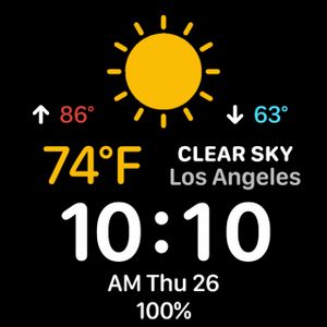
This is pretty good but also not the right colors or font. Does the weather icon change?
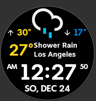
Nice Weather Icons @petruuccios not seen them before. Glad to see they change. Good they simulate by running the Time Machine. Hats of to you and @mrantisocialguy for Jumping at this Request.
I am not that Keen on breaking my Development Programme to do them. Nice Job Both of you.
Hit the play button on preview twice, to make it fast forward and you will see.
Thanks, I could not remember where I snatched them, I would have given credit earlier.
Thank you for sharing them ![]() I only colored some a bit for this case.
I only colored some a bit for this case.
Hey Listen @petruuccios . I was not being Facetious . I did not recognise the Icons . Very Nice when they are coloured . I honestly did not remember posting those . I have to say they were not all my own work . Oh May be they were ? I wish I could remember some of this stuff :::)))
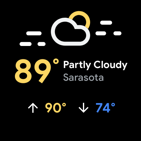
This is as close as I can get it. It resembles the WearOS weather widget, but it will never be the same.
Wow .