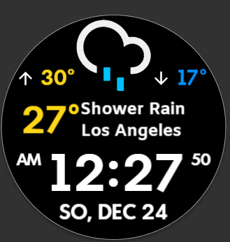
That looks pretty neat @mrantisocialguy
Maybe add some more colours ![]()
What about this way?

Hey nice work Peter, I like it, maybe a little colour to the main time, to make it stand out more ![]()
Getting closer. I think the font and color are off and it’s too busy
Ok, Im gone with this, had fun 2h longer than I expected ![]()
That’s what I had forget. The colors and temperatures. That’s what happens when you get busy on too many projects…
This is pretty good but also not the right colors or font. Does the weather icon change?
Nice Weather Icons @petruuccios not seen them before. Glad to see they change. Good they simulate by running the Time Machine. Hats of to you and @mrantisocialguy for Jumping at this Request.
I am not that Keen on breaking my Development Programme to do them. Nice Job Both of you.
Hit the play button on preview twice, to make it fast forward and you will see.
Thanks, I could not remember where I snatched them, I would have given credit earlier.
Thank you for sharing them ![]() I only colored some a bit for this case.
I only colored some a bit for this case.
Hey Listen @petruuccios . I was not being Facetious . I did not recognise the Icons . Very Nice when they are coloured . I honestly did not remember posting those . I have to say they were not all my own work . Oh May be they were ? I wish I could remember some of this stuff :::)))
This is as close as I can get it. It resembles the WearOS weather widget, but it will never be the same.
Wow .