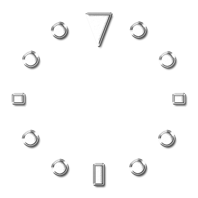
So, recently I thought about doing a redesign of an older diver watchface that I made a while back, this time I made the dial in a textured wavy blue style. Here it is (my apologies that I forgot how to convert a link into a direct portal of the face in the post):
I’ve noticed that when I publish a realistic design like this one it always gets very few syncs, whereas more basic looking digital or hybrid watchfaces always seem to get syncs much faster even though they lack the detail of a design like this.
I’d be curious to hear your opinions as far as how to improve the design!
I like dive watches. I have a few real ones. I also created a number of dive watches here.
To comment on yours: I prefer larger dials and being wider apart, but that’s just me. I really like the waves, nice hands, and nice large tick marks. I’ve tried to do wave, but never came up with something nice. So well done!
Thanks for your advice! I agree with you regarding how small the two sub-dials are, I made them as large as I could given the space between the tic-markers, but I don’t really like how the hands obstruct some of the view. That being said, I kept the sub-dials horizontally across from each other rather than vertically because I liked the symmetry with the date window and logo more than if I had placed them vertically apart.
The background looks good.
I only would suggest two things.
a) make the rectangular marks shorter to either pull the subdials out from the centre or make them larger. To me your seems like a variation of those from resource section and should be easily cropped like this:
b) The hands could use proper shadows to give the face more depth. To me best simplest method is to turn on the built in shadowds, better is to make duplicates of each hand layer below the actual one, tint them black and reduce opacity and shift them few pixels down, yet best looks, if those duplicates are made as black variant of the original image with some blur
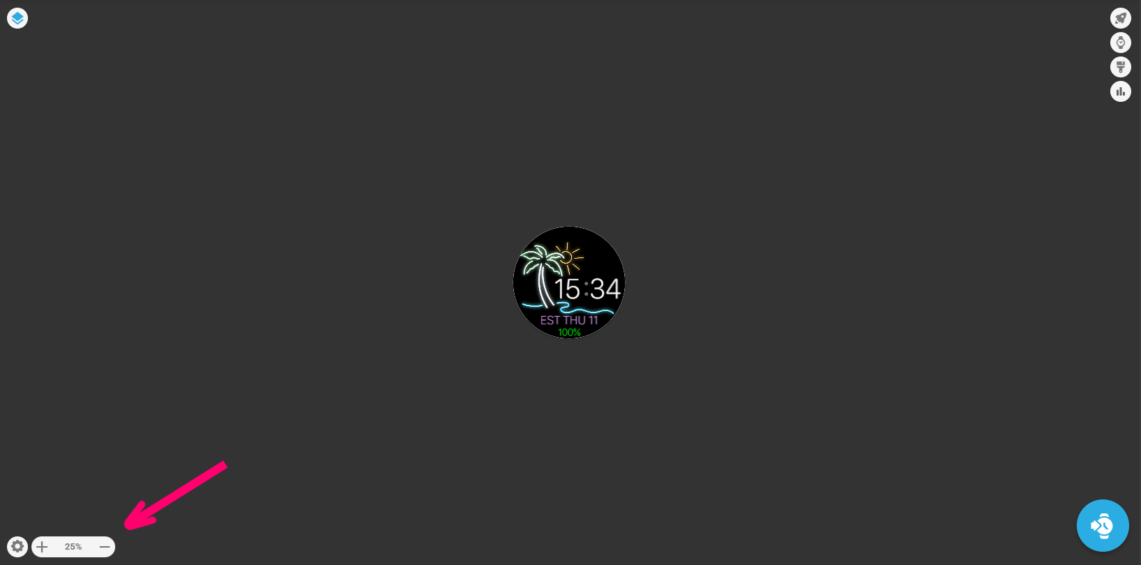
To answer your question, a lot of fine details get lost at the scale of a watch and especially at the scale of the preview thumbnail. The background in the dive watch looks awesome, but basically just comes a plain blue background when it’s in the app. I’ve spent days making intricate designs that look great in creator, only to realise that you can’t see half of it on the smaller watch screen. Simpler designs often read better on a watch because they look clean. The trick is to exaggerate detail and texture so that it’s still visible, but not overbearing, on the watch itself
@roycaruso
I’ve been bit in the butt on that issue myself. When I have a question about it, I will use the size control in the lower left set to 25% to get an idea how it will look on a real watch.