I have been doing watch faces here off and on for a few years, while trying to improve my graphic arts skills in between all the stuff of living. Looking through how I began and where I am now, there is such a big difference. I finally feel confident enough to join the forum. Yes, I’ve neglected coming here and saying hello, though I have lurked a lot and learned tons. You are all some really talented people!
You know, I never thought I’d be so passionate about watches-well, watch faces anyway.
thanks! edit: I just took a look at yours, and I love the earth theme, w/longitudinal and latitude. I have done a little practice with planet and space graphics. I know it must come easy to some, but not me. hope to get as good as yours
thanks! they are inspired by vintage omega. I really love those old omega’s. got interested bc the omega speedmaster was the first watch on the moon, and it’s quite nice, but the pie plate design from the 60s really got me. wish I owned a real one
Really digging your minimalist style of your watches. that genre can be challenging, to inspire interest while muting decoration. there’s a kind of tension in minimalist work that’s hard to do.
Welcome to the community forum @ephielemmons. We are all somewhere between beginners and master craftsmen. Just remember there are no stupid questions, but I have seen a few stupid answers.
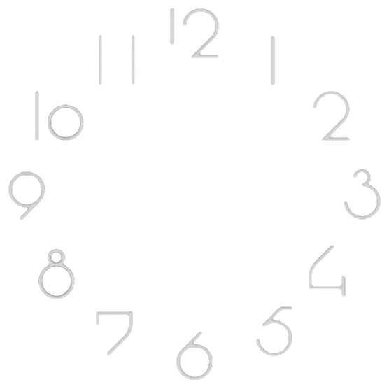
Thank you! Having lurked here for awhile, I know this is a pretty friendly community. I noticed on your watches great font choices. I particularly like the font you use on MAG 1593. What one is that? Looks like art deco.
Sometimes I will spend an hour or two just exploring fonts. Have made a couple partial fonts myself, but there are so many really good ones already out there, haven’t seen the need to do more than a few special font symbols for the project I may be working on. A full typography set? Not yet. Maybe not ever. Probably not ever.
The font on the words SMART WATCH is Atomic Age Regular. If you are referring to the analog numbers, that is a picture file I downloaded some years ago. I really have no idea what the font name is. I have sure searched because I like it myself, but I’ve never found it yet.
I’ll be happy to help look as well. I was searching for the name of a script font I use regularly but had a brain fart-could not recall it for the life of me. Made me nuts, then my partner (I call him The Google Master) found me a link (I think to get me to stop complaining) WhatTheFont! « MyFonts Maybe we’ll be lucky
I went searching again on 1001 fonts and used the search terms 1920’s, 1930’s and art deco. I found a few that were somewhat close, but I found a bunch of other interesting period style fonts.
Welcome to the Community @ephielemmons where I see you’ve already been lurking Nothing wrong with that, and you’re right, loads to learn and plenty of friendly/helpful people
I went searching as well yesterday for about 2 hours at a few font search sites etc. We prob checked the same places. I saw the period stuff, too, but none of it is a close to actual art deco as that one. I am really tempted to just make it. Do you recall where you got the image? Sometimes I mine vintage illustrations for ideas, and that font looks like something straight out of a 1920s magazine ad. (hope I’m not being annoying, I fixate on art/design ideas some times)
No, I don’t remember where I found the image, but I’ll go you one better, here is my image for you to download. Just make sure you open the image first before downloading it. The Facer Community pages has a history of cropping photos in the worst way if you just right click it here on the page to save.
 edit: I just took a look at yours, and I love the earth theme, w/longitudinal and latitude. I have done a little practice with planet and space graphics. I know it must come easy to some, but not me. hope to get as good as yours

 Nothing wrong with that, and you’re right, loads to learn and plenty of friendly/helpful people
  lol no not like that