Hey!
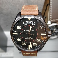
So, the whole reason I joined Facer in the first place was to create my dream watch face, my dream watch face being an actual real physical watch I saw one day in a store and simply fell in love with it immediately, first sight. However, 900 euros for a watch that mostly just tells the time is way too rich for my hide (mind you, I’m not above buying something like this, or even more expensive, but I simply don’t have the pocket change to go for it, probably never will  ).
).
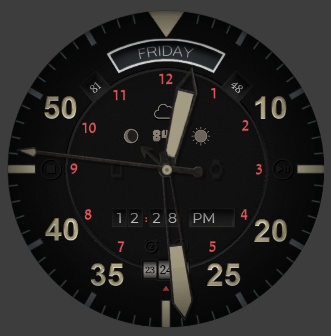
After more than a month, probably closer to 2 of hard work on this (and a copyright take-down the minute I posted my very first rendition x_x which almost gave me a heart attack [thank you Facer for taking pity on me :P]), I think I’m finally done with my tribute! However, I don’t think I’m ever going to be posting an actual working/downloadable version because if Facer or the Swatch Group decided to take it away from me for good… I don’t know that my heart would survive that lol 
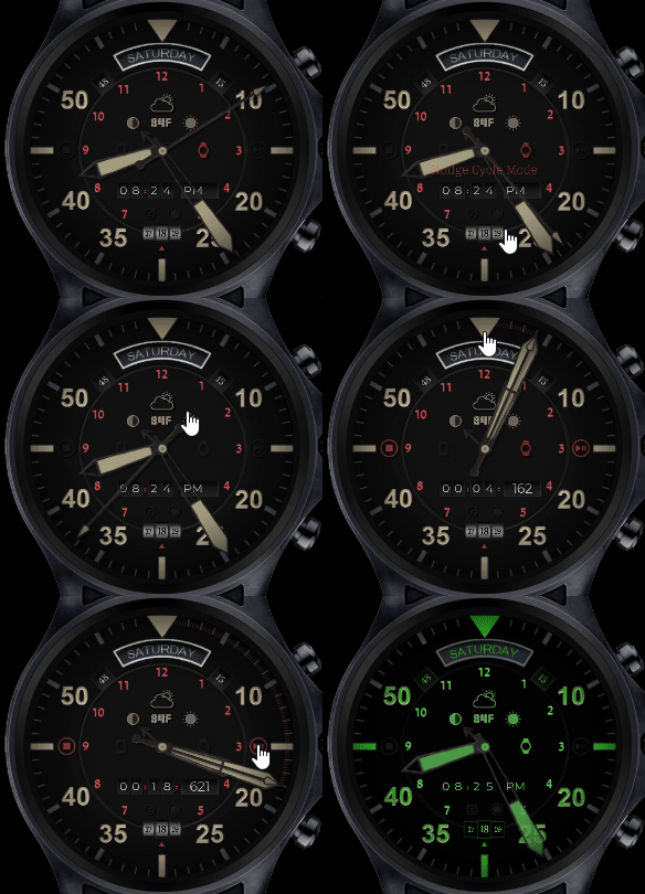
Instead, here is a GIF showcasing most of the features, as well as a list just so there’s no confusion over what’s happening (which is quite a bit :P)
Again, very sorry I’m not able to share this with the world, but I am waiting on a reply from the Swatch Group (although I’m not actually expecting them to reply to be honest  ) to see if I can get permission to post it. Until then, I don’t even want to mention the actual Brand of the original watch for fear someone may take it/my account down >_<
All of that said, enjoy the “art”, I suppose :P!

Bear with me, it may take a bit to load the entire gif.
Also you may want to open the gif in a new, black-background window to fully appreciate the detail. It’s a dark watch face because the Active 2 watch is insanely bright.
Feature list:
- Day of the week window up top.
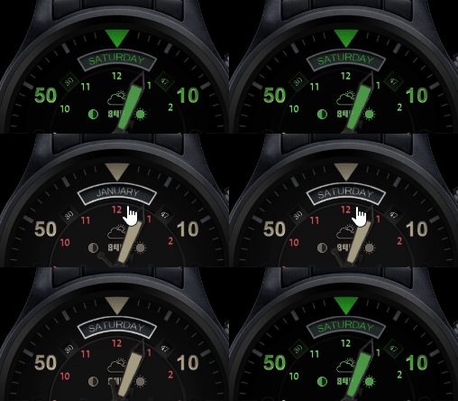
Shortcut access to your calendar by tapping on the day of the week window.- Tapping the Day of the week window now smoothly “rotates” the week day/month dials to display the current Month and vice versa, a toggle that persists through AOD.
- Date at the bottom (showing yesterday, today and tomorrow’s date complete with accommodation for leap years).
- 3 different types of “Nudge Mode”, which make the time needles fly around the watch face to get out of the way temporarily in case they are blocking the view of an element. 1st mode makes the needles take a shallow V form. 2nd mode makes them cycle around. 3rd mode is the same cycle as the 2nd, except it’s triggered on screen Wake, rather than a tap of a button.
- Sleeping mode, turning the entire watch face into a big digital time form for when the watch is presumably charging on your nightstand at night, and you wake up in the middle of it groggily wanting to know the time

- Phone and Watch battery indicators in the top left and right corners respectively, with appropriate icons to the left and right of the center of the watch face that will dimly flash red when either/or battery meter dips below 20%.
- Weather icon showing the current weather condition and temperature. Able to tap it to fade the temperature out and smoothly accommodate the weather icon.
- Day & Night needle behind the normal time needles. The moon icon doubles-down as a display of the moon phase.
- Digital time below the center that can be read in either 12h or 24h format based on your phone settings.
- Chronograph mode tapping the triangle at the very top, where the needles smoothly fly to 12 o’clock, and the Stop and Play/Pause chronometer buttons light on to the left and right sides of the watch face
- The chronograph can work independently from the time, which means you can start it, then come out of this mode and have the needles point at the time, all the while the digital clock below the center continues to show the chronometer time. When going back into chronograph mode, the needles smoothly fly to 12 o’clock, and then back to where they should be telling the chronometer time.
- AOD Mode. The whole watch face turns into “glow in the dark” mode, where every important bit glows brightly green, and some elements are slightly adjusted for better visibility, such as the green glowy bits of the time needles turning slightly transparent, since “Nudge Mode” won’t work when the screen is “off”.
- Lastly, clicking the center of the watch face opens up the Color Picker, allowing you to change every element currently shown in Red to any color you wish, including the millisecond tick marks that start appearing as the chronograph needles move forward.
HH-360B v2.2F - Free Version:
- There is also a “free” version that doesn’t have any “tap” features, it is simply the watch face with anything and everything that doesn’t require touch (the temperature for instance shows by default), so no chronograph, no color picker, no nudge modes, etc, but for the most part the whole watch face is there!
Update:
Tapping the Day of the week window now smoothly “rotates” the week day/month dials to display the current Month and vice versa, a toggle that persists through AOD. I say “rotates” because there aren’t any actual dials/circular images to speak of, each day and month is it’s own image, so some opacity and positioning trickery had to be implemented 

New little update:
A little animation On Wake to the date number dials at the bottom (same update for the Free version):

Despite it being based on a real watch, not a single element was taken from photos, but rather custom made/drawn by me on Gimp.
Huge shout out to @mikeoday for his knowledge and patience, giving me several hands to work out how to make the needles move the way they do!
Plea Note!: If anyone has the ability to actually get in touch with the Swatch Group reliably (e-mails don’t seem to be working out) and is willing to give me a hand, I would love to get in touch with them either personally, or via a third party to get permission to publish this!

 Yeah I’m not holding my breath on hearing from the Swatch Group, but you never know


