On a first sight I dont know what I am looking at, but its ok, its some abstract image. Maybe name or description somehow related to the content, could give me a hint.
I can only tell you what I would do different (not that you have to).
The battery arc could have some faint background, so it is clear it goes around half the circle when full.
The icon next to battery percentage could be a bit misleading, usually is used for burned calories. I would use battery icon.
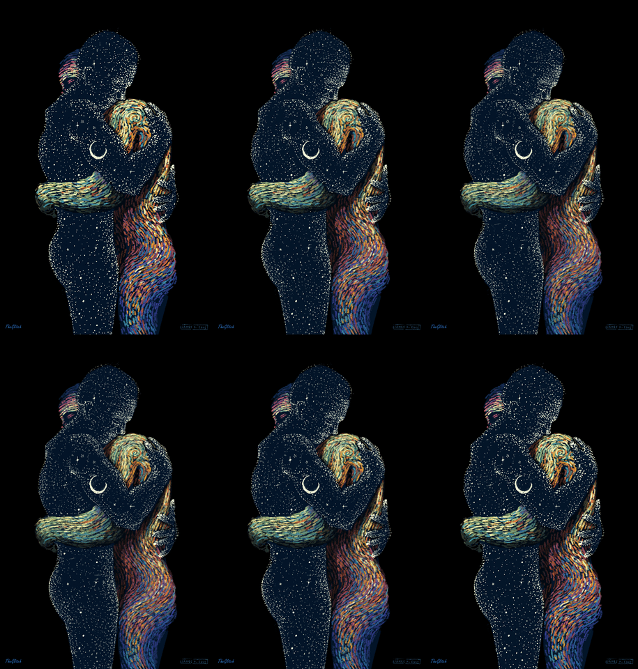
The following image is of a couple hugging .GIF, I made the changes, do you think it looks better now?
A imagem em sequência é de um casal abraçado .GIF, fiz as alterações, acha que está melhor agora?
I like the couple idea, all looks good, I like the color combination, the only thing I would change is that the outline around the text is too close to the text in the lower part of the watchface, I would put it a bit further away but otherwise it all looks awesome. Good job!! ![]()
Sadly the Action on your Gif is not very visible . I would turn the speed down to .3 sec which is the minimum . I see you have an OFFSET of 5 sec if this a trick to get around the 5 seconds preview Jolly well Done . I always use Trigger on Wake . We have to test these things .
Assim?
No Mate . 0.3 . Decimal Point 3 . One third more or less .
The translation confuses me
A tradução me confunde todo
I don’t know how to make the image move a little faster
These are visual things . Change the numbers and look at it on your watch
.
.
.
Estas são coisas visuais. Mude os números e veja no seu relógio
I can not test it unless you post the Gif here .
.
.
Não posso testar a menos que você poste o Gif aqui.

.
.
.
So I set the Duration to 0.4 . See the test . The animation is nice but it is a bit fine detail for a screen the size of a watch . Se I have included a Filter fading in time with the Heart Rate . It might bring a bit of dimension to the GIF .
.
.
.
Então eu configurei a Duração para 0.4 . Veja o teste. A animação é boa, mas é um pouco detalhada para uma tela do tamanho de um relógio. Se eu incluí um filtro que desaparece no tempo com a frequência cardíaca. Isso pode trazer um pouco de dimensão ao GIF.
It was wonderful…
The gif action is not correctly visible. And also if possible change the font to something different.
Any suggestions friend?
Alguma sugestão amigo?
I think it’s a good watch face, you did a good job.
Eu agradeço amigos e peço perdão por qualquer erro que tenha cometido ! ! !
What do you think of this one?
O que acham desse?