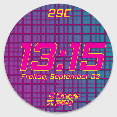
wanted to publish my new color version for and older wach face what your opinions ?
any ides for improvement?
3 Likes
Good design, well thought out, not sure about the Bright Pink colours over the Light Blue background though 
2 Likes
Too much purple…I posted you a colour palette that harmonises with the purple of yours to achieve more contrasts for readability.

#0B9AA1
#EDCF1C
#A1136F
#ED059C
1 Like
Forgotten…the date is not completely legible, one has swallowed the characters at the end.
1 Like
Thank you all for the great comments!
1 Like
i relly liked you color design i will try your suggestions out ;D
my recent updates
1 Like
Looks much better now for my taste and has a slight 80s touch. 
2 Likes
