I completely understand that the steps text on the graphics file will go & may aslo remove time text and make digital clock larger.
And its for going to be part of a free collection for a tiktok creator called fantabulous furries which i am being allowed to create so i accept any accessiblity/readability idea’s i want it to be good.
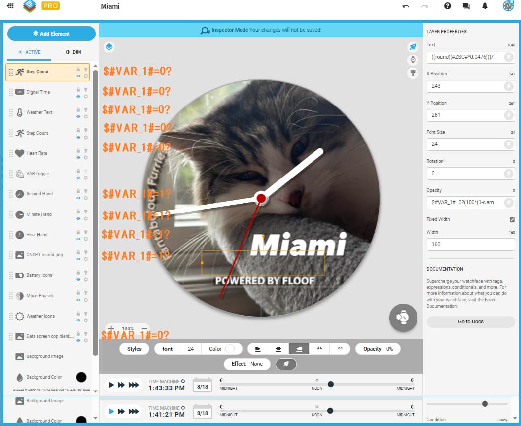
You can use formula like this $#VAR_1#=1?(100*(1-clamp(#VAR_1_TE#/1000,0,1))):(100*clamp(#VAR_1_TE#/1000,0,1))$
for opacity of your alternate background image. It is set for the transition to take 1000ms. You can alternate the value to what suits you best.
To test it in preview, do not forget to make the time run.
Well done, you’re definitely learning and progressing
Your chosen Font is quite thin and small is all I can comment on, maybe choose a different size or style: I find Nunito Bold works well myself, but it is your style and your Face, so it’s whatever you like, not the masses.
I did not comment on the “style” earlier. Other mentioned the used font is really subtle, which I actually like (check also the patopian font, its not so pretty, but little thicker than the minisystem), but I would suggest to unify the font use for texts around the face. I mean either all texts use one, or the values one font and descriptions other, but not mixed.
Thanks for advice I will have a look at that too. but scrapped the mini system one must admit Nunito bold looks a better even i can read it a little better too.
more of a design touch felt looked a bit plain without something around icons but eventually be cool to make a animation or something but animation is something i am learning at moment but its pretty hard.
but could make app links to weather app etc later on once learnt how to do VAR_TE and dissolve etc
I would like to warn you, the stroke and glow effects on texts are not working right on some watches. For outline to rise contrast of white text above light background, I would suggest black duplicate text layers below it, shifted diagonally one or two pixels. With rounded font like Nunito it works well.
Follow Peter where ever you can . He is a Master . You must make a special folder for his Formulas . Not many use his Descriptive Style . He makes it as easy as possible to Read . Like a good Book . Some are Posting Formulas Generated by Bots . I can never read them . If you Focus on the work of People like Peter you will learn well how it all works .
that is good to know. I design on a simple but classic style as people who have used my faces seem to really like it. so learning how to do the data page side is great as i am now getting closer to place where i can create hybrid’s.
but only want things like the steps, digital time etc to appear on the data page only so where need bit more guidance.
you can use the same formula on their opacity too.
or you can employ another variable to switch between analog/digital mode independently from the background, or in combination with some of them.
brilliant that just tested that is perfect! still getting issues with the background layer i pressing the toggle to the data page as you can see it goes straight to the background layer any idea how to stop this.
You changed the layer order and did not adjust the opacity of the first image for transition.
Just negate the mentioned formula for it to alternate between the backgrounds (change 1 to 0). $#VAR_1#=0?(100*(1-clamp(#VAR_1_TE#/1000,0,1))):(100*clamp(#VAR_1_TE#/1000,0,1))$
just done one more tweak to the layout and background issue is only on facer creator doesn’t appear on watch but the first picture loop is happening still only thing need the clock hands as the top layer on the analogue face but struggling to get them to show on that and not the data page and also any idea how to hide the moon, battery and weather icon.
sorry for all the code adjustments but i am really pleased how this is looking thanks to your help
It is about the layer order
Try it this way. Those are the starting conditions for the opacity of layers.
Layers without suggestion do not have opacity settings.
Thanks that was great explanation got a new issue but its a design one so I can fix that and i think understand the basics of VAR toggle bit more now but Boolean logic that’s going to take a bit longer to understand.
I never realised as well the layer system in facer creator worked in similar way to photoshop which i am pretty experienced with.