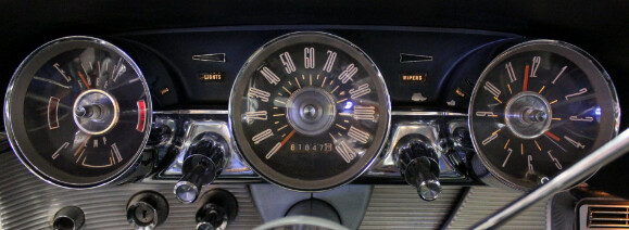
Second attempt at a more /realistic/ style of watch face. Heavily inspired by the old Thunderbird gauges.
Let me know any thoughts or any improvements.
Second attempt at a more /realistic/ style of watch face. Heavily inspired by the old Thunderbird gauges.
Let me know any thoughts or any improvements.
Nice . May I show you this . The Gauge falls like a glass half full to empty . It is not that I like symmetry . It will not let me go .
I love that idea! Exactly like a glass.  The symmetrical appeal is really satisfying.
Very nice gauge-like watch face. I could easily trace your inspiration source 
I like gauge type faces, done few my self. If I may suggest something, try to play with the area ratio between the central “shield” and the hands reach. Maybe add some shade to to the disc too (duplicate it, tint the lower one black, shift it down and to side and lower its transparency). I could not resist to play with it a little.
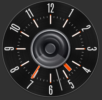
looking at those gauges, I think a narrow font would also make a ton of difference
You’ve legit made it look so much more realistic, just with those few tweaks!! Still learning all the little ins and outs that really tie a piece together. Thanks for the tips though!  And I think I’d also play around with what @ThaMattie said about the narrow font.
Thank you!
Do not worry, with exercise one learns best. If you could not find anything better, check for example the antonio thin font.
Here’s an update. Took all your advice and brought it up to speed
Really liking the overall look of it now. Much more complete.
Nice job . Well done . 

That’s pretty neat, but 2 things: firstly, you don’t have to post it again, as the image you first posted will always be up to date lol But secondly, I think your Battery percentage is a bit confusing increasing/decreasing on both sides simultaneously 
@icrltd4 You will see I encouraged @dioramite to do that with his Gauge. So Blame me. Some times I find the 360 ones confusing as some have them going AC and some CW. Just another way of representing Data. 


What is wrong with a bit of SYMETRY . Worked on Lathes too long . Top and Bottom always came out the same . 

cool stuff!
I blame @russellcresser  But truth be told, I am more fond of the “glass emptying” approach. Feels a bit more intuitive to this design.
Love the automotive theme!!! Great job!!!