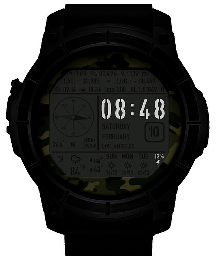
I used two layers on this military watch to give it the old and new look.
I am waiting for your positive and negative comments from you, dear designer friends.
They both look pretty cool, but most of the Text is way too small for my liking and you really need to do something with your Dim Display, AOD.
It looks very nice and realistic. The old glass effect is my favorite.
There is always a shortage of space in such detailed watches.
You made it according to the AOD screen concept, after all, too much light is dangerous for a military watch ![]()
You also have great work, thank you for your nice comments.
I think it would be more appealing to dim the AOD screen rather than remove all detail and highlite the time and power. But everyone has different taste. A completely black display will be better for battery, but newer watches last 2 days or so. Older watches people unlikely to use AOD.
I will make an update on this as soon as possible.
Thank you for your nice comment.
Very cool face. As an ex-military, when it comes to watches, I’d suppose military means simplification and only the most necessary info present on the watch. I remember us having a digital watch with only time on it. As our captain said; keep track of time and do your work, you’re gonna have no problems in military.
Being ex military, I find civilian’s notion of a military watch face amusing. This is far too busy, what is important is the time and being able to see it clearly and accurately everytime it is needed.
