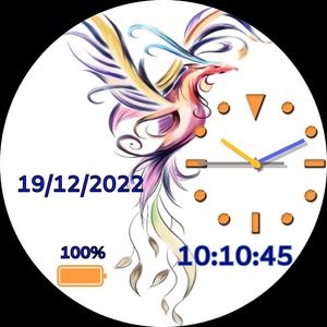
I would not overlap the artwork with the date and time. I presume you legally own that or have the artist’s permission to use the Phoenix Dragon image per Facer TOS. In addition, I think the image should be sized to fit the watch face so the top is not cut off and is contoured around the analog clock better. The main image is a watercolor, so a font and analog clock similar to watercolor brush strokes might be more in keeping with the design.
In addition to what @Linlay advised, I would get rid of the year in your date, or stack it so it is not overlapping the image.
You could also stack the seconds under the hr./min.
How can I do this positioning of hours, minutes and seconds at different levels?
Place the tags #Db#:#DmZ# at the X and Y position you desire. Then create another layer with just #DsZ# (seconds) and put it underneath at a lower Y setting. This is just one idea to keep your lines shorter so that they are not overlapping the image. Sometimes we place text intentionally over an image. It’s really up to you.
Hello I will try here. Thank you very much
