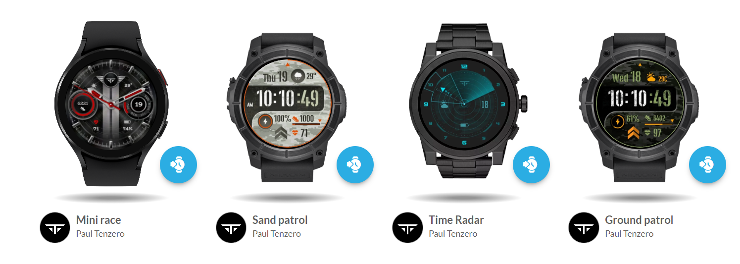
Hello everyone, I would like to share my first “serious” design. I still have to learn about functions and so on, but I am very happy with my first humble achievement of surpassing 100 syncs in less than a day and that motivates me to continue improving. Any opinion will be very appreciated. Thank you!
9 Likes
Looks great! Battery text is a liiiitle small but youve got the icon so no biggie (You also used a different font for it?). And the day is a little small as well, but you’ve got room to increase that font size. Good job though, keep it up!
4 Likes
@Rator Thank you so much. Yes, I used a different font because the other one did not have the % symbol. OK about the sizes, I’ll check it out!
3 Likes
Your “first”? I think it looks really good!
The dim mode does not reflect the nice face you created, but that is my taste…
3 Likes
You’re welcome! You can still set the battery font to the other font and it should replace the % with a default font.
1 Like
And I agree with @tom.vannes the DIM mode doesnt let you see the time. I would keep the hands in there at least.
2 Likes
Cool look. Well done. I like the sense of depth you’ve achieved.
Purely my opinion… The top left is more sparse than the top right. Small adjustments to the weather icon and font size can balance that. But I haven’t seen it synced … those differences may be close enough on a watch screen.
3 Likes
That’s a nice design. On your battery readout, I’ve had that issue of not having a percent sign in the font I am using. One work around is to use the font you want to use and #BLN# then just add the percent sign with another font that does have one. So instead of #BLP# you end up with #BLN#% which does the same thing but takes two elements to accomplish, one for BLN and another element with just % in it.
3 Likes
You have a nice collection of Faces already I see, nice work, and welcome to this great Community… we’ve all lots to learn, but also lots to share ![]() Enjoy your Face Creating journey
Enjoy your Face Creating journey

4 Likes
@tom.vannes Thank you Tom, good point. Yes I have not a clear idea about user´s needs or expectations about DIM yet, buy probably they´d like to see more of the main face style.
2 Likes
Yes! @Rator surely the anxiety of publishing led me to that practical solution. I’ll have to work on patience =)
1 Like
Some even want the exact same in AOD mode without any dimming. I have actually create a watch face twice, one which is AOD friendly and the second one not.
3 Likes
Thank you @brian.bontrager I value your opinion. What is design if not adjusting details for the user’s perception? For example, I love music and I can appreciate a good composition although I don’t have the foggiest idea how to compose. In the same way, I believe that whoever sees a design, not being a designer, can perceive that mathematical rhythm or grid that supports it and feel that it is correct or not. So yes, that minimal details are very relevant. Thank you
1 Like
@mrantisocialguy where you were yesterday? =) I thought… there must be a way to modify that tag. Thank you!
1 Like
Nice words. I appreciate it. Thank you!
1 Like
OK is good to know! I couldn’t have figure that out
Ha, that anxiety never goes away!
1 Like
So Nice… good luck friend ![]()
![]()
1 Like
Youre doing such a good job!! It looks really awesome, keep up the hard work, youre doing amazing ![]()
1 Like