Hi all
This is in the works… love to hear your feedback…
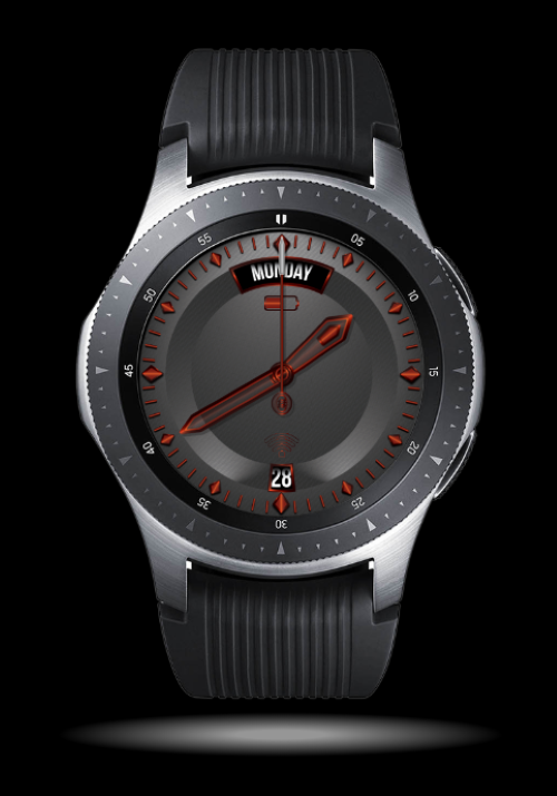
Trying to create an elegant, simple watch face with minimal clutter, so what do you think looks better:
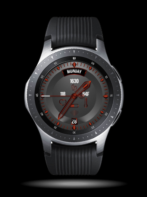
OR
Hi all
This is in the works… love to hear your feedback…
Trying to create an elegant, simple watch face with minimal clutter, so what do you think looks better:
OR
I like the dial background and of the the two I prefer the first. I also like the red colour but I’m not sure how well it will be seen on a watch - on mine, dark red tends to merge into the background.
I like the hands.
I like it very much. The clock is limited to the essential. At work I wear a smartwatch with a small display and would prefer the second version ;-). Privately I wear another clock and tend to version one. I really like the colors.
Thank you all for the feedback…
@chpschubje; it makes sense, since I’m not on pro (I would have loved to make one version with a tocuh to change the look) I will make 2 versions for both
@oregon900; actually the hands took the most time on illustrator, thanks
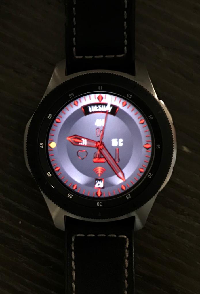
@mikeoday; I took a picture of the face installed on my Galaxy Watch, sorry for the quality…
Looks like the hands show up very well on your watch - well done!
Just published…
Mystique I
Mystique II
Enjoy…
Very nice!