I have a smaller collection inspired by the brand with wings and an anchor.
Which version do you like the most?
7 Likes
Orange For Me .
4 Likes
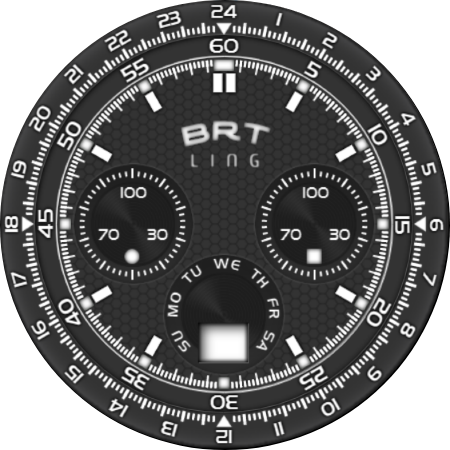
I like the silver one best, but there is something missing in the top quadrant, like logo or other sub-dial (moon indicator for example), simply too much flat area on otherwise busy dial.
4 Likes
Guys, don’t make me add anything else. I did it for less than 4 days and it sucked quite a bit, you know that I’ve been annoying you for the last two days because I didn’t have a real view of it anymore and I only saw shades of colors. Nothing that would give any appearance of a real pattern with shapes. ![]()
![]()
![]()
![]()
4 Likes
How about this? might be enough, right?
4 Likes
I put it there and it doesn’t look bad.
3 Likes
Its ok.
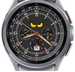
I had in mind something more goofy ![]()
like the eyecolor going from green trough orange to red depending on remaining battery charge (like the Doom avatar when loosing health points)
4 Likes
I’ve incorporated those eyes into the dial several times and it never looked good.
Maybe someday with a roofed clock face when I’m working.
3 Likes
Orange looks best to me but the Faces don’t work for me anyway sorry, too many Bezels/Numbers for my simplistic tastes ![]()
3 Likes
I’m glad you didn’t see what the original looked like.
4 Likes
Nice!! Like the Blue one ![]()
1 Like