It is with great pleasure that we introduce ILJ Watch Faces to the Facer community.
ILJ was founded with a clear and uncompromising vision: to bring the spirit of high horology and the enduring codes of luxury watchmaking into the world of Wear OS. Our creations are shaped by a deep admiration for the traditions of Swiss design—where elegance is defined by restraint, refinement is found in proportion, and every detail serves a purpose.
In an age of disposable aesthetics and fleeting trends, we believe there remains a place for designs that reflect permanence, distinction, and quiet confidence. The influence of classic Swiss timepieces can be seen throughout our work: balanced dials, deliberate symmetry, disciplined typography, and a considered approach to color, texture, and layout. These are the qualities that have long defined the great watch maisons, and they continue to inspire every ILJ creation.
Our watch faces are designed for those who appreciate more than functionality alone. They are intended for individuals who understand the allure of traditional horology—who value the artistry of a beautifully composed dial, the heritage behind timeless forms, and the sense of character a watch can convey. ILJ seeks to translate that world into a digital format without sacrificing the sophistication and integrity that make fine watch design so enduring.
Rather than chase novelty, we strive to create watch faces that feel elevated, distinctive, and authentically luxurious. Each design is conceived to bring a sense of prestige to the wrist while remaining wearable, balanced, and true to the principles that have guided generations of master watchmakers.
We would be delighted to engage with fellow enthusiasts here and hear your perspective:
What elements make a watch face feel truly luxurious to you?
Which aspects of Swiss horology do you most appreciate when reinterpreted for Wear OS?
Do you favor a purist expression of classic design, or a more contemporary evolution of traditional watchmaking codes?
We look forward to joining the conversation and sharing a design philosophy rooted in heritage, craftsmanship, and a lasting devotion to the art of timekeeping.
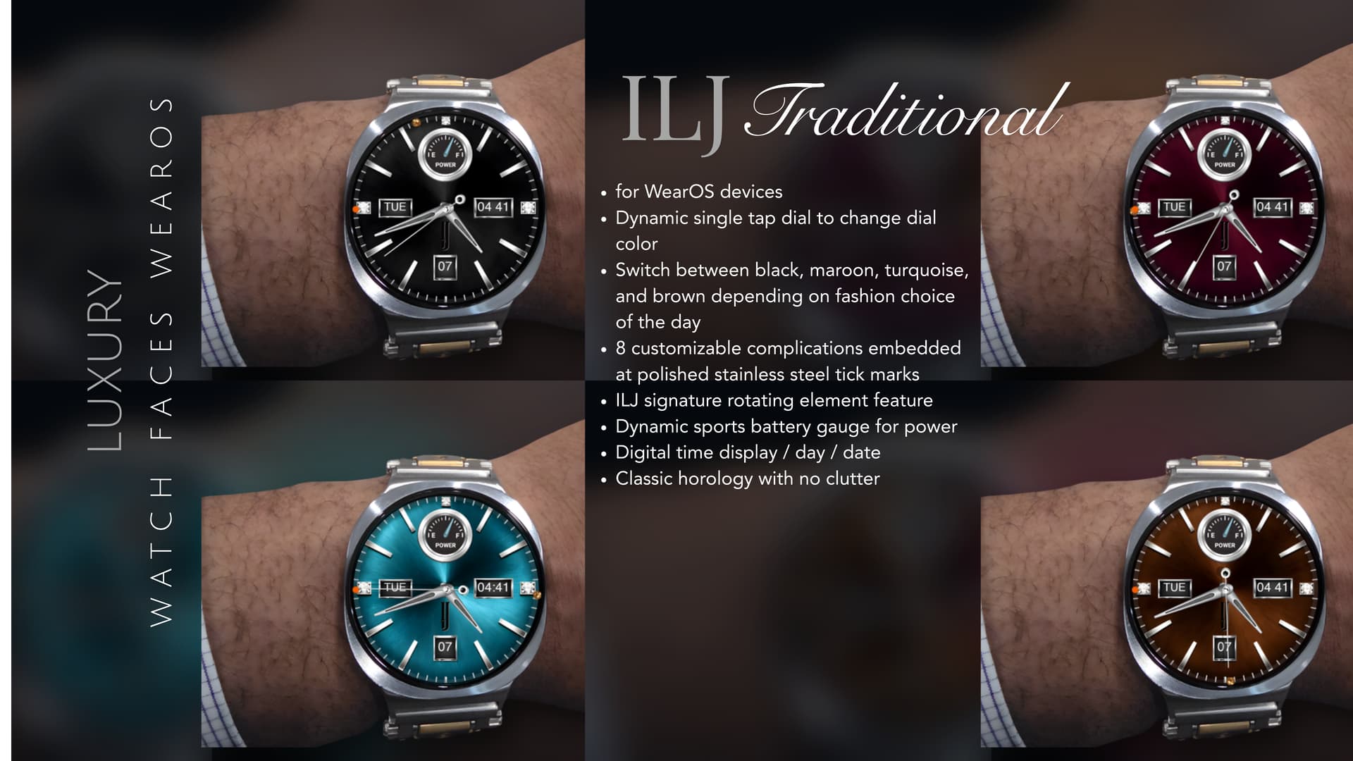
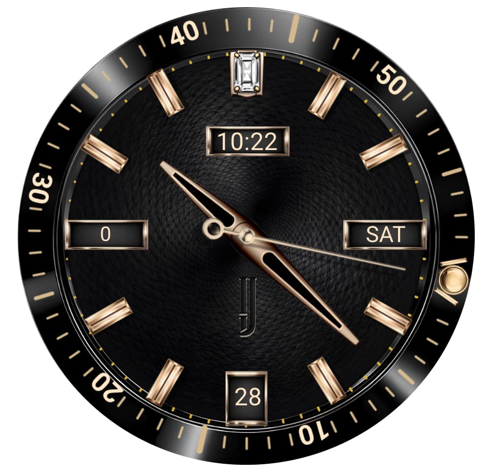
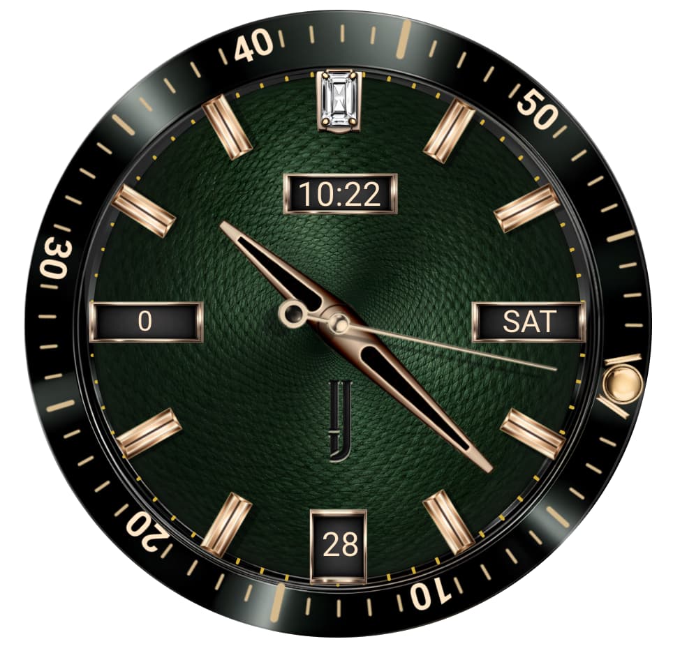
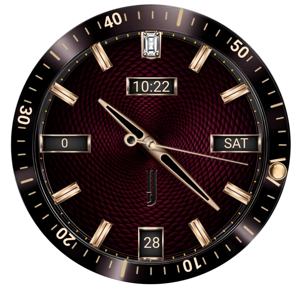
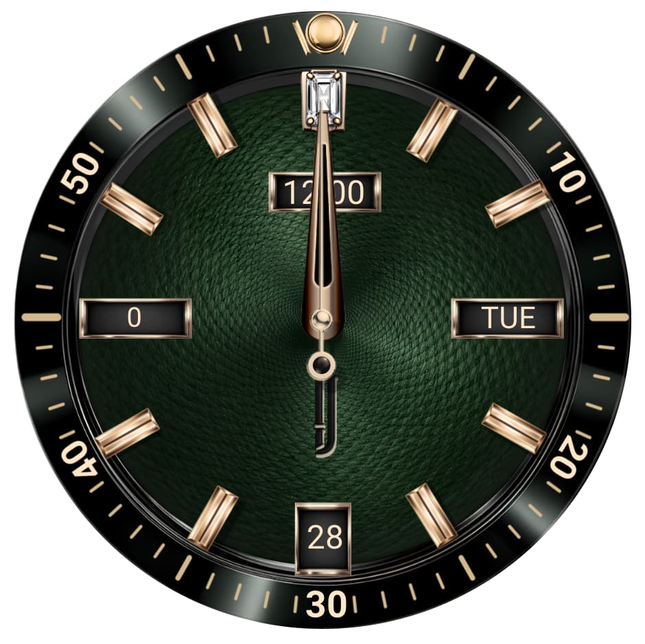
Russell, absolutely. We just released the ILJ Traditional and previously the ILJ Altier. Here is the latest released watch face. Our ILJ Meridian is coming out in about 2 weeks considered our best work yet.
I think we have see these images about month ago.
You maybe changed the bezel marks font.
But hey, why are the marks still misaligned, overlapping edge and the numbers turned differently?
Russell, we design and publish only for WearOS in the Google Play store so the ILJ Altier and ILJ Traditional are formally released for purchase. The ILJ Meridian is coming out soon.
Petruuccios, you may be correct we made some modifications in the design. Regarding the mis-aligned numbers the bezel actually rotates, which is a signature feature of ILJ. No worries touch to see with a still image.
Yes. The left window is Steps. But our design come with 8 customizable complications at the 1,2,4,5,7,8,10,11 tick marks. This prevent digital clutter but provides the most complications of any luxury watch face on the market. We always give the user 8 complications and a movement feature.
@ilj . I wonder how you Rotate the Diving bezel . I guess you are not allowed to post a Link here to a Face on the Play store . So I wonder what your post is about if you have not Published that on Facer.io .
Russell, you are correct. Facer rules does not allow me to post promotional content leading to another platform, but many WearOS users visit Facer so it is beneficial to inform a galaxy or pixel watch users of our presence and designs. The bezel rotation is done via code in my design tool so you cannot control it but it rotates ever so slightly counterclockwise as not to be a nuisance. Our DNA is not based on digital watch face design with a lot of digital content, we target the consumer that prefers classic time pieces with modern technology that does not clutter the watch face so it still looks like a classic watch. Digital watch faces are fine we just don’t play there.
Sorry, but this doesn’t feel right to me It just seems like advertising Non Facer Faces here on Facer, which surely can’t be right. Also; if the Bezel rotates, then the 30 is definitely round the wrong way now.
Sorry, just my thoughts.
Icritd4. No need for apologies. All feedback is welcomed. We’re not exactly sure what you mean doesn’t feel right. We are allowed to post for Facer with our WearOS designs but have not been a member long enough to post as we are relatively new to the watch face design community. Once we gain approval we will post. We were actually seeking input on our watch face designs to this community so that when we can post we would know if our objectives have been met. Also, the image was the draft version not the final. We posted to give one of the users an idea of our design abilities and style.
@ilj . The point I am making is having decided to include a digital to make it Hybrid . I feel it should be a little more readable . I make your digital read out about 2 MM high . Just don’t bother if it is not in your DNA .
Russell, good feedback but the digital element in our design is more for quick assessment of time and we do not want it to overpower our classic horology. Take a look at the watch face and all the elements working and see if you still have the same opinion. https://youtube.com/shorts/QbwBweXZuRI
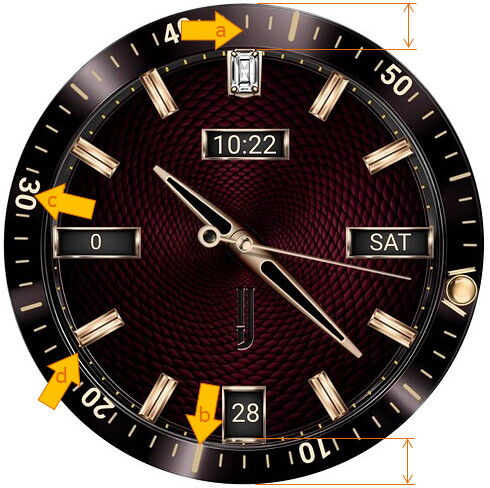
Maybe words are not enough. Let me point out what I mean by misaligned and differently turned numbers…
See how are aligned the bezel marks in spots a and b? I doubt it is intentionally like that, nor the bezel wider on top than on bottom
c) all numbers on bezel have bottom on inner edge, but 30 on outer. This is more usual for cosmetic bezels, that do not turn, rather than turning ones.
d) all hour marks touch the bezel inner edge, but the at 8h does not reach it and at 1h and 11h they are somewhat over the edge. Or maybe it is by that oval bezel shape. This does not resemble swiss made
Petruuccios, appreciate the feedback. I’ll need to check with my design team and see if the image you show is an earlier draft that was corrected especially the bezel size difference. I would also suggest visiting the link I sent to Russell to see the basic operation of the watch from an alignment perspective. Good input. My design team sent a note, reminding me this is in final design stages, which is why it is not formally released. I laughed and sorry, I know but was trying to send basic design characteristic of ILJ. My design team has a question as well. Do. you like the watch face design?
Shame your Dot on the Bezel could not reflect something like Battery Power or may be the transit of the Sun making it a 24 hrs dial . But as Peter says . Spend a bit more time putting the Lux in Luxury . To answer my Question is the left hand Digital Numeral going to be steps . Or may be Battery Power .