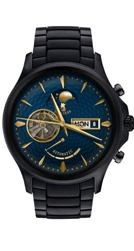
And we will all eventually choose the gold hands and markers with neon red theme color and the striped background…
I swear to … if you all find something wrong with the scale again. 
One question though. This preview won’t let me choose which color or which background or hands I want to display.
6 Likes
I find this classic look very successful.
graphically well implemented.
I just think that the coil spring is going too far.
That seems unrealistic.
3 Likes
Maybe you have to open it on separate page, click its name. Here in forum the tap zones may not work (for me they work). The theme colors can be previewed on phone app.
I like the overal design also the flexibility. Trouble is, in preview nobody sees all the variations. Lets say somebody searches for black dial with golden ornaments for his golden watch, but all he can see when scrolling trough the listings, is the default settings.
2 Likes
Looks pretty cool, very nicely done 
1 Like
Thank you 
I think I’ll try to adjust the coil movement a little. We worked really hard on that one. Originally I wanted the balance wheel to sort of slow down a little in both ends and accelerate but I never really nailed that movement,
1 Like
![]()
