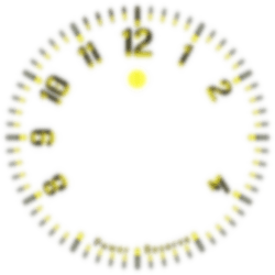
Here is one published some days ago to restart designing with facer.
Quite a simple analog watch face which corresponds more to my daily use.
I’m pretty well surprised with the glass and texture rendering on my Galaxy watch.
enjoy!
@zebardast.reza: I have Added the .png for the hands 
7 Likes
Hey, that looks pretty neat, you did a great job there, and thanks for sharing the Hands as well. I was expecting a Lume on the Dim display, and you surprised me by changing the whole colour instead. Keeping the same colour scheme and adding a Lume effect to the Hands and Numbers (or Hour Markers) would look really cool for AOD I think…maybe something to consider for a mark 2 version 
1 Like
Thanks a lot @icrltd4 !
Actually, there is some “subtle Lumes” here and there … indeed, maybe too “subtle”  but works like a charm with my watch which dims anyway for any facer modes, Classic or Dimmed in the app settings.
My process is almost the same. Working with blender, I create the “Scene” and then only change the light to (re)generate the different png.
The magic with blender is the final rendering really depends on how I configured the Lights but also the material and its behavior (glossy, anisotropic, IOR, coating, specular, etc.).
here are the lume layers (with some alpha tricks !):
2 Likes
![]()


