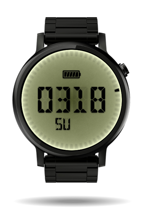
A simple LCD watch I’m working on. I’m new to Facer and slowly learning the ropes here, but it’s going well I think. The problem I have right now is that I want to make everything from scratch in Photoshop. This is not a problem per se, but it generates a LOT of layers. This one has 43 layers so far… Sure, I could create a font from the digits and use that instead, but then my layer styles wouldn’t look the way I want them to. The digits have subtle drop shadows that really add to the look, but wouldn’t be available to me if I had used a font.
I will add a date and maybe weather later on. I’m still deciding on the style of the seconds, but that would mean 15 layers instead of the one I have now, so I might keep it for that reason. It will be released when it’s done.
This is really cool. I think you could make your own font and still have the drop shadows. Just make it so they’re a part of the font. Alternatively, you could have an image which contains every possible drop shadow, and make it so the font covers the drop shadow where it’s not needed, and where the font isn’t covering, the shadow would show through and look how you want it to.
It looks great so far, I’m excited to see it when it’s done. I don’t even know how you would do that without a font but I do like it. I feel like it would be more optimized if you made it into a font and did the shadowing in facer. Unless you built the shadow into the font. Both of thoes options would probably be better than that many layers.
I’m actually going to buld it as a font as well to see how much of a difference it makes. The building of the watch is s bit involved, but it runs smoothly on my Gear S3.
The problem is that it can’t. I can add a glow or a stroke to digital time, but I can’t seem to add a soft drop shadow. The glow might be used to emulate the slight softness of the LCD though. I was thinking about adding a digital clock layer under the main one, only slightly offset and with a glow. I’m not sure it would produce the result I want though since I can’t set the falloff of the glow.
Thank you.
The problem with that is that the TTF-fonts Facer uses are simple vector graphics and cannot have blurs or other effects contained in themselves.
Good idea, but the problem is that the covering font wouldn’t have the actual texture of the background, it would just be a single color. That way, the grain and gradient of the background would be lost.
Thank you.
It’s simple, but requires a lot of layers. I simple place and show a certain image at a certain time. For each digit, when the time is such that the digit would be a 0, I display the image with the 0 on it. At all other times its hidden. The same applies to all numbers. That’s why I need 42 layers. 3 for the tens of hours, 10 for the single hours, 5 for the tens of minutes and 10 for the single minutes. 28 layers right there. I do the same for the battery. One for the frame, 5 for the bars. I could add the frame to the bar images to save one layer, but I was thinking about making the last bar blink when it’s under 5% so I need them separate. Although the frame might be added to the background, it would also make positioning a bit harder. 34 layers with the battery. Then the same for the days, 7 layers. The seconds is just an analog hand that rotates, but I’ll have to do some work on that since the drop shadow ends up on the wrong side half of the time. Last is the background. Since I change the shape when using a square face I need it to be a layer of its own. That’s 42 in total. In the original post I mentioned 43, but the last layer was an empty graphics layer that I now removed.
I’m still learning the tool though and your responses have made me think about trying out other options to see how they work out. Maybe I’m being a bit too nitpicky about the looks of the shadows and it’s always a good thing to optimize.
Thanks for your feedback guys, I’m happy to recieve more of it.
I can understand your Problems. In Photoshop everything is possible but Facer creator has a lot of Limitations. For sure you can make Layers for every possible number constellation but this will mean a lot of work on a single watchface. Others did before.
I got used to this limitations and try to live with them as good as i could or i am working with a lot of tricks to reach my goals. I think, Facer will get better in the future and so the functionality will.
It’s always frustrating to go from a powerful tool that lets me do anything graphically to one that is much more limited. I have a few ideas on how to overcome them, but I suspect they’ll be more work than they’re actually worth. Like you say, I’ll have to get used to the limitations and try to find a good balance between perfect control and ease of building.
I’d love to see support for bitmap fonts though. If there was a tool in Facer that allowed me to map numbers and characters to bitmap images (essentially, a simple bitmap font maker) that would help a lot. But Facer will surely get better with time, as you say, so we’ll just have to wait and hope.
In the meantime I’ll use this design as a test and try out a version using the digits as a font. I’ll update when I have something to show.
The best thing would be a Photoshop with all Facer-Possibilities. Or the other way around. My Wishlist on Facer Creator is bigger than the one i would send to Santa Clause.
The text has a small drop shadow and a subtle softness. If I made an image with all the shadows and then used a font to cover where I didn’t want there to be shadows, the font covering the shadows would be visible. Where I don’t want the shadows is also where I want only the background to show so this isn’t an option.
I don´t know, if it will help you, but when i want some Textshadows then i clone the Objekt, set it to back, make a small offset in x- and y-Direction and set transparency to 50-70%. For sure it is not that smooth, but it works. Think about the size of the picture and the fonts on the smart watch display…
 My Wishlist on Facer Creator is bigger than the one i would send to Santa Clause.