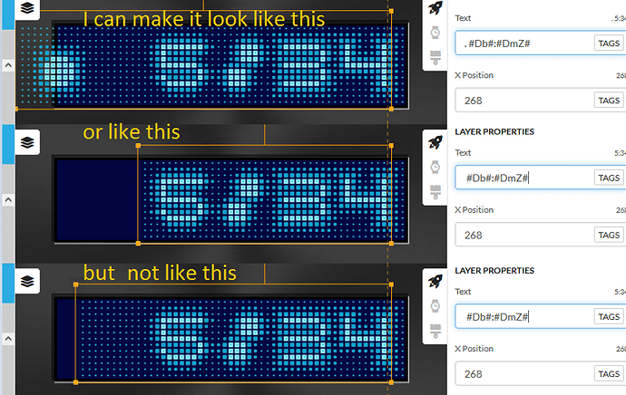
Good evening. Does anybody have idea, how to put space in front of hour digit instead of leading zero?
When I try writing it in the line, it does not show.
How is the idea to paint the first digit in the background color?
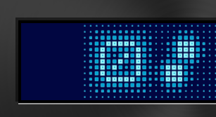
Actually I found a font that gives some pattern to the “empty” space, and would like to have there “uniform display area”.

You can also divide the time digits, and make each one its own alignment, at least the first digit.
Problem is, if I put space in front or behind tags, it gets ignored. Seems I will have to put some dummy letter in front of the space and then mask it somehow 
You could also do like @lucky.andrei said and split each number into it’s own area then just use opacity to set it to not display when you don’t want to see it. I do something similar by darkening the 10 hour digit on 12 hour displays like this one: MAG 1427
If you view it in 24 hour mode or in 12 hour mode at 10 through 12 hours am & pm it will show up fine. It only darkens in 12 hour mode at 1-9 hours. Inspection is open if you want to see exactly how I did it.
Thank you guys for tips, but what I wanted to do, was the small dots that are part of the font in place where the first digit of hour would not show until 10h. The space has them, but facer shows space only if it is between some other glyphs.
Do you want three small dots to be displayed?
no, the dots that are part of the space “glyph” in the font (marked red). I doubt, I can make it well aligned by using picture, that facer resizes, and I am too lazy to prepare the digits as bitmap font when I am still experimenting with the sizes and colours.
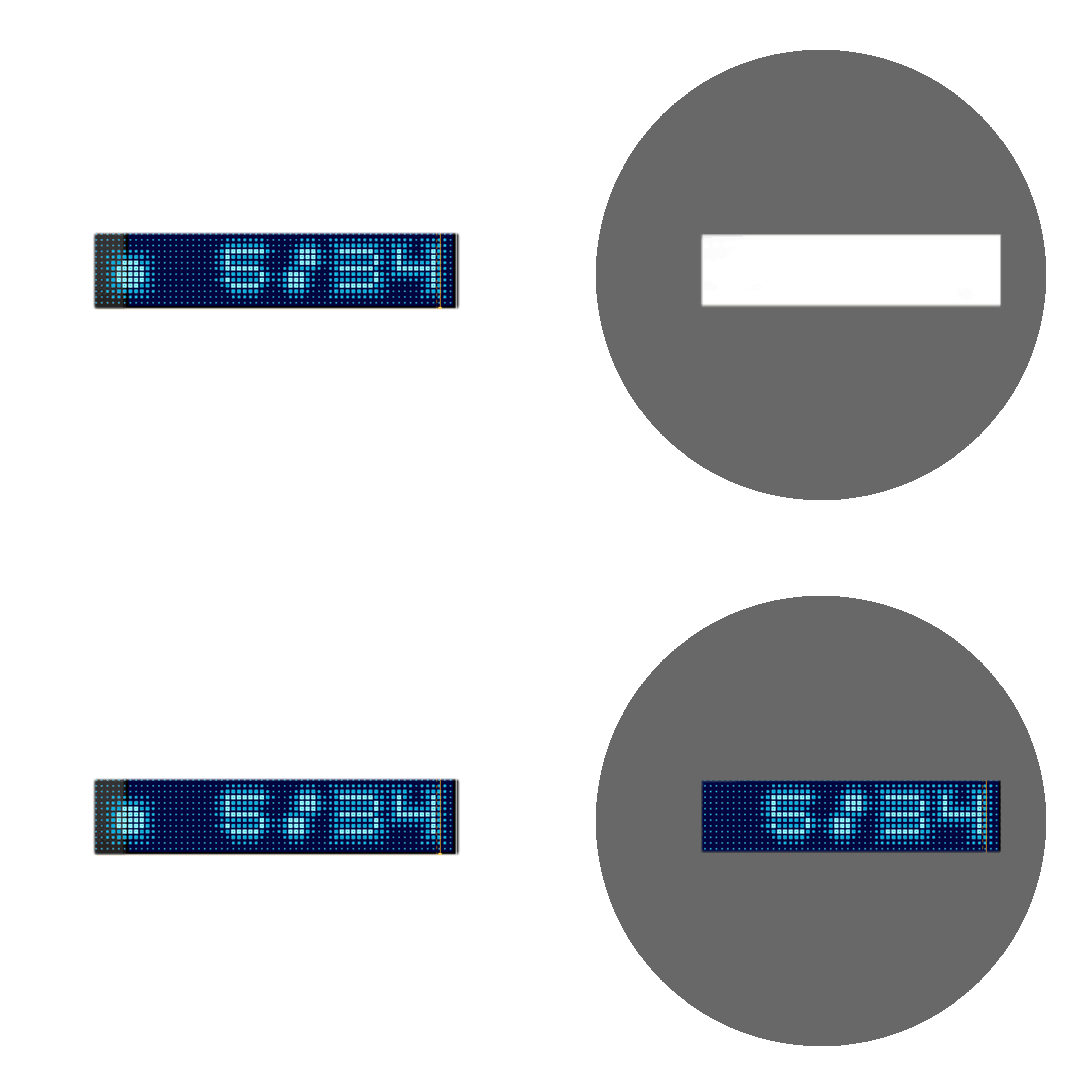
Something like this?

The only way is to make a background of such blue dots and position it accurately. And in this case I’m not sure that everything will go right
That’s a cool font! Seems like your idea of masking a dummy letter in front to allow for the space will work, why not just go with that? You could make your own feathered black mask png instead of a hard shape layer from the Facer creator to make it look smoother.
probably you got the principal design that can mask the dot and space you need just letting trasparen where digital time goes than just use dot and space you need and use a level down of the cover
Thanks guys, decided I will make the “mask”. Just little later, when finshed plaing with sizes and layout.


