works now, synch a previous I think. Still learning the virtue of patience.
ps: how can you check on your watch? someone told me it can only be after publishing?
I am going to DM you. Stand By.
Done.
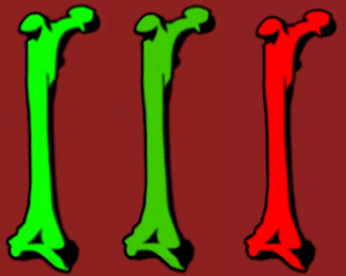
I have a bone battery indicator based on the formula for opacity from this face of Peter:
I have been playing with formula, but I can’t get gradual transition from 100 to 0 for the green layer.
Its keeps green long time (opacity 100) and then drops very quickly to opacity 0 (red layer underneath).
Could you please take a look at the formula? ![]()
One of the bones must be yellow. if you want a smooth transition . Here is an inspectable . dinner soon I will check what you have done .
I can see something has gone wrong with the code . try this one look at the battery gauge on the right
Thanks. Sleeping time so check it tomorrow ![]()
LOL
I love smile-sad faces, so funny…
And damn again: 3 colors blending for battery… elegant way to do it!
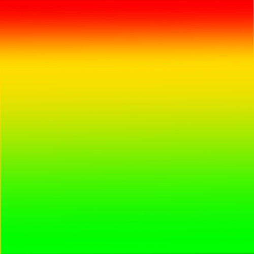
How I do it: I make one .png with blended colors from green to red and then I cover it with black reverse progress bar.
Yeah good call. I like abstract gauges.
That’s nice and smart too; think I’m gonna use your image if I may ![]()
Sadly when we mix Green and Red we get Mud .
Here is a little Test you can use to Blend 2 or three colours .
You can make Yourself Resources with it by taking a shot with the Little Camera on the Creator watch Preview in Square mode .
If any body thought it was a good Idea to publish it I will or someone else can Plonk some hands or Numbers on it . Might be fun to do some zooming rotating and fading with the graduation . So I know we are getting a bit of Topic . Someone please Sack Me .
Grad resource in white Sorry . It is there trust me .
Also just for fun a Nearly Transparent ( 1% Opacity ) Frame to make your animations glitchy . I had to use it to do a trick on another platform . Now that is going to be difficult to see.
Is this the way you mean it with the black progress bar?
No, you have to do it in reverse. So you have the full .png uncovered and then you cover it with black progress bar.
here is one with the inspection mode ON, watch battery and phone battery are made that way.
In this case opacity of covering bar is 50%, I wanted the bottom .png to be seen 50% percent.
nicoclaessens99, here is a simple learning version:
When watch battery is 100% you can see the whole .png, the lower the battery power is the more of .png is covered with black bar.
Progress bar
Color: black
Fill ratio: ((100-#BLN#)/100)
Opacity: 100% (or less if you want .png to be seen)
Background opacity: 0%
Rotation: 180
Thanks ![]() Understood!
Understood!
Hello Russell or other helpfull friends
I put in a thunder sequence underneath the headbanger (toggle 1/0 by clicking the head)
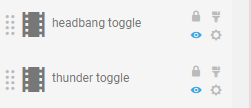
It works fine in Facer, but no thunder on my Ticwatch.
I have no clue why not?
Wow Dead Cool . When did you go PRO ? You have opened a box there for sure. Sadly syncs are low on Premium stuff but that will do well . Good Call . Great fun .
thanks. I think I have 9 syncs in total for my few watches but I don’t mind.
For me it’s fun.
I’m PRO since I joined facer, few months ago.
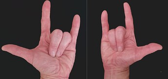
Funny trivia : I didn’t find matching hands, so I took my own ![]()
Therefore the colour is different than the arm.
My Friend you have come a long way in a few months . I had no intention to but trying to help someone with something Interactive I signed up . I will probably cancel my subscription when I am Happy with some templates .
I send you my Button setting Template.
]Ha Ha we crossed each other . Did you want me to play with those hands ? Good shots . you are obviously ambidextrous :::)))
no ![]() then you have to know that at the first round I put my right hand for all directions. It felt something was wrong but it took me a while to discover that on my watch I had a severe handicap to my hand.
then you have to know that at the first round I put my right hand for all directions. It felt something was wrong but it took me a while to discover that on my watch I had a severe handicap to my hand.
Your WIP is cool already. I think you are very creative.Thanks for the template.
I’m still working on my headbanger, i’m changing the sweatdrops in something else to have better visibility… You gave me inspiration with the yellow triangle
