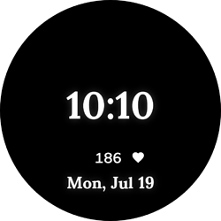
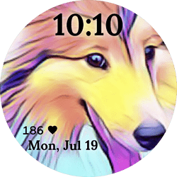
I just published my very 1st Facer Watchface 
And I already got notice that someone synced it to their watch. I can’t believe it.
Nice …
Congrats!
Well done Digby, it’s a nice design, you might wanna change your Font colour for the Heart Rate and Date though, there not too easy to see against the bright background.
Thanks. I’ve changed it to black and I figured out I can move the location of the elements in the always on display.
What do you think?
That’s great Digby, well done 
You can share anything you’re creating here for feedback, help, or advice; I’m quite often asking for help or asking what people think of my designs lol
P.S. I see Nicole has added your Face to her Favourites, nice one 
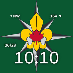
Thanks @icrltd4 you have been really helpful and encouraging. I really do appreciate it. Here is my Scouting design:
Is there anything you would change?
No problem, that’s why we’re here in a Community together, and I’m still quite new to all this myself, there’s lots of help I’ve had from the wonderful people here.
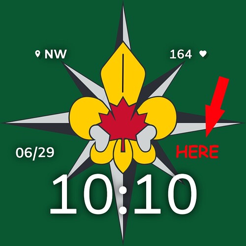
That’s a pretty neat design you’ve got there, it looks good as it is (and remember it’s your design, so if you’re happy with it then that’s what counts). If I had to change something, I’d just add “something” like Weather Icons, or Temperature just above the end of the second number 10, simply to add symmetry to it that’s all, but that’s just me lol
That’s a great idea. Thanks!
The idea of maintaining symmetry, that is very interesting, in this design.
As my friend @gizmo wrote, that’s why I also share the idea of keeping the balance in this design
In particular, in order to achieve a good design effect and interest.
Very nice creation @digbythedog.ar
Cordially JDCardozo


