Hi everyone!
I’ve been working on my first Analog watch and I am about done however I have 2 elements for when the battery gets low, one flashes red and the other just reveals itself and I can not get both of them to work together.
Basically, I want a red glowing ring to appear around the center of the clock rings. How would I do this? Here is a link to the watch so you can inspect it and see that I have both Elements and one only shows after the battery reaches 15%. How can I make them both one item or can I do that?
2 Likes
I went and checked it out. You have the flashing part but not a trigger to set it off at the proper battery level. If you keep the flash expression you have as is just slide it offscreen until needed. $#BLN#<16?160:999$ will put it at position160 when the battery is below 16% and at 999 or well off screen above 15%. The second way is how I do it. Here are the expressions I use for flashing the battery image.
Flash fast: $#BLN#<16&&#BLN#>=0?(100 * (sin(((#DWE#/0.5-(floor(#DWE#/0.25))) * 2 * pi)))):0$
Flash slow: $#BLN#<16&&#BLN#>=0?((floor(((#Dsm#)-(floor(#Dsm#))) * 2)) * 100):0$
Flash slowest: $#BLN#<16&&#BLN#>=0?((floor(((#Ds#/2)-(floor(#Ds#/2))) * 2)) * 100):0$
You will need to remove the spaces before and after each *. I have to add those spaces, or the community page treats it like some sort of HTML coding and will not show them without the space.
3 Likes
Hey mrantisocialguy, Thanks man!
I had also posted this in the showcase your designs or a channel like that and another guy gave me this code/tags. I tried yours and they work great, however, I prefer his because if you look it has a more smooth fade in and out. Let me know what you think.
$#BLN#<=10?((sin(-#DWE#*2))*50+50):0$
3 Likes
Thanks again, Thomas!
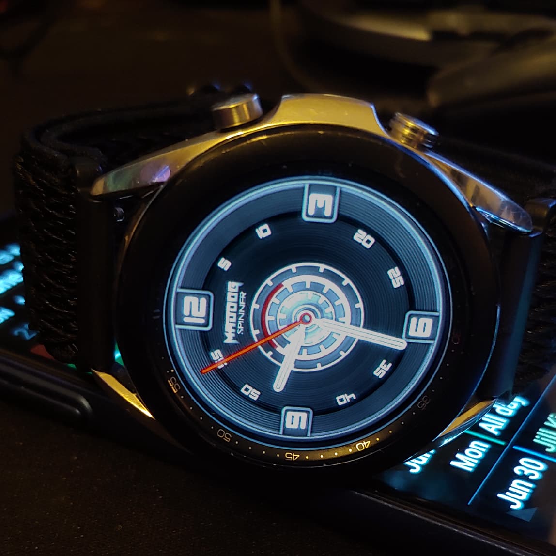
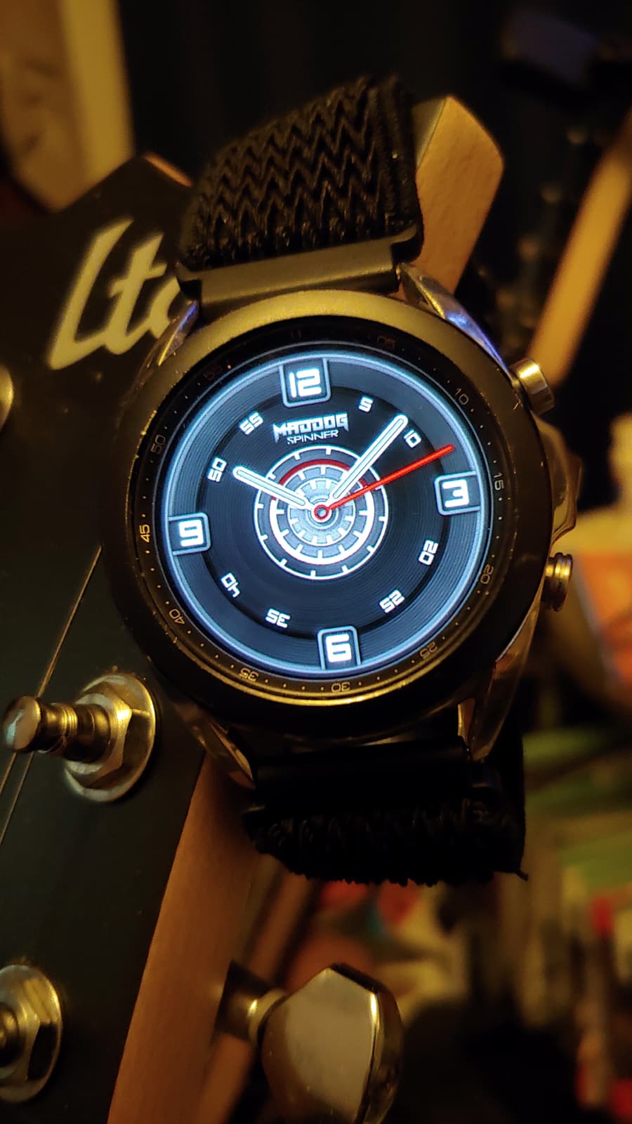
Here is the final face. I’ve not done the AOD yet. Pondering on how I want to do it still. =)
WHOA WAIT UP. This looks very bad when I finally pushed it to my watch. ugh!
4 Likes
Just consider it for future use. As for the fading in and out I’ve got that code also. If I remember correctly it’s described as a “breathing” style of flash. Moving stuff off screen works just as well as an opacity tag to make it not show. Another method is putting a tag into the width or height and making it the width/height you want when active and for inactive just make that dimension zero when you don’t want to see it. A lot of different ways to do the same thing.
4 Likes
Very cool I see! Thanks mrantis!
1 Like
Nothing to add there. I usually play with opacity. Haven’t gotten my head around moving things off the screen, although it is needed for locking the screen for example  . But hey @wolfkazack, you’re on the right track, looks good!
2 Likes
@wolfkazack. Debut Analogue Face ( More or less ) and you have a Battery Gauge on there I have not seen before. I have seen a Shit Load of Faces or is it a Load of Shit Faces. I am very proud if I had a little to do with that. What I see here is someone Embracing the Spirit of the Community and Running with it. Sadly this kind of Face does not collect as many Syncs as others but It will collect Kudos. Good Job.
2 Likes
i think the design is really good.
Graphics are nice and clean.
Ideas are well implemented.
great…
3 Likes
Hey guys! Thanks Tom, Rusty, SR, Thomas and Mrantisocialguy!
I appreciate everyone’s help! I will try to do some more neat and better faces the more I learn and hopefully get some more Creative Mojo, as I like to call it. - One of my favorite things about this face is the battery level too. It did not seem proper to put a digital one on an analog face and a mechanical one with a number on it just seems to distract me. So this one was an idea you all gave me when teaching me about all the various things you can do.
I think sync will come the more I get familiar with the tools and the more my Creative Mojo grows. I think there is some nitch or sweet spot everyone can find and get lots of syncs if that is what they are going for. I see a lot of Power Creators putting out a lot of faces and they look amazing here on this site but once you sync them most of them I just remove shortly after playing with them because they just don’t work for me. I think Tom said it best in another post about 2 kinds of faces.
I’ve done a bit more work and will post an update after a bit. I sync’ed it to my watch last night and have been using it all night to see if it works for me and so far so good. A few minor changes and I think it will be done. I enjoyed learning and making this face! It’s not near what I would consider a masterpiece hehe. But it’s nice! =)
Ooops! EDIT: I can’t forget to thank ICR either!
3 Likes
Here is the final version I think!? Yay!!
I really like it! I’ve made a few minor changes to make it look better Hue/Saturation wise and shorten the clock hands just a bit and made the seconds hand a few pixels wider. Little tweaks like that. Added in a logo! Not sure I’m in love with it yet. But for now it will do, it does look cool. I think for my first few Analog watches I will call them “The Spinner Series” and they will be based off this Design mainly.
Does anyone have any suggestions before I publish it? I am open to all!!
Oh hmm I think I wanna try something to the Hour Hand.
Nope never mind it looked kinda bad. SO I will keep this design. =)
How do you change the Watch Image it’s self? Like say I wanted the Watch to be a Fossil or Moto or the new Galaxy 4? Can you do this for each of your watch faces or does it just default to what?
4 Likes
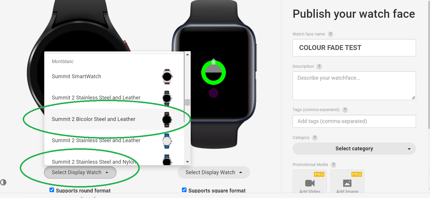
When you publish select a display Watch . It makes a lot of Difference . Especially if you have made a Ladies Watch .
2 Likes
Thanks Rusty, I never noticed this! doh!
2 Likes
So much to learn. So easy to skip past stuff. You would not belive what I asked at the Begining. It is a pleasure to help someone who appreciates it at much as you do :::)))
2 Likes
I personally would like more light effects.
But this clean look is better than I thought.
I think it’s good.
Yes, a series of these would be great.
3 Likes
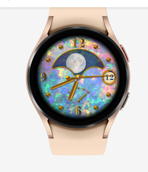
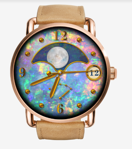
Is that one a good display watch for a ladies watch (like the gemstone/birthstone face I had made)?
2 Likes
The one you circled in your earlier screenshot, the Summit 2 Bicolor Steel and Leather.
2 Likes
@kourosh Yeah Sorry Flagged that up as an example of what you could chose not what you should . That is far to boyish for a Lady . Try Q Wander . Nice clear Face . I always go for Gold if I want to Invite Boys and Girls to the Party.
2 Likes