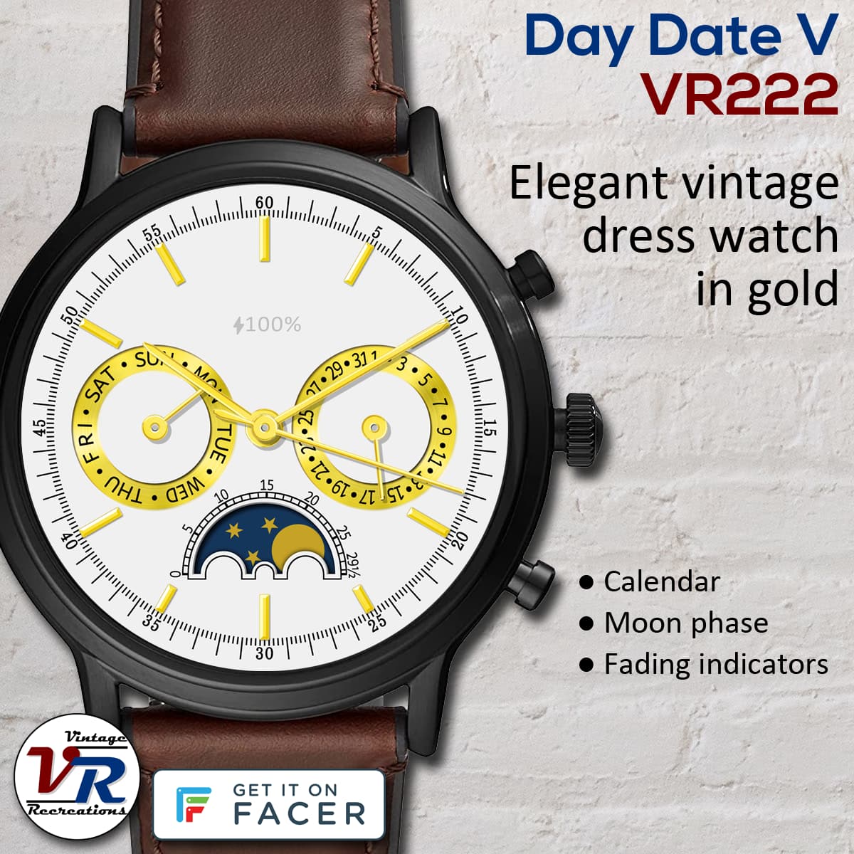
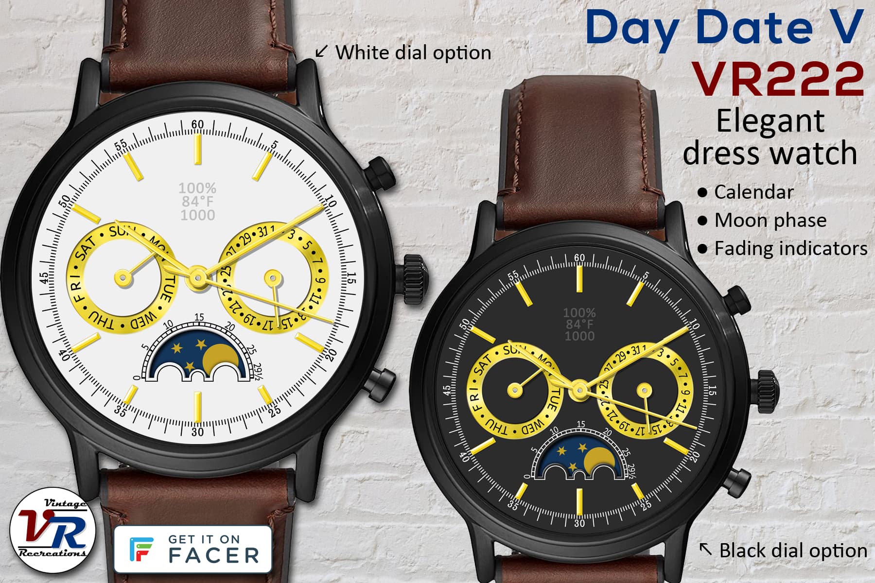
I avoided this lunacy for a long time, but the new moon tags just cry out to be used. Even then, there was much research/reading/testing to get going. And then came sizing up the moon disk and cutting open its aperture on the dial.
Not crazy about AOD since there’s no lume on the face.
It’s too bad you can’t zoom/enlarge watch faces when viewing them, too much detail is lost (not that you see all detail on the watch itself, but still!). That’s one of the reasons I add promo cards.
Thanks guys. Since it has no actual lume, I added feathered white glow to the hands and markers for AOD but I’m not sure how I feel about it. Should I reduce the glow some?
I think the AOD looks fine. It always looks different on a watch. WOS3 uses the Samsung style AOD. It is much brighter on my new GW4 than the old Active running Tizen.