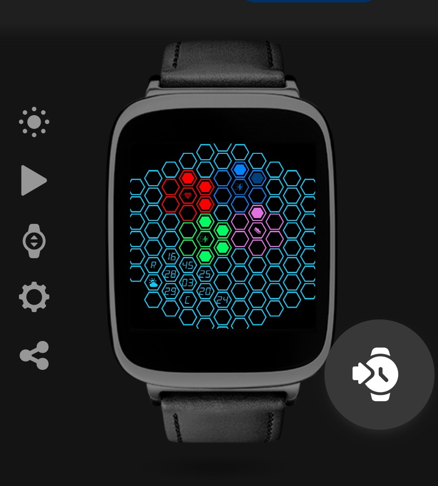
Would love to have some opinions on what I have done here, This face started out as my attempt at a Hexagonal Progress bar which then got sort of abandoned but you can still see it for the battery percents in the finished watch
I got inspired by this face here
The Heart Rate Meter is in 30bpm sections, the Step meter is in 1500 step incriments with a final 1000 step centre to hit 10,000
12/24 Hr and Metrtic/Imperial is supported
Also the First letter of the day of week is mapped such that Sunday Maps to U and Thursday Maps to R
I haven’t published it yet as I want to be sure I have everything exactly how I want it before I go and do that.
My Hexes are smaller than the Hive hexes but on my Galaxy Watch 5 everything is still readable.
1 Like
I am an Old Fart . I put my Hands up . Sorry . The only issue for me is readability . At this stage I would have to Put that on my watch and get my Loupe out . the Concept is brilliant the work is Masterful . These Faces are popular . Sadly the AOD loses any of the Character of the Ambient or what ever it is called. I do not use AOD so that is fine.
Just look at what you will see on a square Model Watch .
.
.
1 Like
I do agree with you on the AOD, I also don’t use AOD hahaha
As for a square face watch It’s not perfect but you did make me notice that I’m missing a hex to the lower left of weather that wouldn’t show up on my round face but that I could for sure add.
3 Likes
BTW . Try posting the same link as the Hive one . It works better when viewing on a Mobile App .
3 Likes
Fully agree with russelcresser, the font is in my opinion much to small.
3 Likes
I didn’t even see the numbers! Perhaps make either bigger hexagons or combine 4 or 7 hexagons and make the text bigger. I like the idea though - many possibilities here.
3 Likes
16px is the recommended minimum considering accessibility needs for those with less than perfect vision! (Like me)
2 Likes
16?  I like my Font sizes to be at least 20 to 24
1 Like
My Font for the main numbers is 18 the only smaller font is the Heart rate and Battery Percent numbers but I do agree It could be bigger
Trying to come up with a size that is bigger slightly and yet still allows everything to fit, I tried duplicating my face and increasing by 10px in both directions and it was too big
I’m going to play around with it some more
Does this look any Better?
Its a Duplicated one where I upped the size from 18-24 and just hid the hexes as needed to make that work
1 Like
 I can read something… Cool
1 Like
Even better now that I hid the Centre Hexes of my meters (Sadly the reason I began this project as the battery ones were a hexagonal progress bar)
Upped the Icon and Font size there too, and Moved the moon down by the Temp/Weather and made it bigger too.
1 Like