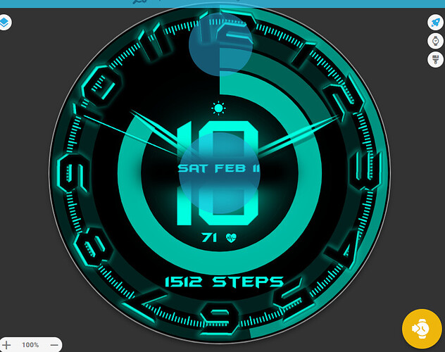
My first watch face. Let me know your thoughts. Went for a somewhat OLED hybrid design.
First Face? Great work for your first, well done ![]()
Thank you very much. Yes my first but many to come. I have experience with graphic design and motion design. Haven’t made anything in years. Got a smart watch and found Facer. It’s an awesome community with lots of great artists. Lots of inspiration from looking at what others have created. I’m going to learn how to create some animated gif effects soon. Going to go full force and try to make a name for myself. Probably going to start off with some minimalistic designs at first then get more intricate.
Sounds like a plan and I look forward to seeing what you come up with, I’m a big fan of animations (as most people here already know ![]() ).
).
Gifs can be added using the Sequence option in the Creator, but they must be 25 frames or less ok. An easy Online Gif Editor is called ezgif, where all sorts can be done for free, without any stupid watermarks being added, and if you want to check it out you can find it HERE, which will take you straight to the amount of Frames editing section.
Have fun ![]()
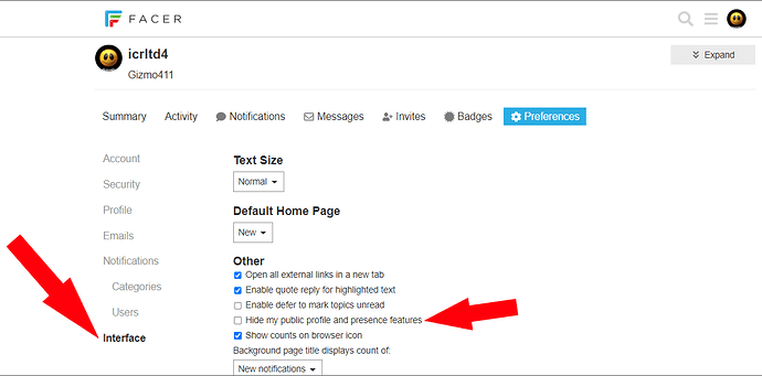
(P.S. Can’t check out your Facer profile being it’s set to Private).
I think for first face it is really very good.
And since you asked for thoughts, when I think of it second time, there are few details I would do differently. Please take it only as personal opinion, not that the face was bad or something.
-The hour and minute hand are almost same size, so on first glance one still has to read the digits to identify them.
-The placement of progress bars does not help either, since the inner where I would expect hours is for minutes.
-The inner progress bar might be little more tame to feel like supporting element rather than main thing, and so allow them hands to stand out little more
Really appreciate you pointing me in the right direction. Saves a whole lot of time. How do I remove private? I looked in settings couldn’t find it
I appreciate the constructive criticism. I’ll tweak some things tomorrow switch the bars around adjust the opacity and maybe create another face or work on one. I was going for a OLED futuristic kinda style.
Learn some thing every Day . Not seen that page before . Thanks my Friend .
Strange it was already unchecked.
I switched the circle progress on minute and hour. Adjusted hand size. Decreased outer battery ring size to enhance readability of numbers and progress rings for more focus on the time. Is there a way to have a Free version? Same thing just without color customization? Also is there a way to make minute hand tick?
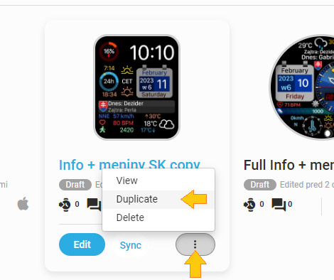
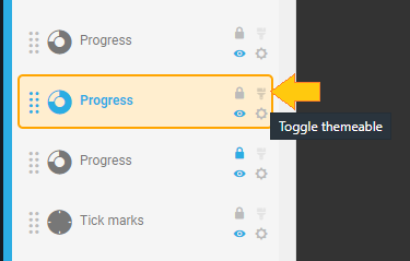
I guess yes, you can make duplicate draft of your active face and then remove the color palette feature (the paint brush icon) form those elements where you added it. Rename the clone and publish it.
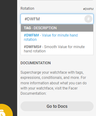
To make the minute hand tick you can use the #DWFM# instead #DWFMS# tag in its rotation field.
But you have all other hands moving smooth (they can also tick by removing the S in the end of the tag).
Thank you! I really appreciate this.
