I just made a new watch face and need some suggestions on what I could add, I feel like something is missing on it.
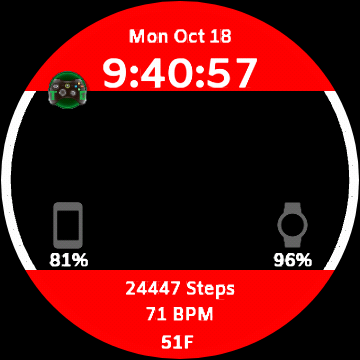
Personally I would move the time down into the top area of the black above the watch and phone battery icons. Plus make it large enough to fill that area. Then I would make the date much larger and move it to the center of the red area.
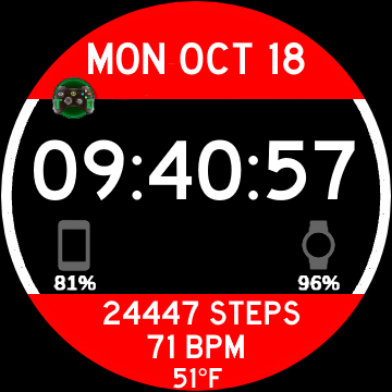
Something like this:
You could also move the temperature in between the two battery icons and add a current weather icon
That actually looks way better thanks for the advice!
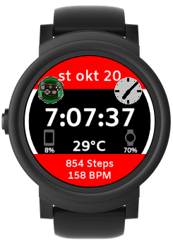
I just finished up the changes but open to more. I made 3 versions with different colors
I would publish all three versions. Don’t be surprised if the blue one gets more syncs. I’ve noticed that on all my faces that I offer different color versions. One more tip, when you are linking a watch face only put the link address by itself on a line with a space above it. It should look something like the example below. Don’t include the question mark and the example watch brand in the link.
https :// www . facer . io / watchface / 2ini8B6PzC
I added spaces so that the thread wouldn’t actually put the link here. Now I will post the link to your blue version so you will see how it shows.
Welcome to the Community Adam 
The changes are good, but I’d add an Xbox gaming image (or sequence) where the black area is.
Thx for the suggestion but I only planned on my logo being the only image on my watch faces
1 Like
All good, I just thought it was the theme for the Face sorry.
Ur fine it’s understandable
1 Like
toss some hands on there! also maybe instead of the date as you have it now, you could use this to fit a little better…
10/19/21
then maybe the day of the week spelled out under it?
1 Like
I don’t know where I’m gonna fit some hands but your other suggestion I will get to as soon as I have the time thanks for the advice Rator
Hi, maybe you could make small analog dial to counterweight the logo.
3 Likes
You can just plop em right in the middle. As long as theyre thin enough, they shouldn’t block the digital time much. Good luck!
1 Like
They could even go behind the Digital Time, Temperature, and Battery Gauges 
ok, first things first petruuccios I tried your idea first however the numbers are way too small to read so then I moved on to Rator and Icrltd4’s idea but I’m trying to find a color for the hands that aren’t the color of the watch, white, or black as the minute hand would blend in. I would just pick any random color but don’t want to do that as that color may be a future watch color. So any suggestions on a color for the hands and style would be appreciated. Thank you all for helping me make my faces look better and look forward to any more suggestions you may have!
1 Like
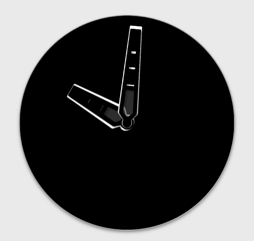
I always find that a Pale Blue works well with most Faces, but don’t forget that you can play around with Opacity as well. You can double up on the Hands as well, to make them them stand out more, one on top of the other, making the lower one slightly larger which would add an outline to the one on top, so 2 colours could be used then, even White or Black to show on a Black or White background. Here’s an image I knocked together quickly using 2 of the basic Hands just to show you -
1 Like
Thank you for that idea I have no idea how I didn’t think of that. I used to take a Graphic Design class and we were taught that if something blends in to put some sort of outline on it to make it stand out. I will share a picture of what the changes look like after work today. If they look good I will make the changes to the other two faces and update all of them
1 Like
For the hands for that face I’d use a 50% gray with a white outline and a dark drop shadow.
(tip: you can darken the built in drop shadows in the creator by making multiple layers of the hands.)
These are neat designs but it is hard to see the battery level indicators on my watch but other than that they are neat
1 Like
OK thank you viper I will fix that as soon as I can I have been very busy lately but I’ll post and update when I’ve made all the changes that I picked and I will make the battery indicator text and the face a little bigger
1 Like