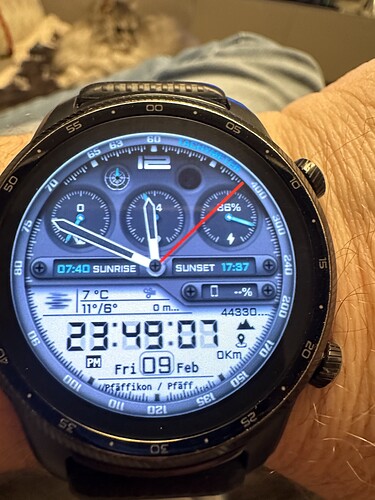
Hello friends. I’ve released my new digital watch face. I need your valuable opinions about the font size, symbols, what looks bad and what looks good on this face. I find this aspect of Facer very valuable in terms of improving myself further. Thanks in advance ![]()
Nice style . Love the Moon walk . But most of th text is too small for me . But The face is not meant for Retired Old Folk .
It does not appeal entirely to young people. But what you say is true. I will also make more legible clocks ![]()
I like this - very clean, good depth, texture and shadowing. Well done!
Thank you ![]()
Its very good, I like it.
If I had to suggest something, maybe the inserts in main hands could be semitransparent or even none and the hands could have more strong shades similar to those on the top edge of displays.
Thank you. Are you talking about the black parts on the arms? I had the idea of making them transparent. I need to give it a try. Logical
Great!
Thank you ![]()
Looks really good! I try not to use font size smaller than 10, otherwise it becomes difficult to read.
One thing that I would change is the location, My location is prettty long and so it never displays nicely. I would make it scroll.
Thank you. Is there a code to slide the location? If there is, I can update it immediately ![]()
Not sure if there is a code for one text, but the trick is to have 4 times the text, each, X position:
((360-(((#DWFSS#)*7)))+1850)
((360-(((#DWFSS#)*7)))+1260)
((360-(((#DWFSS#)*7)))+700)
((360-(((#DWFSS#)*7)))+140)
And if you want a text in the center in DIM mode, you’ll need a 5th text just for the dim mode with static position.
Here is my watch face with an example (open for inspection). Look for “timezone”, the “timezone s” is the shadow text:
It’s great. I will definitely try this. Thank you for sharing ![]()
My tastes tend towards the less-is-more. I would have gone for either digital or analog, but not both.
I think it is excellent! I have learned that it is impossible to please everybody. Beginners here do tend to use extra-small font because it seems large enough to them on their workspace, but on the watch it is too small. Other than that it is a beautiful design. Keep up the good work!
