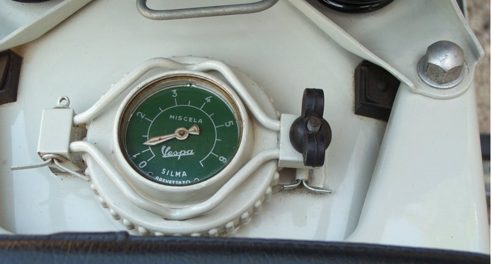
A clock in the style of the 50s Vespa … the small Vespa runs once a minute.
I am always open to suggestions and criticism.
2 Likes
Nice, clean design, I like the colors too!
And legibility is good with this font and size 
1 Like
very nice!
1 Like
Looks great! What do you think of moving up the weather icon to vertically align with the temp - side by side - to give you room for a fuel gauge at ‘6’ - matching your colourways obviously (to show watch battery power).
I love this design, but I believe your Raven name and Logo should be bigger, it’s hard to see it properly.
I agree with Rich about the power gauge, that’s one of the essentials for me. But as an alternative to new info… you could make the Vespa’s progress the power indicator instead of tracking seconds. You’d lose that constant motion, but it would be a way not to disrupt your current balance.
1 Like
Thank you for the feedback.
I made the RAVEN logo a little bigger, but I didn’t think the idea of moving the weather symbol to suit my taste was so chic.
The idea of repurposing the “VESPA” as a battery indicator sounds good … if I only knew how.
1 Like
Nice idea, and I like the combination of colors you’ve chosen for your face.
Keep it up, looks promising 