Thanks to RUSTY-CRESS for all the graphics help with this one -
9 Likes
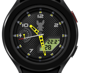
Very pretty ![]() . But for the battery, we don’t know where is the 100% and the 0%.
. But for the battery, we don’t know where is the 100% and the 0%.
2 Likes
Maybe by adding a red bar to indicate 0%
3 Likes
Surely 100% is at the top.
3 Likes
Looking good. I like not having animations ![]()
I imagine this will look great in other color combinations as well.
The font needs to be a bit smaller (or the display a bit bigger) for the 24h people though:
3 Likes
Thanks for pointing that out @ThaMattie and yes @rob.fisk the 100% is at the top, but I see what you mean @amzerwatch and will amend it as soon as I can. Thanks guys, this is exactly why we have this Community, to help each other…and have fun of course ![]() You’ve renewed my faith in this Community after recent events
You’ve renewed my faith in this Community after recent events ![]()
3 Likes
Thanks Brad, I saw a G-Shock that I liked the look of, so gave it my own treatment (with @russellcresser assistance) ![]()
2 Likes
@ThaMattie @rob.fisk and @amzerwatch
I’ve edited it all after your comments, and think it looks much better now, so thanks for your input guys, much appreciated ![]()
8 Likes
now is perfect! ![]()
![]()
2 Likes
I do likw to colour my battery progress but don’t find it essential.
Very nice addition though.
2 Likes