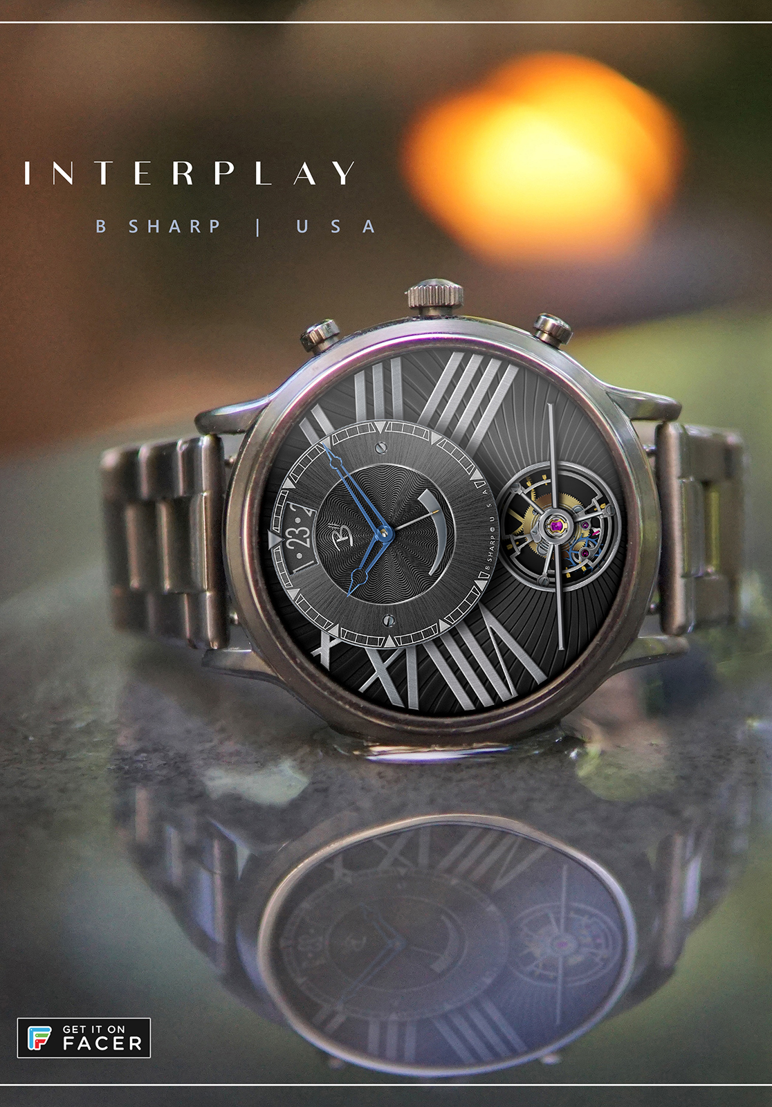
To tie my watch design hobby to my primary artistic pursuit, jazz music, I like to turn to song titles to name my designs. This one was easy (Thank you Bill Evans!) as the face has many interplays at work. There is motion set against stationary, varying textures, light and shadows, contemporary and classical… all conspiring together to create a stunning art piece on your wrist which conveniently happens to tell the time.
A future paid version of this face will include multiple themes and a selectable Hybrid Mode to display essential smart watch info.
Follow B Sharp Watches to never miss a new release!
High quality as per usual. I’m still not a fan of tourbillon watchfaces, but the rest looks great.
I like the wavy back panel. Only thing I noticed when wearing this for a few hours is that there could be a bit more contrast between watch and hands, especially in dim mode I found it hard to read the time at a glance.
Is this on your Carlyle? I find that auto-brightness tends to be a little darker than I like on that watch. I actually wore this face off an on for about a month before releasing it and in its current incarnation never had any problem with reading things at a glance. Outdoors in sunlight of course had the same challenges of most other faces, but I tend to load a different sort of face when I’m say playing tennis, knowing it’s harder to see the screen.
I have nothing against gears / open faces, but somehow I don’t like it when the watchface is closed and has that 1 hole of craziness.
Yes on the Carlyle, and with auto brightness. It is a shame you cannot adjust the level of auto brightness like on a phone. A set brightness only works half of the time, and the auto brightness is indeed slightly too dim (often the dim mode is brighter than the active mode)
I meant that more as an example of hands that are completely lost in the dial though I’m sure it’s not as bad in 3d.
These hands are the ones I originally made for my Sidewinder face but in that design I thought they didn’t have enough weight so I beefed them up a bit. But for this one after much wearing/testing I much preferred these.

 though I’m sure it’s not as bad in 3d.