Hello everyone;
before I publish that I would like to have your opinion on this design … Thank you in advance for your criticism and suggestions
2 Likes
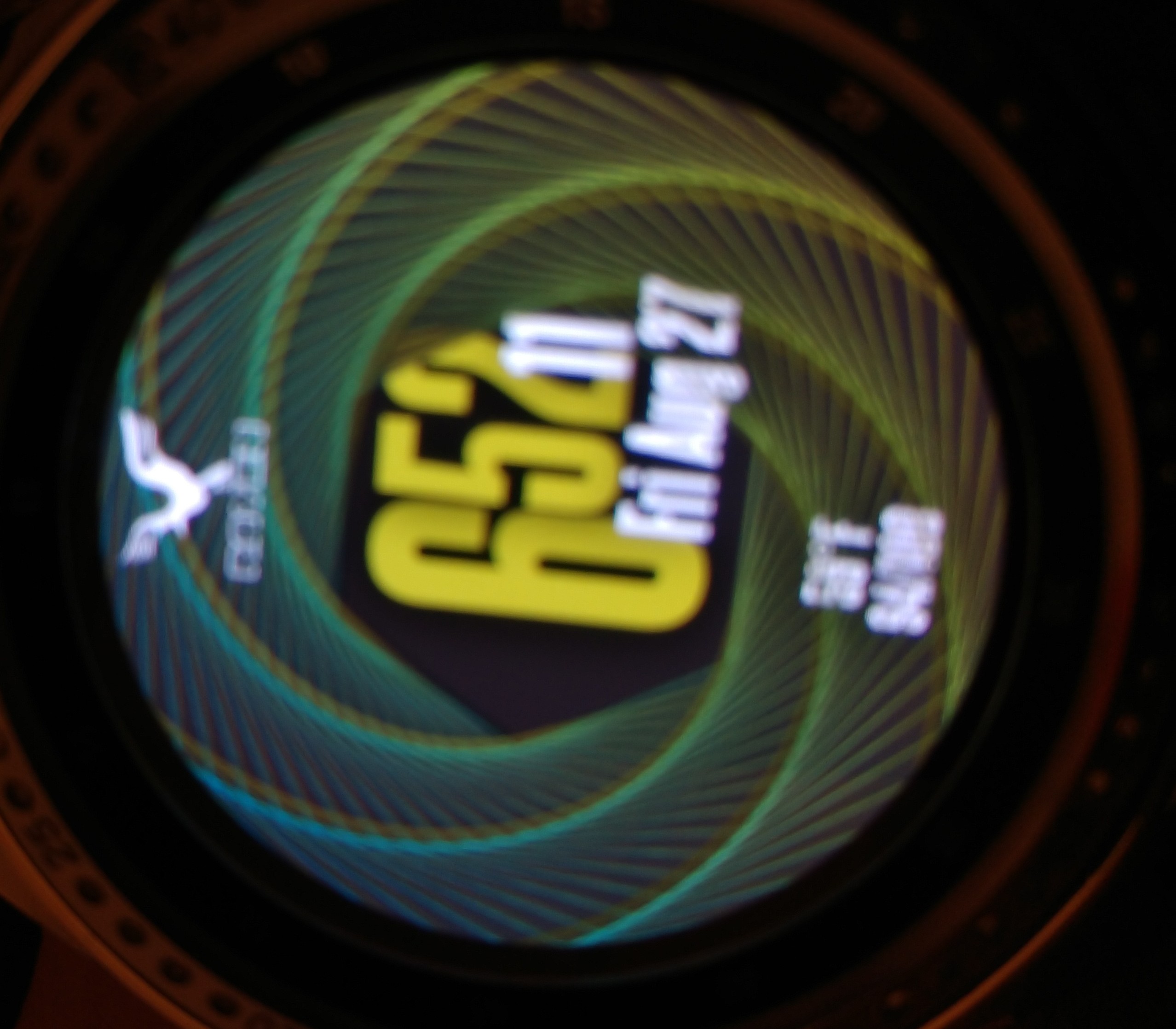
Reminds me of James Bond intros 
Very cool idea with the double swirl layer, almost hypnotizing 
Did you test the date on your watch? It may be a bit too small and thus difficult to read on the watch itself (but I can’t try syncing yet as it’s unpublished). That’s my only concern.
I like how you couple colors together, don’t know where you get your inspiration from but the color matching is nice!
1 Like
The truth is, your designs and way of thinking are good to invent your styles of work … 

Very interesting and good combination of colors! 
I congratulate you good work !!! @upgrade-gd 
Cordially !!!
1 Like
Nice design yes, but all the info looks a little small to me sorry.
I personally would have the Swirls rotating as well, counter clockwise 
2 Likes
Thanks for your feedback.
I have now made the date display larger and published it
2 Likes
Congratulations Raven, maybe go back and edit the Temperature and Battery as well, make them a little larger? Just as a note, I find that 20 or 22 is usually a good readable size. Remember that it’s all what you’re happy with though, we only advise and provide opinions/suggestions 
1 Like
I am always grateful for good criticism … with this in mind, I have set the font size to 24
3 Likes
Bravo my friend, it looks just right now…in my opinion of course
2 Likes