3 Likes
*Very interesting !!! very well designed !!! good idea!!! 


Good color of the design … only the numbers and the letters are seen very little … could it be another color? …
Cordially
I fully agree with cardozo198013.
And for the hands, I would also use others if necessary.
Otherwise, good idea and keep at it. 
1 Like


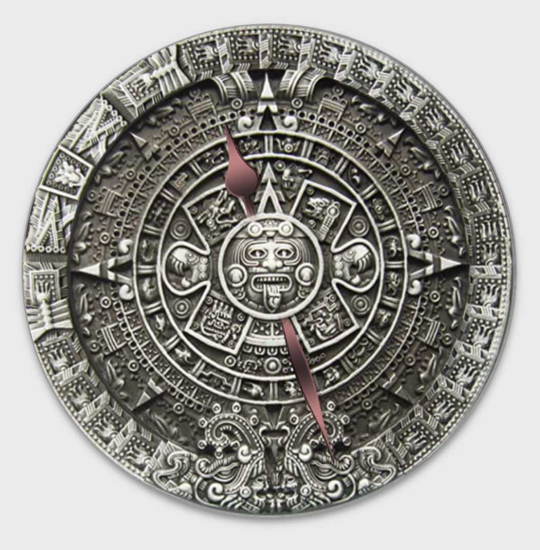


Hi, I agree with what has been said earlier, the contrast between the design and the text is making it a bit hard to read. Overrall looks cool! 
1 Like
Wow. thanks , you seem to be able to make my ideas work so much better, i cant wait to start fixing it up
2 Likes