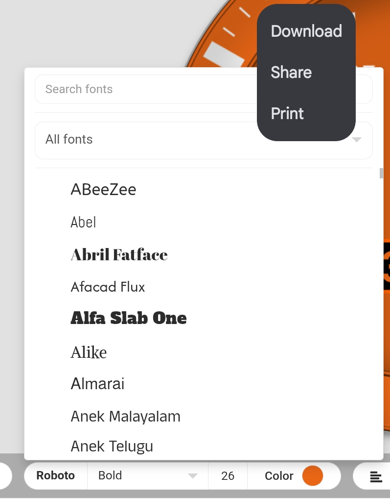
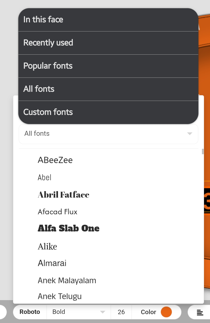
Hi @Facer_Official. Looks like the new changes made to the font selection have broken mobile experience again. Difficult to access menus. Its obvious that mobile/tablet support is not high on the agenda as a lack to check that new features don’t take away features is not being done.
I’ll just have to use the laptop I suppose, but feels like step backwards again, when something was working just fine and now it doesn’t.
Edit…i can eventually access the menu by long tap followed by short tap and dismiss of menu. Not ideal though.
2 Likes
Even on my laptop I dont like this.
If it aint broke - don’t fix it!
1 Like
@Linlay
I don’t overly like it or dislike it. It’s just going to take a little time to become familiar with it.
1 Like
I mainly use custom fonts, so just scrolling down was a fast way to access my fonts.
Now there is a click more to do. Ideal would be if I could set the default to “Custom fonts” or “In this face”.
So yeah, not in my favour…
2 Likes
I preferred it the way it was. Much easier to access.
1 Like
The new fonts are nice, but not filtered at all. I often search for fonts with fixed width and now I will simply have to add custom font for that purpose, its faster than scroll and test the long list.
1 Like
That is usually the way when technology changes after people have used it for years. I’ve used custom fonts 99% of the time so I think this new feature is fun and not inconvenient at all.
1 Like
The one thing that I like is most fonts have different sizes as in regular, bold, extra bold etc. This version you select the font name then you can decide which version from the drop-down panel. That makes changing boldness much easier on the fly.
2 Likes
I’ve wished that Custom and In this Face could be listed differently, but maybe they will get to switching those topics around eventually. Once I’ve chosen a font I usually stick with it, but perhaps others do things differently.
2 Likes
Okay let me put it another way- why do you think it has improved?
I guess it is a part of a User Interface redesign and I will have to get used to it. I still dont think it’s an improvement but I guess I’m just old fashioned and dont like change 
1 Like
I like the addition of more fonts with options such as Bold, Semi-Bold, etc… It is a nice change rather than having to pull up my local font organizer that keeps thousands of fonts I’ve collected over the years. Everyone has different needs - which was exactly what I’ve told people who have tried to recruit me to join the competition.
2 Likes
Its a nice change that brings more fonts to be selectable, but executed poorly. Default should probably be “In this face” as once you select a font its the go to. Would be appreciated if Facer did some compatibility checks on tablet. While its technically not officially supported, it used to work. Lots of changes of recent are causing more clicks. Less efficient. Takes more time to achieve the same task. Lets get some time saving features in the next drop of improvements please.
1 Like