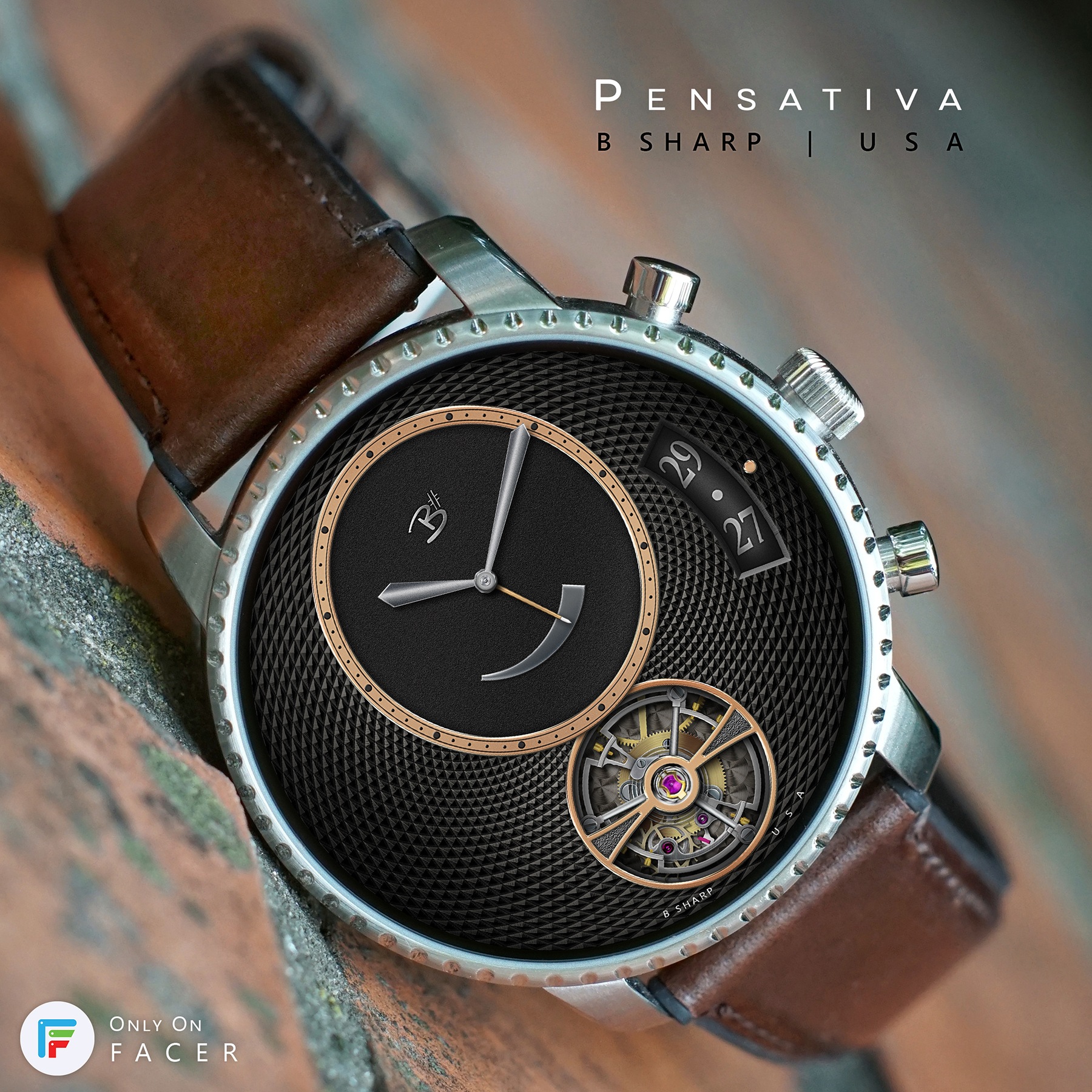
When I first made this design I tried out with a date window but thought it detracted from the clean lines so I left it out. But now that I’ve revisited it for this rose gold edition I like the date window (which generally is one of the fundamental elements of info I want on a face anyway).
I actually really like rose gold and try to use it when appropriate. I don’t feel it has to be only for women’s watches. To me it’s very compatible with this layout and the guilloche and not overly feminine. I think there are enough silver elements to still tie it together framed in a SS case like the Fossil here, but ideally the watch itself would be rose too. The preview with the Zen Watch is a perfect match!
5 Likes
Very nice one !
No matter with rose gold, it fits perfectly with the Qexplorist !
What happened with the hands ? it doesn’t have the same high quality as the overall watchface …
1 Like
Thanks! I kind of miss that watch. This was the Gen 4, but after having to send it back to fossil for servicing a couple of times they decided to replace it with a Gen 5. The Gen 5 is better technology for sure, but I like the case more on the Gen 4.
What aspect of the hands do you refer to? The style or the graphics? I’m not likely to change them because I like how they look with this design, but I’m just curious.
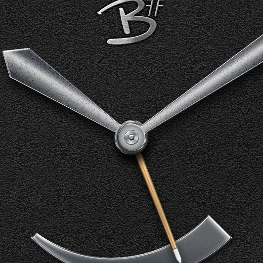
Actually, I’m not referring to the hand design itself but rather to the rendering.
Comparing with the tourbillon, with very small and sharp details, the center pin look to be “blur”.
… okay, I confess I have to zoom in to see such a detail 
ah, I understand what you mean. I guess sadly that’s just the nature of what happens when these things get shrunk down. I’m obsessive about details that really only get seen in all their glory on a big screen. So much nuance and subtle texture/shading is almost completely lost by the time it’s on the watch screen 
But, I do believe it’s still worth the trouble and affects how good a face looks on the watch. and it’s kind of the most rewarding aspect for me anyway.
here’s what the center of the hands look like zoomed in, does that look any sharper to you?
1 Like
pretty much better for sure 
I was just wondering how you can have a tourbillon with high res results and not the same res on the center pin …
I think any difference is due to the file size when I’m making the parts. My hands template is 1600px height but the center pins end up being drawn to scale within the template at just 60px or so. Balance wheels I usually draw near 800px. Even the screw heads and jewel bearings used in the TB were drawn near 400px in their own file. The detail and sharpness you get rendering layer effects and such with the larger files is far superior to applying the same effects to 100px objects. So, there you have it
1 Like
Do you let facer scale down the 1600px images, or do you save them scaled down first?
First I export to png full size. Then I have a couple of PS actions made to easily scale down. My standard size for face and hands is 800px. Gears/balance wheels/date wheels and such I usually do 400. It’s overkill I know, but I can’t bear to see them degraded any more than that!
Ok good to know, I need some more details in my work, will have a go with bigger and seperate images (I have everything in one 1280px file now)