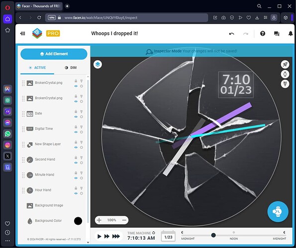
Just joined the community and am trying my hand at designing watch faces. Been having a lot of fun so far and finally made one I really think is a good look. Let me know what you think, wide open to feedback and criticism.
Good start. Move that broken glass on top of everything else. Will look better
Yes, that was my first idea too, bringing the broken crystal image above all other elements.
Something like this
Welcome @mreatini . Good start . You are in the right place for sure . I find the Seconds progress in your Fall into nature a little indistinct . As these guys are pointing out having these things in the correct layering is worth looking at .
Welcome to the Facer Community @mreatini ![]()
You’re off to a good start there but as the others said, yes, layer the Broken Glass image on the top. In my opinion I’d have the Hands visible on the Normal Display as well, not just Dim Display, which a lot of people don’t bother with.
Keep up the good work ![]()
Nice work! I may be in the minority here, but I actually quite like the layering (the back half of the second hand underneath the glass and the front half of the hand on top of the glass). It looks as if the hand itself has broken through the glass ![]() Agree with @icrltd4 that it’s worth seeing if you can add the hour and minute hands to the wake display though
Agree with @icrltd4 that it’s worth seeing if you can add the hour and minute hands to the wake display though ![]() Keep it up! Facer is a very fun and addictive hobby/ community.
Keep it up! Facer is a very fun and addictive hobby/ community.
Wow that’s a beautiful design! And excellent advice, thanks so much!
