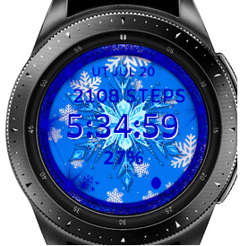
I built this face with a animated snowflake in the center…but on both my watch and phone …also my creator it is sluggish …it is supposed to make one Revelation a minute
4 Likes
I congratulate you on the design !!! very nice … 

This design goes right to the places where I live … 
With minus 40 degrees of temperature, in winter …
With all due respect … in your design, I would change the color of the letters, to better see the information …
well, you do it, how you like it best, your design🙂
Cordially
4 Likes
I’m working on another one with different colors in it …using the blue background and snowflake…this one was built for a friend and this is how they wanted it as you can tell they might be a bit crazy about the color blue
2 Likes
Everything’s fine… @viperh1020
I only gave my opinion, as a designer.
You do the design, however you like it.
All perfect…
Cordially
1 Like
Hi, maybe to improve contrast, while keep the blue texts, put lighter blue (or even white) duplicate text behind it and shift it one pixel in both directions…
3 Likes
Nice design Viper, but I agree with the other guys, it’s real hard to see the info with blue on blue, you should add an accent colour to it like petruuccios said.
Another thing, it looks like your main rotating snowflake isn’t quite central, needing to shifted down slightly…sorry, just looked outta place to me.
1 Like
Yeah that text just need to be white or leave it blue and make the background whiter
1 Like
I made a second version of this watch face with some changes
4 Likes
It’s better, well done
2 Likes
Beautiful, nice work. I would change the fonts to white and/or dim the background.
3 Likes