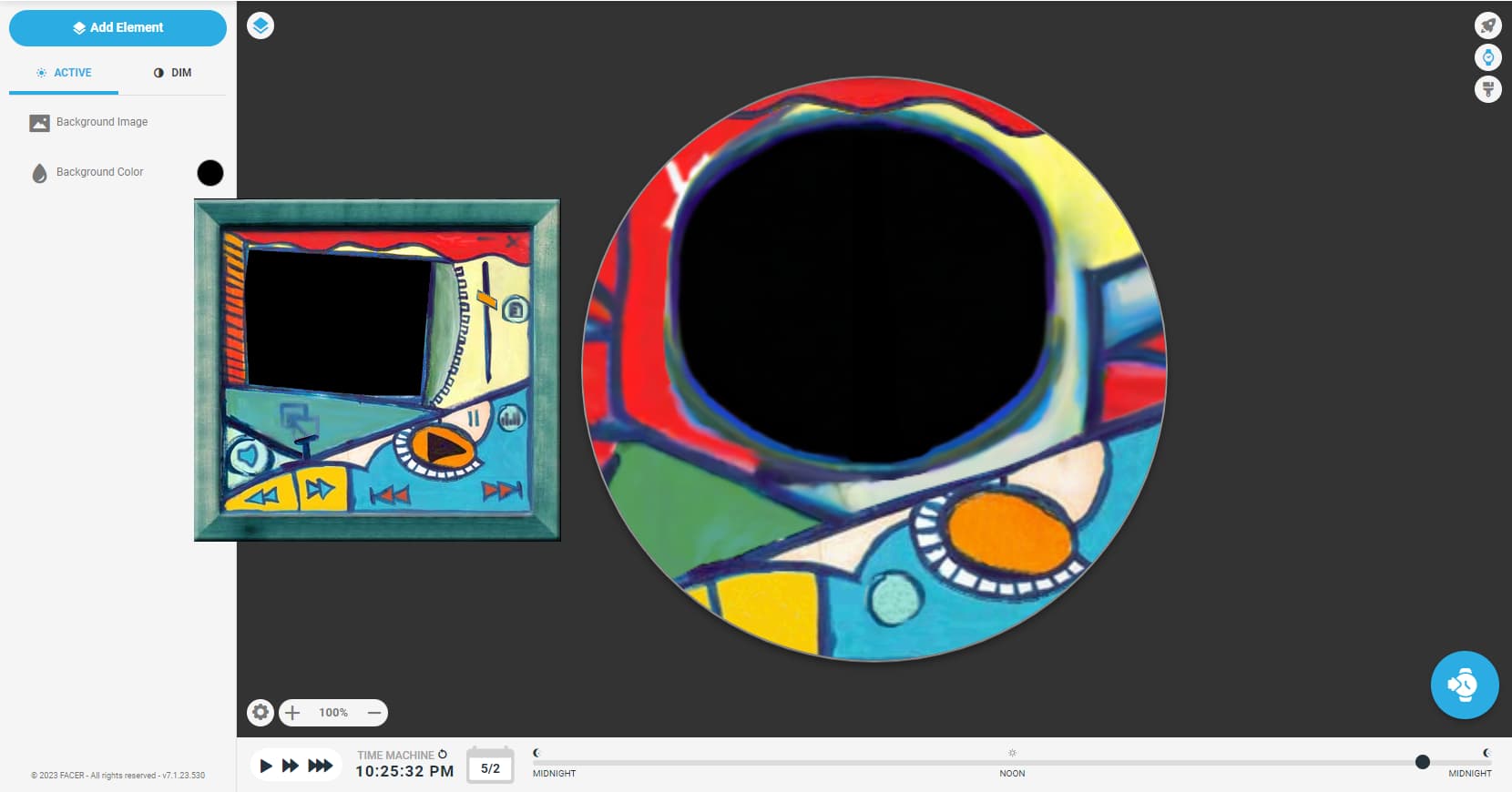
I’m currently making a watchface inspired by a particular Windows Media Player skin.
Even though I am a good artist, I’m not exactly good at mimicking the original art, but with the help of our convenient, yet controversial friend on the internet, the AI, I ran the skin through DALL-E, and then combined the sections from the actual skin and the generated part together, whilst erasing any buttons (e.g. the play button, the pause buttons and etc)
Here’s the watchface background in comparison to the original counterpart on the left side. No clue what to add next inside of the watchface, apart from the obvious black circle inside. I’m obviously going to keep it black so that it should be a reminder that this is inspired from a Windows Media Player skin, unless if the replies said otherwise, haha.

2 Likes
Just a nice Simple Analoguge . Battery power and Date are the accepted minimum. Those kind of faces are really popular. You may want to do a Digital version as well with the Rounded Ariel Font. That is popular. The Facer rounded ended hands will look nice there as well.
1 Like
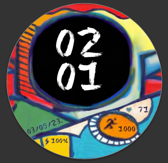
I could definitely do that kind of idea, but while I am currently making the watchface, I just added some random steps and heart rate counter thingies as well as the date and battery power as well.

I used a font called ‘Painter’ and I think it might just suited the aesthetics better. But I will consider the digital version of it too.
2 Likes
Sadly I will not be able to see those on my watch with my Old Eyes. Remember some Displays are 28mm diameter active screen. Love the font. Draw some Hands Free Hand ?
2 Likes
Oh, you’re right. I do need to tweak the spaces of the orange circle and the white semicircle a bit to accomodate larger sized fonts.
2 Likes
Does this look any good? I took your suggestion and I think it looks quite fantastic this way. What do you think?
1 Like
Love your Digital Font. Minutes a little smaller than the Hours maybe. I do not want to nit pick. The Active part of my Watch Face Display is 34 mm dia the preview above is 60 mm dia, your data numerals stand about 2 mm high on the Preview. So on my watch I will give you 1.2mm. So we are talking 1/22 inch in English. My watch is not small it is the GW4 Classic 44mm.
For the abstract look of your Face you can split the numers up. Use abreviated month to give a clue what the date numrrals mean , dump the year. If you dont know the Year you probably dont need a smart watch. You can have the Icons for steps and HR under the numbers. No one is going to shout at you if the numerals don’t fit exactly in thier compartments. Let them all be a little naughty / unconstrained.
1 Like
I was going to give an impression that the date would look like as if it was made on the date, as in like, the date that artists place when they finished their artwork, however I took your suggestion for the date, and this is how it looked:

1 Like